Month: August 2019
MongoDB, Inc. to Present at the Citi 2019 Global Technology Conference and the Deutsche Bank 2019 Technology Conference

MMS • RSS
Article originally posted on MongoDB. Visit MongoDB
NEW YORK, Aug. 30, 2019 /PRNewswire/ — MongoDB, Inc. (NASDAQ: MDB), the leading modern, general purpose database platform, today announced that it will present at two upcoming conferences: the Citi 2019 Global Technology Conference in New York City and the Deutsche Bank 2019 Technology Conference in Las Vegas.
- Chief Operating Officer and Chief Financial Officer, Michael Gordon will present at the Citi Conference on Friday, September 6, 2019 at 8:45 AM Eastern Time and will be webcast live.
- Mr. Gordon will also present at the Deutsche Bank Conference on Tuesday, September 10, 2019 at 7:25 AM Pacific Time (10:25 AM ET) and will be webcast live.
![]()
A live webcast of each presentation will be available on the Events page of the MongoDB investor relations website at https://investors.mongodb.com/events-and-presentations/events. A replay of the webcasts will also be available for a limited time.
About MongoDB
MongoDB is the leading modern, general purpose database platform, designed to unleash the power of software and data for developers and the applications they build. Headquartered in New York, MongoDB has more than 14,200 customers in over 100 countries. The MongoDB database platform has been downloaded over 70 million times and there have been more than one million MongoDB University registrations.
Investor Relations
Brian Denyeau
ICR for MongoDB
646-277-1251
ir@mongodb.com
Media Relations
Mark Wheeler
MongoDB
866-237-8815 x7186
communications@mongodb.com
![]() View original content to download multimedia:http://www.prnewswire.com/news-releases/mongodb-inc-to-present-at-the-citi-2019-global-technology-conference-and-the-deutsche-bank-2019-technology-conference-300909780.html
View original content to download multimedia:http://www.prnewswire.com/news-releases/mongodb-inc-to-present-at-the-citi-2019-global-technology-conference-and-the-deutsche-bank-2019-technology-conference-300909780.html
SOURCE MongoDB
Contributing to the Kubernetes Community: Getting Started Q&A with Contributor Nikhita Raghunath
MMS • RSS
Article originally posted on InfoQ. Visit InfoQ
At KubeCon + CloudNativeCon China 2019, held in Shanghai and attended by over 3500 attendees, the major talk was about the pace of growth of the Kubernetes community and discussions were focused on how to contribute to the community.
In addition to talks by the local Chinese community, many of the event’s presentations touched on the staggering numbers that the Kubernetes community has managed to collect in a relatively short amount of time. Lots of the hallway conversations with developers were focused on how contributions can be made in some form to the community, as the feeling of merely being part of the community was not enough. The Cloud Native Computing Foundation published some stats recently that track the Kubernetes journey which is the foundation’s largest hosted project.
InfoQ caught up with Nikhita Raghunath, a contributor to the Kubernetes community. She is also a CNCF Ambassador and the technical lead for SIG Contributor Experience.
Raghunath begins the discussion by outlining her first contribution, and although it initially appeared to be an intimidating experience her fears were eased by her interactions with the community. She also talks about the organization of the community, and outlined some of the tools in the contributors aresenal with a key goal of enabling a better understanding to the reader of how and where to contribute.
Although people can read the detailed Contributor Guide for a comprehensive how-to, Raghunath outlined several quick tips and tricks that are especially focused on the impatient contributors who are keen to get started and to move up the contributor ladder.
InfoQ: Welcome to InfoQ. Can you start by highlighting your first contribution, please. How did you plan this, how long did it take and any lessons learned?
Raghunath: When I was in college, I noticed that Kubernetes was participating in the Google Summer of Code (GSoC) internship program. GSoC is a four month paid internship program where students can work on open source projects.
As part of my GSoC application, I decided to work a bug related to incorrect marshaling of integers in CRDs (called TPRs back then). I wasn’t really familiar with how TPRs worked internally, so I decided to first read the design proposal related to it. Once I got a fair idea about it, I then moved onto understand how Kubernetes did JSON serialization and deserialization. To be honest, understanding this from scratch was a little intimidating. I looked at existing issues, grepped the codebase for terms related to it and asked numerous questions in the SIG API Machinery slack channel. After this, I finally created a PR and it got merged!
The whole process took me about a week, with a couple of hours of work each day. I remember being confused about how the whole GitHub automation worked and I was afraid that I’d be asking really silly questions in Slack. Looking back, I realize how my fears were unfounded because everyone was really kind and patient while answering. This was in 2017 and we have come a long way in terms of contributor-facing documentation since then. There are docs explaining the automation and videos about code-base tours. My biggest suggestion would be not shy away from asking questions and show up on slack and (if possible) meetings so that other contributors see that you are active and know who you are. This also helps while taking up/delegating new tasks and moving up the contribution ladder to a reviewer.
InfoQ: Can you offer any tips on how to get started with contributing, especially those that are impatient and don’t want to read the contributor guide from cover to cover?
Raghunath: We have a cheatsheet (in eight languages) for this very reason! 🙂
Apart from the cheatsheet, here are some practical tips:
- Start with lurking in SIG slack channels and meetings! It removes any added pressure about introducing yourself or contributing from the beginning. It would also prove beneficial in understanding the community conventions and the current tasks the SIG is working on. The contributor calendar contains information about all SIG meetings. In case you are not able to attend a meeting, meeting notes can be helpful in getting a quick rundown.
- Kubernetes uses Prow for CI/CD and GitHub automation in the form of “slash commands”. When you create a PR, you might see bots adding certain labels and comments and even asking you to run certain commands. Understanding this automation is crucial to make sure that your PR gets adequate attention from reviewers and is merged quickly. The command help page gives a handy overview of all commands including examples on how to use them.
- To find an issue to work on, you can look for issues having the `good-first-issue` or the `help-wanted` labels. Apart from these, fixing lint, shellcheck or static check errors are good places to start diving in with code contributions since they don’t require a lot of familiarity with the codebase.
- For an overview of the kubernetes/kubernetes repo, you can checkout the codebase tour. If you’d like to have a codebase tour of specific repos, you can also ask about them in the Meet Our Contributors sessions. Running a `git blame` on a particular file can point you to the specific commit/PR that led to the change. This is very helpful since PRs contain a lot of additional context and discussions.
- If you are looking for specific mentorship and are willing to contribute a certain number of hours per week, consider “shadowing” on the release team. Shadows get mentored by leads, and can even step up to become leads in future release cycles!
InfoQ: Is it significantly easier to contribute to the Kubernetes docs than to an actual Kubernetes code repository? Can you provide some comparisons of contributing to docs versus contributing to code repositories?
Raghunath: I believe this is more nuanced. Fixing typos in documentation are easier for sure, but doc contributions extend far beyond that. Expressing technical concepts in clear, concise and unambiguous terms such that it’s easily understandable by people with all levels of technical background is tricky to get right.
One of the tasks actively being worked on by SIG Docs right now is localization to different languages. While this might seem easier on the surface, it is much more strenuous. Localization goes one step beyond just translation and requires that all concepts be adapted to convey a similar connotation in the target language, while still maintaining the original meaning. Implementing this in practice requires careful review and a vast understanding of the technical concepts and the language.
Let’s compare this with code changes like fixing lint, shellcheck or static check errors. Fixing these involve running a script, which then outputs failures containing exact reasons for the errors. Since the reasons are already known (most of the times, the reasons also contain suggestions on the required changes), it is easier to fix them. Moreover, fixing these errors don’t particularly require an immense knowledge about technical Kubernetes concepts.
InfoQ: If I know how to issue a Pull Request (PRs) on GitHub, what else do I need to know from a technical perspective before I can start contributing code to code repositories?
Raghunath: Firstly, you will need to setup your development environment. Depending on the repository you are contributing to, you might need to run additional commands as well. The
CONTRIBUTING.mdfile at the root of the repo would be a good place to find more information about these. Once you make changes to the code, it is important to split the changes into logical series of smaller commits. One quick tip is to have any generated code in a separate commit since this makes reviewing the changes easier.While we don’t impose any specific restrictions on commit message style, adhering to good commit message practices is always helpful. Note that certain repos might also impose additional restrictions like disallowing merge commits or keywords in commit messages. After creating the PR, you will notice bots adding labels and comments to your PR. Understanding the GitHub automation and slash commands as mentioned above will help in interacting with bots easier. Here are some commands that are commonly used:
- Apply the SIG label by adding a comment
/sig cli. This will make sure that your PR is surfaced to SIG CLI reviewers.- Writing
/cc @usernamewill request reviews and/assign @usernamewill assign a particular person to your PR./retestwill automatically retest any failed tests on your PRs. This is especially handy in case your PR encounters any flakes.- And the most important command:
/meowand/woofwill make the bot comment with a cat and dog picture!After your PR looks good to the reviewer, they will add the “lgtm” (looks good to me) and “approved” labels to your PR using the
/lgtmand/approvecommands. Once your PR has these labels, it will get automatically merged by the bot.
InfoQ: Are there any particular Kubernetes communities that are more amenable for making contributions? In contrast, which ones are more challenging to contribute to?
Raghunath: There are certain tricky bugs like scalability failures or flaky tests that are harder to debug and fix but in my opinion, it is not possible to label a particular repo as harder to contribute to with a blanket statement.
Having said this, many people equate contributing to Kubernetes as contributing to the core kubernetes/kubernetes repo. But this is far from the truth. There are many other subprojects and repos in the `kubernetes-sigs`, `kuberentes-client` and the `kubernetes-csi` GitHub orgs as well. All of these repos are incredibly important and generally have a smaller set of folks working on them. Working on these subprojects is “easier” in the sense that you can have greater interactions with the maintainers and have quicker review response times.
InfoQ: Besides the satisfaction of contributing code to open source, are there other rewards to contributing code in the Kubernetes community?
Raghunath: Code was the initial aspect that attracted me, but I stayed even after my internship and continued contributing because of the community. “Come for the code, stay for the people” definitely resonates with me. I made countless friends from various parts of the world, and while many of them work at different companies, we still get to work together and learn from each other.
Personally, the biggest reward for me was that a lot of doors opened for me while I was hunting for jobs. Several contributors have also switched jobs, and yet continue to work on Kubernetes same as before. This helps in individual growth and also makes the project succeed long-term.
And of course, there are other rewards like the Kubernetes contributor patch, a chance to attend the Kubernetes Contributor Summit (co-located with KubeCons) and a big stash of Kuberentes-related swag!
In summary, although there a number of steps and processes associated with contributing to the Kubernetes community, understanding and following the guidance outlined above may reduce some of the intimidation factor, and make contributing to the community a lot easier.
More detailed information on contributing to the Kubernetes community is available in the Contributor guide.
MMS • RSS
Article originally posted on InfoQ. Visit InfoQ
Chirp uses audio to send and receive data using only a device’s speaker and microphone. Recently, Chirp had a chance to test their technology by sending signals to the Moon. InfoQ has spoken with Daniel Jones, Chief Technology Officer at Chirp, to learn more about Chirp codes.
Chirp sends data using either audible or inaudible frequencies, enabling the exchange of data between devices without requiring the establishment of a network or pairing. The devices exchanging Chirp codes can share the same acoustic environment, e.g., a room, or use any medium able to carry audio, such as a telephone line. Given the intrinsic nature of audio, Chirp codes can be easily broadcast to multiple devices at hearing distance.
On the technical side, Chirp relies on frequency shift keying (FSK) for signal modulation. Chirp messages can include any specific sequences that are used to indicate the start and length of a message as well as support error detection and correction.
As mentioned, Chirp recently carried through an experiment and sent a Chirp audio code to The Moon:
The signal was heard from the computer speaker, followed by a moment’s delay as it was beamed from the radio telescope and upwards through the earth’s atmosphere. The moon-bounced response then crackled back through the Skype link, backed with cosmic static. Astonishingly, given the number of lossy links in the transmission pipeline, the transmission decoded first time.
The major advantages of data-over-audio technologies like Chirp are the ability to let devices communicate without the hassle of establishing a network setup or pairing. In addition, audio codes are useful in environments forbidding the use of radio-frequencies.
InfoQ has spoken with Daniel Jones, Chief Technology Officer at Chirp, to learn more about Chirp codes.
Could you explain a few compelling use cases where Chirp audio codes could be used? What kind of existing technology do they improve upon or aim to replace?
Although there’s an array of connectivity technologies out there, data-over-sound fits a niche that no other technology quite fulfils: short-range, multi-way data transfer that happens at the tap of a button. Chirp’s USP is that it just works: no passwords or pairing, no need to enable Bluetooth, no problems with device support.
Another benefit of using sound as a medium is that it won’t carry through walls, unlike RF-based media like Bluetooth and Wi-Fi. That makes it suitable for tasks like room presence detection, in common scenarios like shared workspaces where you might have meeting room hubs in lots of adjoining rooms.
We’re working with providers to make meeting room hubs that send out Chirp ultrasonic beacons that can only be heard within that room, which contain all of the network information. You step into the room, your device detects exactly what room you’re in, receives the Wi-Fi credentials, connects to the network, and then connects to the meeting room screen. This is one of our favourite application areas as it solves so many pain points at once.
We’re also seeing a lot of uptake in IoT. One common use case is configuring smart devices with Wi-Fi credentials; instead of having to manually enter your password into each new smart device that you bring into your home, you can simply chirp them from your mobile device.
Chirp is also popular in toys and gaming, for tasks such as discovering nearby gamers and creating data links between the TV and accompanying second-screen devices.
What are the advantages of using inaudible audio codes for device-to-device communication?
The key advantages are:
It’s friction-less: Chirp doesn’t require any passwords or pairing. Any device that hears the tone receives the data.
It’s low-power and low-cost. Chirp is provided as a software-only solution, so if your device already has audio I/O, you won’t need to make any changes to your bill of material.
It’s universal: It runs on any mobile device made in the past 10 years, and can even be transmitted down simple channels like VoIP or streaming video.
It won’t pass through walls, which enables us to do room presence detection outlined above.
It’s secure and trustworthy: As it doesn’t pass any data to the cloud, it is safe from remote snoopers. You can layer industry-standard cryptography algorithms for private transactions.
What are the current limits of Chirp technology in terms of throughput, energy efficiency, reliability, overall quantity of data that can be exchanged?
Reliability has always been our key objective, as it’s so important for that friction-less experience. We’ve dedicated years of research time to solving these problems. And thanks to the optimisation work of our expert embedded engineers, Chirp requires very little power. It can run on sub-$1 microchips (Arm Cortex-M4 @ 64Mhz), and, paired with wake-on-sound microphones such as Vesper’s VM1010, uses less power than BLE.
Since the acoustic channel is very noisy, we must highlight that you’re not likely to see data rates anywhere near those of BLE. At typical peer-to-peer ranges, expect rates of 100-200bps. That’s enough to send an email address, token ID, or an encrypted set of credentials – but maybe not your home videos! At NFC range, we’re able to transmit at 1kbps.
What were/are the major technological stumble points you needed to solve to make Chirp codes work reliably?
For the first few years, we were firmly focused on the R&D necessary to make data-over-sound robust enough for noisy real-world environments. We began in a research lab in University College London, doing field tests in all sorts of noisy places – pubs, streets, rock concerts.
This was tested to its limits when we began trialling with EDF Energy on creating long-range ultrasonic links within their nuclear power stations, to solve the challenges they have with Wi-Fi restrictions in these sensitive environments. Remarkably, we were able to attain 100% data integrity over a long-duration, long-range test, even in the deafening 100dB surrounds of their turbine hall.
More recently, we’ve been porting the code to work on a wide range of IoT devices and focusing on power and optimisation. This has opened up the technology to a lot of new devices and form factors, most recently the new Arduino Nano 33 BLE Sense board.
Could you explain how the “Moon mission” came about? In what ways is your tech relevant to space missions? And what is the meaning of being able to send an audio code to The Moon and then decode it?
We were one of the technical sponsors of the first hackathon at Abbey Road Studios, where we met a talented artist called Martina Zelenika. She has an ongoing art project in collaboration with a radio observatory in the Netherlands, in which she bounces short fragments of audio off the surface of The Moon, encoded as RF signals, and decodes the reflected signal back here on earth.
We thought it would be wonderful to send the first Chirp signal to The Moon and back. And, in a testament to the decoder’s reliability, we were able to decode the noisy reflected signal first time.
It would be of limited use in real space missions as mature transmission schemes are already used which modulate data directly onto RF waves. In our version, we were sending data over sound over radio, which — although a fun experiment — is unlikely to be adopted by NASA any day soon!
Chirp is not the only data-over-sound solutions provider. Other players in the market include ITC Infotech, LISNR, Sonarax, and others.
Chirp provides a suite of cross-platform enterprise-ready SDKs that can be downloaded for free. Written in C, Chirp SDK supports Arduino, Android, iOS, Windows, all major browsers, and desktop OSes.
MMS • RSS
Article originally posted on InfoQ. Visit InfoQ
Cloud provider DigitalOcean recently released a pair of new managed data services. Their Managed MySQL and Redis offerings are on-demand and elastic, and offer a variety of sizes and high-availablity options.
In February of 2019, DigitalOcean launched their managed database service with PostgreSQL as the first supported engine. They shared that MySQL and Redis options were on the roadmap, and this month they delivered on that commitment. In a blog post about their Managed Databases for MySQL and Redis, André Bearfield of DigitalOcean explained how these databases reflect the simplicity and usability that’s synonymous with their services.
Developers of all skill levels, even those with no prior experience in databases, can spin up database clusters with just a few clicks. Select the database engine, storage, vCPU, memory, and standby nodes and we take care of the rest.
DigitalOcean delivered capabilities one might expect from a managed database. They offer automatic software updates to the database engine and underlying operating system, in a maintenance window of your choosing. There are automatic daily backups that are retained for seven days. During instance failure, DigitalOcean automatically replaces failed nodes with new ones that pick up from the point of failure. For manual recovery from a backup, users restore into a new database instance. Both Managed MySQL and Redis options support up to two standby nodes that take over automatically if the primary node fails. Managed MySQL customers can provision read-only nodes in additional geographic regions for horizontal scaling. Managed MySQL customers also get access to monitoring and proactive alerting functionality, and the ability to fork an entire cluster based on a specific point in time. Bearfield says that Managed Redis will also get database metrics and monitoring upon general availability.
Both the Managed MySQL and Redis offerings come with two cluster types: single node or high-availability. The single node clusters start at $15 per month and provide 1 GB of memory, 1 vCPU, and 10 GB of SSD disk storage. As evident by the name, the single node clusters aren’t highly available, but do support automatic failover. The high availability clusters offer up to two standby nodes and begin at $50 per month. The single node plan offers database instances as large as 32 GB of RAM, 8 vCPUs, and 580 GB of storage. The high availability plan goes a notch larger with machines offering 64 GB of RAM, 16 vCPUs, and 1.12 TB of disk storage.
Whether you look at the 2019 Stack Overflow developer survey, Jetbrains 2019 Dev Ecosystem survey, or DBEngine rankings, it’s clear that MySQL and Redis are wildly popular database engines. Shiven Ramji, DigitalOcean’s VP of Product, says that the company is driven by supplying developers with what they need.
“With the additions of MySQL and Redis, DigitalOcean now supports three of the most requested database offerings, making it easier for developers to build and run applications, rather than spending time on complex management,” said Shiven Ramji, DigitalOcean’s senior VP of Product. “The developer is not just the DNA of DigitalOcean, but the reason for much of the company’s success. We must continue to build on this success and support developers with the services they need most on their journey towards simple app development.”
The Managed Databases for MySQL and Redis are currently available in a subset of regions globally, with DigitalOcean promising wider availability soon. For both engines, you’re allowed up to 3 clusters per account, private networking is only available within the same datacenter region, and while clusters can be resized, they can only be made larger, not smaller. MySQL v8 is the supported edition with a handful of unsupported features, and Redis version 5 is offered with a few limitations.
During the past few years, DigitalOcean has expanded beyond offering low-cost virtual private servers. They’ve launched an object storage service, managed Kubernetes offering, more robust networking options, and now managed databases.
MMS • RSS
Article originally posted on InfoQ. Visit InfoQ

In a recent Harvard Business Review article, “Why inclusive leaders are good for organizations and how to become one”, authors Juliet Bourke and Andrea Espedido describe their new research into the characteristics and benefits of ‘inclusive’ leadership. Findings, including Improved collaboration and improved activation of team diversity, are extremely useful for software teams striving for Agile and DevOps cultures.
Inclusive leadership focuses on multidisciplinary teams that combine peoples’ collective capabilities. Bourke and Espedido found that:
Teams with inclusive leaders are 17% more likely to report that they are high performing, 20% more likely to say they make high-quality decisions, and 29% more likely to report behaving collaboratively. What’s more, we found that a 10% improvement in perceptions of inclusion increases work attendance by almost 1 day a year per employee, reducing the cost of absenteeism.
The authors discovered six traits or behaviors that distinguished inclusive leaders from others:
Visible commitment: They articulate authentic commitment to diversity, challenge the status quo, hold others accountable and make diversity and inclusion a personal priority.
Humility: They are modest about capabilities, admit mistakes, and create the space for others to contribute.
Awareness of bias: They show awareness of personal blind spots as well as flaws in the system and work hard to ensure meritocracy.
Curiosity about others: They demonstrate an open mindset and deep curiosity about others, listen without judgment, and seek with empathy to understand those around them.
Cultural intelligence: They are attentive to others’ cultures and adapt as required.
Effective collaboration: They empower others, pay attention to diversity of thinking and psychological safety, and focus on team cohesion.
The article also includes links to the main research published previously by the authors and some quick advice on what to do. Their four ways to get started are:
- Know your inclusive-leadership shadow: Seek feedback
- Be visible and vocal
- Deliberately seek out difference
- Check your impact, are people copying your role modeling?
The sample for the study is from three Australian organisations, This single aspect of leadership should be of great help to those organisations striving for more impact from their investment in diversity.
The article cites additional sources for further investigation that Deloitte have published:
MMS • RSS
Article originally posted on Data Science Central. Visit Data Science Central
When Anthem first announced the breach of 80 million of its records, FBI spokespersons credited Anthem with responding only weeks after the attack started.
Soon after, Brian Krebs, who blogs at KrebsOnSecurity, uncovered evidence that the attack might have started much earlier.
Why does it take so long for companies like Anthem to discover data breaches in progress and even longer to tell consumers?
Although the answer to that question remains complicated, one truth is undeniably simple: Consumers are the last to know.
10 Months in the Making
On April 21, 2014, the IP address 198.200.45.112 became home to a new domain called we11point.com. Additional subdomains, including myhr.we11point.com, hrsolutions.we11point.com, and excitrix.we11point.com were added. Security discovered that the subdomains looked like the components of the Wellpoint corporate network. Wellpoint, until late 2014, was Anthem’s corporate name.
The last subdomain, excitrix.we11point.com, is associated with a piece of backdoor malware that masquerades as Citrix’s VPN software. The malware had a security certificate signed by DTOPTOOLZ.COM, which is a known signature for a large Chinese cyber-espionage group called Deep Panda. In May 2014, Deep Panda targeted a series of phishing emails toward Wellpoint employees, trying to obtain their login credentials.
Interestingly, Premera Blue Cross, another large health insurance provider, disclosed a data breach on March 15, 2015. A few weeks before the disclosure, a security firm tied Deep Panda to another domain called prennera.com. Premera discovered its breach in January 2015 but revealed that the first attack happened back in May 2014.
Experts say that Deep Panda probably didn’t want to steal and sell 80 million records worth of patient information. Instead, the organization wanted to find records on one or more individuals that could help it infiltrate a U.S. defense program.
Why it Went Unnoticed
Attacks go unnoticed for several different reasons. Because few attacks disrupt a company’s external services, intruders often remain undetected on the network for long periods of time. Also, companies might receive endpoint alerts related to intrusions, but they receive so much security data that they can’t analyze all of it.
Buried by alert data and logs, analysts can’t distinguish which notifications are real and which are false alarms. Time and financial constraints prevent them from investigating every lead and keeps big companies like Anthem from connecting the dots.
Despite the staggering evidence that companies are typically slow to detect data breaches, corporate security teams think they’re better than they are. For instance, a security survey of 500 IT decision makers revealed that when asked, IT leaders claimed that they discovered most data breaches within 10 hours. The Verizon Data Breach Investigation Report, however, contradicts their claims.
According to Verizon, 66 percent of breaches take months or even years to detect. Properly configured network and cloud security and data center defense tools can prevent many infiltrations. However, when attackers obtain an administrator-level password, as Deep Panda did during the Anthem attack, they don’t have to break through company defenses.
Disclosing the Breach to Consumers
Because Congress has so much difficulty coming to a consensus on cybersecurity, particularly data breach disclosure requirements, different states have created a mashup of laws. Instead of containing specific timeframes regarding data breach disclosure, these laws often use vague wording. For example, a New York disclosure law states that companies must publish “in the most expedient time possible and without unreasonable delay,” but it also allows delays that accommodate “the legitimate needs of law enforcement.”
Anthem, possibly learning from the mistakes of other organizations, disclosed its breach and contacted law enforcement not long after the initial discovery. Other companies aren’t so forthcoming. They keep breaches under wraps for months before letting customers know their information was compromised.
Making Prevention a Priority
Instead of focusing on fending off attacks as they happen, companies need threat intelligence tools that identify internal vulnerabilities and data assets. Then, they should compare that with data from the external threat landscape to anticipate the company’s likelihood of being attacked.
Congress introduced the Data Security and Breach Notification Act of 2015, but critics argue that the law would weaken stronger state laws that are favorable to consumers. Before it can pass a law, Congress has to balance the consumer’s right to know with the company’s desire to keep information private. Staying quiet might help an ongoing law enforcement investigation, but it shouldn’t be used to save face.
MMS • RSS
Article originally posted on InfoQ. Visit InfoQ
Earlier this month Microsoft released .NET Core 3.0 Preview 8 for Windows, macOS, and Linux.
The new release contains bug fixes and enhancements for the ASP.NET Core, CoreFX, and CoreCLR product areas. There are no new features since the framework entered the freezing period in the previous release, and all development efforts are focused on stability and reliability.
ASP.NET Core was the product area most affected by this release. Some of the project templates were updated, like the Angular template (updated to Angular 8). Blazor logging and diagnostics capabilities were improved, along with gRPC diagnostics. Other enhancements include the addition of new networking primitives for non-HTTP servers, case-sensitive component binding, and culture-aware data binding. More details on the ASP.NET Core updates can be found here.
CoreFX received multiple bug fixes and enhancements for the System.Text.Json API, while Core CLR received bug fixes related to diagnostics and exception handling in Linux environments. A complete list of all bug fixes and releases for all affected product areas can be found here.
This preview of .NET Core 3.0 is supported by Microsoft and can be used in production: the Microsoft .NET Site has already been updated with the new release. With the final 3.0 release scheduled for next month, Microsoft officially recommends the start of adoption planning for .NET Core 3.0.
MMS • RSS
Article originally posted on Data Science Central. Visit Data Science Central
Photo by chuttersnap on Unsplash
Machine learning is a hot topic in research and industry, with new methodologies developed all the time. The speed and complexity of the field makes keeping up with new techniques difficult even for experts — and potentially overwhelming for beginners.
To demystify machine learning and to offer a learning path for those who are new to the core concepts, let’s look at ten different methods, including simple descriptions, visualizations, and examples for each one.
A machine learning algorithm, also called model, is a mathematical expression that represents data in the context of a problem, often a business problem. The aim is to go from data to insight. For example, if an online retailer wants to anticipate sales for the next quarter, they might use a machine learning algorithm that predicts those sales based on past sales and other relevant data. Similarly, a windmill manufacturer might visually monitor important equipment and feed the video data through algorithms trained to identify dangerous cracks.
The ten methods described offer an overview — and a foundation you can build on as you hone your machine learning knowledge and skill:
- Regression
- Classification
- Clustering
- Dimensionality Reduction
- Ensemble Methods
- Neural Nets and Deep Learning
- Transfer Learning
- Reinforcement Learning
- Natural Language Processing
- Word Embeddings
One last thing before we jump in. Let’s distinguish between two general categories of machine learning: supervised and unsupervised. We apply supervised ML techniques when we have a piece of data that we want to predict or explain. We do so by using previous data of inputs and outputs to predict an output based on a new input. For example, you could use supervised ML techniques to help a service business that wants to predict the number of new users who will sign up for the service next month. By contrast, unsupervised ML looks at ways to relate and group data points without the use of a target variable to predict. In other words, it evaluates data in terms of traits and uses the traits to form clusters of items that are similar to one another. For example, you could use unsupervised learning techniques to help a retailer that wants to segment products with similar characteristics — without having to specify in advance which characteristics to use.
Regression
Regression methods fall within the category of supervised ML. They help to predict or explain a particular numerical value based on a set of prior data, for example predicting the price of a property based on previous pricing data for similar properties.
The simplest method is linear regression where we use the mathematical equation of the line (y = m * x + b) to model a data set. We train a linear regression model with many data pairs (x, y) by calculating the position and slope of a line that minimizes the total distance between all of the data points and the line. In other words, we calculate the slope (m) and the y-intercept (b) for a line that best approximates the observations in the data.
Let’s consider a more a concrete example of linear regression. I once used a linear regression to predict the energy consumption (in kWh) of certain buildings by gathering together the age of the building, number of stories, square feet and the number of plugged wall equipment. Since there were more than one input (age, square feet, etc…), I used a multi-variable linear regression. The principle was the same as a simple one-to-one linear regression, but in this case the “line” I created occurred in multi-dimensional space based on the number of variables.
The plot below shows how well the linear regression model fit the actual energy consumption of building. Now imagine that you have access to the characteristics of a building (age, square feet, etc…) but you don’t know the energy consumption. In this case, we can use the fitted line to approximate the energy consumption of the particular building.
Note that you can also use linear regression to estimate the weight of each factor that contributes to the final prediction of consumed energy. For example, once you have a formula, you can determine whether age, size, or height is most important.

Linear Regression Model Estimates of Building’s Energy Consumption (kWh).
Regression techniques run the gamut from simple (like linear regression) to complex (like regularized linear regression, polynomial regression, decision trees and random forest regressions, neural nets, among others). But don’t get bogged down: start by studying simple linear regression, master the techniques, and move on from there.
Classification
Another class of supervised ML, classification methods predict or explain a class value. For example, they can help predict whether or not an online customer will buy a product. The output can be yes or no: buyer or not buyer. But classification methods aren’t limited to two classes. For example, a classification method could help to assess whether a given image contains a car or a truck. In this case, the output will be 3 different values: 1) the image contains a car, 2) the image contains a truck, or 3) the image contains neither a car nor a truck.
The simplest classification algorithm is logistic regression — which makes it sounds like a regression method, but it’s not. Logistic regression estimates the probability of an occurrence of an event based on one or more inputs.
For instance, a logistic regression can take as inputs two exam scores for a student in order to estimate the probability that the student will get admitted to a particular college. Because the estimate is a probability, the output is a number between 0 and 1, where 1 represents complete certainty. For the student, if the estimated probability is greater than 0.5, then we predict that he or she will be admitted. If the estimated probabiliy is less than 0.5, we predict the he or she will be refused.
The chart below plots the scores of previous students along with whether they were admitted. Logistic regression allows us to draw a line that represents the decision boundary.

Logistic Regression Decision Boundary: Admitted to College or Not?
Because logistic regression is the simplest classification model, it’s a good place to start for classification. As you progress, you can dive into non-linear classifiers such as decision trees, random forests, support vector machines, and neural nets, among others.
Clustering
With clustering methods, we get into the category of unsupervised ML because their goal is to group or cluster observations that have similar characteristics. Clustering methods don’t use output information for training, but instead let the algorithm define the output. In clustering methods, we can only use visualizations to inspect the quality of the solution.
The most popular clustering method is K-Means, where “K” represents the number of clusters that the user chooses to create. (Note that there are various techniques for choosing the value of K, such as the elbow method.)
Roughly, what K-Means does with the data points:
- Randomly chooses K centers within the data.
- Assigns each data point to the closest of the randomly created centers.
- Re-computes the center of each cluster.
- If centers don’t change (or change very little), the process is finished. Otherwise, we return to step 2. (To prevent ending up in an infinite loop if the centers continue to change, set a maximum number of iterations in advance.)
The next plot applies K-Means to a data set of buildings. Each column in the plot indicates the efficiency for each building. The four measurements are related to air conditioning, plugged-in equipment (microwaves, refrigerators, etc…), domestic gas, and heating gas. We chose K=2 for clustering, which makes it easy to interpret one of the clusters as the group of efficient buildings and the other cluster as the group of inefficient buildings. To the left you see the location of the buildings and to right you see two of the four dimensions we used as inputs: plugged-in equipment and heating gas.
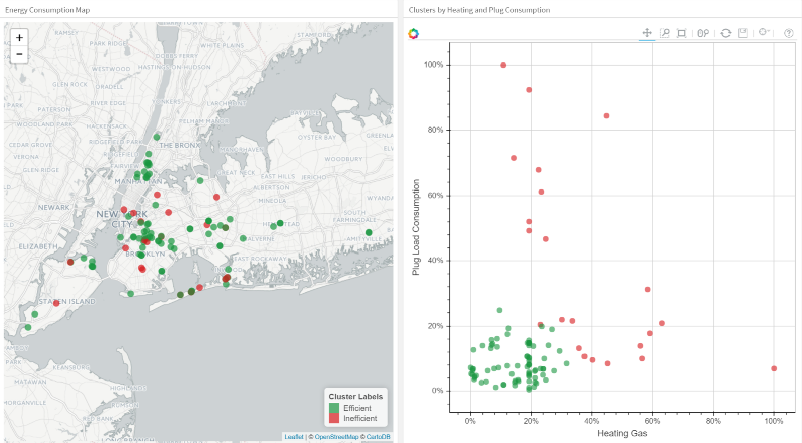
Clustering Buildings into Efficient (Green) and Inefficient (Red) Groups.
As you explore clustering, you’ll encounter very useful algorithms such as Density-Based Spatial Clustering of Applications with Noise (DBSCAN), Mean Shift Clustering, Agglomerative Hierarchical Clustering, Expectation–Maximization Clustering using Gaussian Mixture Models, among others.
Dimensionality Reduction
As the name suggests, we use dimensionality reduction to remove the least important information (sometime redundant columns) from a data set. In practice, I often see data sets with hundreds or even thousands of columns (also called features), so reducing the total number is vital. For instance, images can include thousands of pixels, not all of which matter to your analysis. Or when testing microchips within the manufacturing process, you might have thousands of measurements and tests applied to every chip, many of which provide redundant information. In these cases, you need dimensionality reduction algorithms to make the data set manageable.
The most popular dimensionality reduction method is Principal Component Analysis (PCA), which reduces the dimension of the feature space by finding new vectors that maximize the linear variation of the data. PCA can reduce the dimension of the data dramatically and without losing too much information when the linear correlations of the data are strong. (And in fact you can also measure the actual extent of the information loss and adjust accordingly.)
Another popular method is t-Stochastic Neighbor Embedding (t-SNE), which does non-linear dimensionality reduction. People typically use t-SNE for data visualization, but you can also use it for machine learning tasks like reducing the feature space and clustering, to mention just a few.
The next plot shows an analysis of the MNIST database of handwritten digits. MNIST contains thousands of images of digits from 0 to 9, which researchers use to test their clustering and classification algorithms. Each row of the data set is a vectorized version of the original image (size 28 x 28 = 784) and a label for each image (zero, one, two, three, …, nine). Note that we’re therefore reducing the dimensionality from 784 (pixels) to 2 (dimensions in our visualization). Projecting to two dimensions allows us to visualize the high-dimensional original data set.
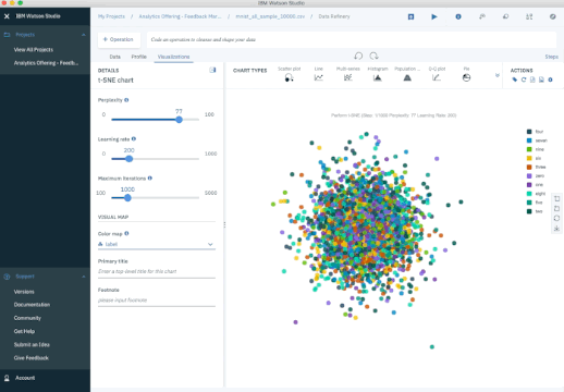
t-SNE Iterations on MNIST Database of Handwritten Digits.
Ensemble Methods
Imagine you’ve decided to build a bicycle because you are not feeling happy with the options available in stores and online. You might begin by finding the best of each part you need. Once you assemble all these great parts, the resulting bike will outshine all the other options.
Ensemble methods use this same idea of combining several predictive models (supervised ML) to get higher quality predictions than each of the models could provide on its own. For example, the Random Forest algorithms is an ensemble method that combines many Decision Trees trained with different samples of the data sets. As a result, the quality of the predictions of a Random Forest is higher than the quality of the predictions estimated with a single Decision Tree.
Think of ensemble methods as a way to reduce the variance and bias of a single machine learning model. That’s important because any given model may be accurate under certain conditions but inaccurate under other conditions. With another model, the relative accuracy might be reversed. By combining the two models, the quality of the predictions is balanced out.
The great majority of top winners of Kaggle competitions use ensemble methods of some kind. The most popular ensemble algorithms are Random Forest, XGBoost and LightGBM.
Neural Networks and Deep Learning
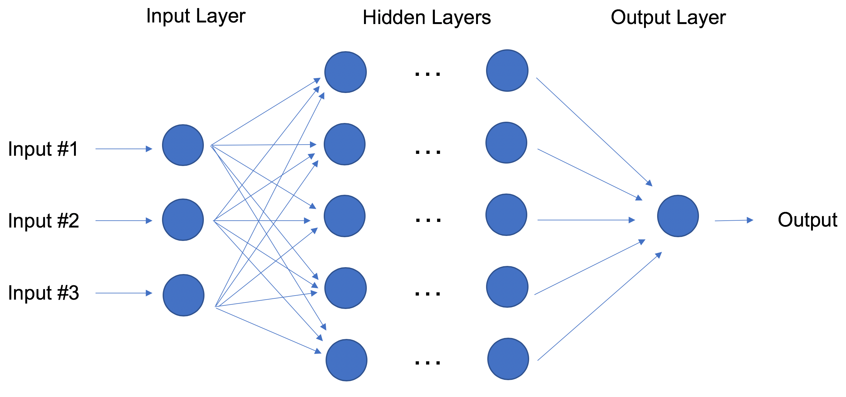
In contrast to linear and logistic regressions which are considered linear models, the objective of neural networks is to capture non-linear patterns in data by adding layers of parameters to the model. In the image below, the simple neural net has four inputs, a single hidden layer with five parameters, and an output layer.

Neural Network with One Hidden Layer.
In fact, the structure of neural networks is flexible enough to build our well-known linear and logistic regression. The term Deep learning comes from a neural net with many hidden layers (see next Figure) and encapsulates a wide variety of architectures.
It’s especially difficult to keep up with developments in deep learning, in part because the research and industry communities have doubled down on their deep learning efforts, spawning whole new methodologies every day.
Deep Learning: Neural Network with Many Hidden Layers.
For the best performance, deep learning techniques require a lot of data — and a lot of compute power since the method is self-tuning many parameters within huge architectures. It quickly becomes clear why deep learning practitioners need very powerful computers enhanced with GPUs (graphical processing units).
In particular, deep learning techniques have been extremely successful in the areas of vision (image classification), text, audio and video. The most common software packages for deep learning are Tensorflow and PyTorch.
Transfer Learning
Let’s pretend that you’re a data scientist working in the retail industry. You’ve spent months training a high-quality model to classify images as shirts, t-shirts and polos. Your new task is to build a similar model to classify images of dresses as jeans, cargo, casual, and dress pants. Can you transfer the knowledge built into the first model and apply it to the second model? Yes, you can, using Transfer Learning.
Transfer Learning refers to re-using part of a previously trained neural net and adapting it to a new but similar task. Specifically, once you train a neural net using data for a task, you can transfer a fraction of the trained layers and combine them with a few new layers that you can train using the data of the new task. By adding a few layers, the new neural net can learn and adapt quickly to the new task.
The main advantage of transfer learning is that you need less data to train the neural net, which is particularly important because training for deep learning algorithms is expensive in terms of both time and money (computational resources) — and of course it’s often very difficult to find enough labeled data for the training.
Let’s return to our example and assume that for the shirt model you use a neural net with 20 hidden layers. After running a few experiments, you realize that you can transfer 18 of the shirt model layers and combine them with one new layer of parameters to train on the images of pants. The pants model would therefore have 19 hidden layers. The inputs and outputs of the two tasks are different but the re-usable layers may be summarizing information that is relevant to both, for example aspects of cloth.
Transfer learning has become more and more popular and there are now many solid pre-trained models available for common deep learning tasks like image and text classification.
Reinforcement Learning
Imagine a mouse in a maze trying to find hidden pieces of cheese. The more times we expose the mouse to the maze, the better it gets at finding the cheese. At first, the mouse might move randomly, but after some time, the mouse’s experience helps it realize which actions bring it closer to the cheese.
The process for the mouse mirrors what we do with Reinforcement Learning (RL) to train a system or a game. Generally speaking, RL is a machine learning method that helps an agent learn from experience. By recording actions and using a trial-and-error approach in a set environment, RL can maximize a cumulative reward. In our example, the mouse is the agent and the maze is the environment. The set of possible actions for the mouse are: move front, back, left or right. The reward is the cheese.
You can use RL when you have little to no historical data about a problem, because it doesn’t need information in advance (unlike traditional machine learning methods). In a RL framework, you learn from the data as you go. Not surprisingly, RL is especially successful with games, especially games of “perfect information” like chess and Go. With games, feedback from the agent and the environment comes quickly, allowing the model to learn fast. The downside of RL is that it can take a very long time to train if the problem is complex.
Just as IBM’s Deep Blue beat the best human chess player in 1997, AlphaGo, a RL-based algorithm, beat the best Go player in 2016. The current pioneers of RL are the teams at DeepMind in the UK. More on AlphaGo and DeepMind here.
On April, 2019, the OpenAI Five team was the first AI to beat a world champion team of e-sport Dota 2, a very complex video game that the OpenAI Five team chose because there were no RL algorithms that were able to win it at the time. The same AI team that beat Dota 2’s champion human team also developed a robotic hand that can reorient a block. Read more about the OpenAI Five team here.
You can tell that Reinforcement Learning is an especially powerful form of AI, and we’re sure to see more progress from these teams, but it’s also worth remembering the method’s limitations.
Natural Language Processing
A huge percentage of the world’s data and knowledge is in some form of human language. Can you imagine being able to read and comprehend thousands of books, articles and blogs in seconds? Obviously, computers can’t yet fully understand human text but we can train them to do certain tasks. For example, we can train our phones to autocomplete our text messages or to correct misspelled words. We can even teach a machine to have a simple conversation with a human.
Natural Language Processing (NLP) is not a machine learning method per se, but rather a widely used technique to prepare text for machine learning. Think of tons of text documents in a variety of formats (word, online blogs, ….). Most of these text documents will be full of typos, missing characters and other words that needed to be filtered out. At the moment, the most popular package for processing text is NLTK (Natural Language ToolKit), created by researchers at Stanford.
The simplest way to map text into a numerical representation is to compute the frequency of each word within each text document. Think of a matrix of integers where each row represents a text document and each column represents a word. This matrix representation of the word frequencies is commonly called Term Frequency Matrix (TFM). From there, we can create another popular matrix representation of a text document by dividing each entry on the matrix by a weight of how important each word is within the entire corpus of documents. We call this method Term Frequency Inverse Document Frequency (TFIDF) and it typically works better for machine learning tasks.
Word Embeddings
TFM and TFIDF are numerical representations of text documents that only consider frequency and weighted frequencies to represent text documents. By contrast, word embeddings can capture the context of a word in a document. With the word context, embeddings can quantify the similarity between words, which in turn allows us to do arithmetic with words.
Word2Vec is a method based on neural nets that maps words in a corpus to a numerical vector. We can then use these vectors to find synonyms, perform arithmetic operations with words, or to represent text documents (by taking the mean of all the word vectors in a document). For example, let’s assume that we use a sufficiently big corpus of text documents to estimate word embeddings. Let’s also assume that the words king, queen, man and woman are part of the corpus. Let say that vector(‘word’) is the numerical vector that represents the word ‘word’. To estimate vector(‘woman’), we can perform the arithmetic operation with vectors:
vector(‘king’) + vector(‘woman’) — vector(‘man’) ~ vector(‘queen’)
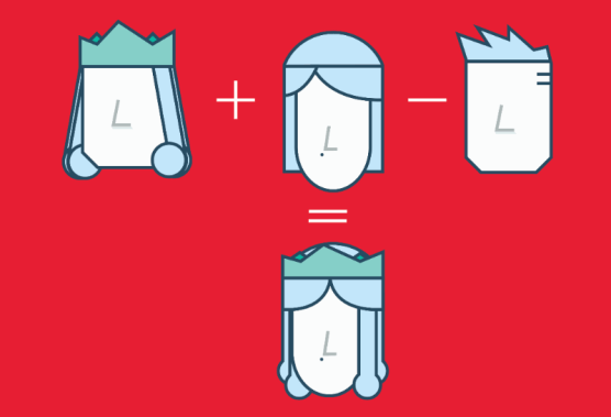
Arithmetic with Word (Vectors) Embeddings.
Word representations allow finding similarities between words by computing the cosine similarity between the vector representation of two words. The cosine similarity measures the angle between two vectors.
We compute word embeddings using machine learning methods, but that’s often a pre-step to applying a machine learning algorithm on top. For instance, suppose we have access to the tweets of several thousand Twitter users. Also suppose that we know which of these Twitter users bought a house. To predict the probability of a new Twitter user buying a house, we can combine Word2Vec with a logistic regression.
You can train word embeddings yourself or get a pre-trained (transfer learning) set of word vectors. To download pre-trained word vectors in 157 different languages, take a look at FastText.
Summary
I’ve tried to cover the ten most important machine learning methods: from the most basic to the bleeding edge. Studying these methods well and fully understanding the basics of each one can serve as a solid starting point for further study of more advanced algorithms and methods.
There is of course plenty of very important information left to cover, including things like quality metrics, cross validation, class imbalance in classification methods, and over-fitting a model, to mention just a few. Stay tuned.
All the visualizations of this blog were done using Watson Studio Desktop.
Special thanks to Steve Moore for his great feedback on this post.
Twitter: @castanan
LinkedIn: @jorgecasta
Originally posted here.
MMS • RSS
Article originally posted on Data Science Central. Visit Data Science Central
The Ugly Truth Behind All That Data
We are in the age of data. In recent years, many companies have already started collecting large amounts of data about their business. On the other hand, many companies are just starting now. If you are working in one of these companies, you might be wondering what can be done with all that data.
What about using the data to train a supervised machine learning (ML) algorithm? The ML algorithm could perform the same classification task a human would, just so much faster! It could reduce cost and inefficiencies. It could work on your blended data, like images, text documents, and just simple numbers. It could do all those things and even get you that edge over the competition.
However, before you can train any decent supervised model, you need ground truth data. Usually, supervised ML models are trained on old data records that are already somehow labeled. The trained models are then applied to run label predictions on new data. And this is the ugly truth: Before proceeding with any model training, any classification problem definition, or any further enthusiasm in gathering data, you need a sufficiently large set of correctly labeled data records to describe your problem. And data labeling — especially in a sufficiently large amount — is … expensive.
By now, you will have quickly done the math and realized how much money or time (or both) it would actually take to manually label all the data. Some data are relatively easy to label and require little domain knowledge and expertise. But they still require lots of time from less qualified labelers. Other data require very precise (and expensive) expertise of that industry domain, likely involving months of work, expensive software, and finally, some complex bureaucracy to make the data accessible to the domain experts. The problem moves from merely expensive to prohibitively expensive. As do your dreams of using your company data to train a supervised machine learning model.
Unless you did some research and came across a concept called “active learning,” a special instance of machine learning that might be of help to solve your label scarcity problem.
What Is Active Learning?
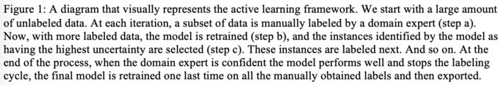
Active learning is a procedure to manually label just a subset of the available data and infer the remaining labels automatically using a machine learning model.
The selected machine learning model is trained on the available, manually labeled data and then applied to the remaining data to automatically define their labels. The quality of the model is evaluated on a test set that has been extracted from the available labeled data. If the model quality is deemed sufficiently accurate, the inferred class labels extended to the unlabeled data are accepted. Otherwise, an additional subset of new data is extracted, manually labeled, and the model retrained. Since the initial subset of labeled data might not be enough to fully train a machine learning model, a few iterations of this manual labeling step might be required. At each iteration, a new subset of data to be manually labeled needs to be identified.
As in human-in-the-loop analytics, active learning is about adding the human to label data manually between different iterations of the model training process (Fig. 1). Here, human and model each take turns in classifying, i.e., labeling, unlabeled instances of the data, repeating the following steps.
Step a –Manual labeling of a subset of data
At the beginning of each iteration, a new subset of data is labeled manually. The user needs to inspect the data and understand them. This can be facilitated by proper data visualization.
Step b –Model training and evaluation
Next, the model is retrained on the entire set of available labels. The trained model is then applied to predict the labels of all remaining unlabeled data points. The accuracy of the model is computed via averaging over a cross-validation loop on the same training set. In the beginning, the accuracy value might oscillate considerably as the model is still learning based on only a few data points. When the accuracy stabilizes around a value higher than the frequency of the most frequent class and the accuracy value no longer increases — no matter how many more data records are labeled — then this active learning procedure can stop.
Step c –Data sampling
Let’s see now how, at each iteration, another subset of data is extracted for manual labeling. There are different ways to perform this step (query-by-committee, expected model change, expected error reduction, etc.), however, the simplest and most popular strategy is uncertainty sampling.
This technique is based on the following concept: Human input is fundamental when the model is uncertain. This situation of uncertainty occurs when the model is facing an unseen scenario where none of the known patterns match. This is where labeling help from a human — the user — can change the game. Not only does this provide additional labels, but it provides labels for data the model has never seen. When performing uncertainty sampling, the model might need help at the start of the procedure to classify even simple cases, as the model is still learning the basics and has a lot of uncertainty. However, after some iterations, the model will need human input only for statistically more rare and complex cases.
After this step c, we always start again from the beginning, step a. This sequence of steps will take place until the user decides to stop. This usually happens when the model cannot be improved by adding more labels.
Why do we need such a complex procedure as active learning?
Well, the short answer is: to save time and money. The alternative would probably be to hire more people and label the entire dataset manually. In comparison, labeling instances using an active learning approach is, of course, more efficient.
Uncertainty Sampling
Let’s have a closer look now at the uncertainty sampling procedure.
As for a good student, it is more useful to clarify what is unclear rather than repeating what the student has already assimilated. Similarly, it is more useful to add manual labels to the data that the model cannot classify confidently than to the data where the model is already confident.
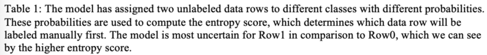
Data where the model outputs different labels with comparable probabilities are the data about which the model is uncertain. For example, in a binary classification problem, the most uncertain instances are those with a classification probability of around 50% for both classes. In a multi-classification problem, highest uncertainty predictions happen when all class probabilities are close. This can be measured via the entropy formula from information theory or, better yet, a normalized version of the entropy score.
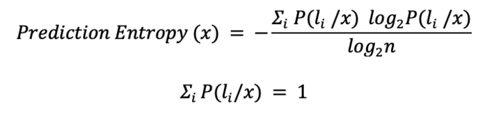
Let’s consider two different data rows feeding a 3-class classification model. The first row was predicted to belong to class 1 (label 1) with 90% probability and to class 2 and class 3 with only 5% probability. The prediction here is clear: label 1. The second data row, however, has been assigned a probability of belonging to all three labels of 33%. Here the class attribution is more complicated.
Let’s measure their entropy. Data in Row1 has a higher entropy value than data in Row0 (Table 1), and this is not surprising. This selection via entropy score can work with any number n of classes. The only requirement is that the sum of the model probabilities always adds up to 1.
Summarizing, a good active learning system should extract all those rows for manual labeling that will benefit most from human expertise rather than more obvious scenarios. After a few iterations, the human-in-the-loop should find the selection of data rows for labeling less random and more unique.
Active Learning as a Guided Labeling Web Application
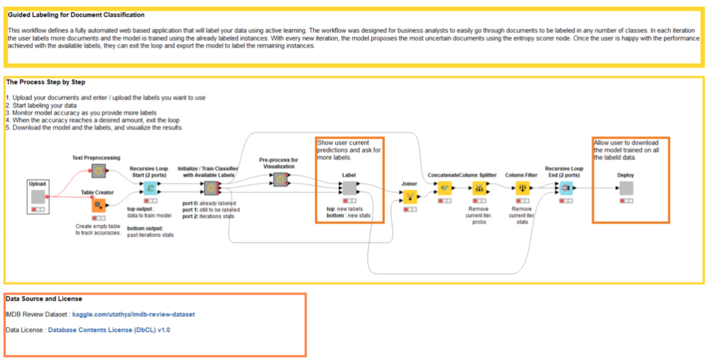
In this section, we would like to describe a preconfigured and free blueprint web application that implements the active learning procedure on text documents, using KNIME software and involving human labeling between one iteration and the next. Since it takes advantage of the Guided Analytics feature available with KNIME Software, it was named “Guided Labeling.”
The application offers a default dataset of movie reviews from Kaggle. For this article, we focus on a sentiment analysis task on this default dataset. The set of labels is therefore quite simple and includes only two: “good” and “bad.”
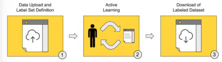
The Guided Labeling application consists of three stages (Fig. 2).
- Data upload and label set definition. The user, our “human-in-the-loop,” starts the application and uploads the whole dataset of documents to be labeled and the set of labels to be applied (the ontology).
- Active learning. This stage implements the active learning loop.
- Iteration after iteration, the user manually labels a subset of uncertain data rows.
- The selected machine learning model is subsequently trained and evaluated on the remaining subset of labeled data. The increase in model accuracy is monitored until it stabilizes and/or stops increasing.
- If the model quality is deemed not yet sufficient, a new subset of data containing the most uncertain predictions is extracted for the next round of manual labeling via uncertainty sampling.
- Download of labeled dataset. Once it is decided that the model quality is sufficient, the whole labeled dataset — with labels by both human and model — is exported. The model is retrained one last time on all available instances, used to score documents that are still unlabeled, and is then made available for download for future deployments.
From an end user’s perspective, these three stages translate to the following sequence of web pages (Fig. 3).
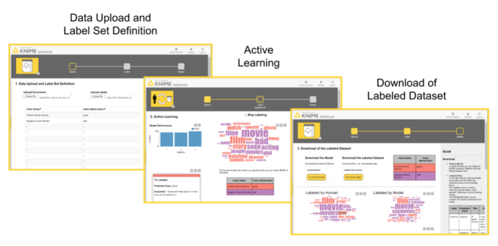
In the first page, the end user has the possibility to upload the dataset and define the label set. The second page is an easy user interface for the quick manual labeling of the data subset from uncertainty sampling.
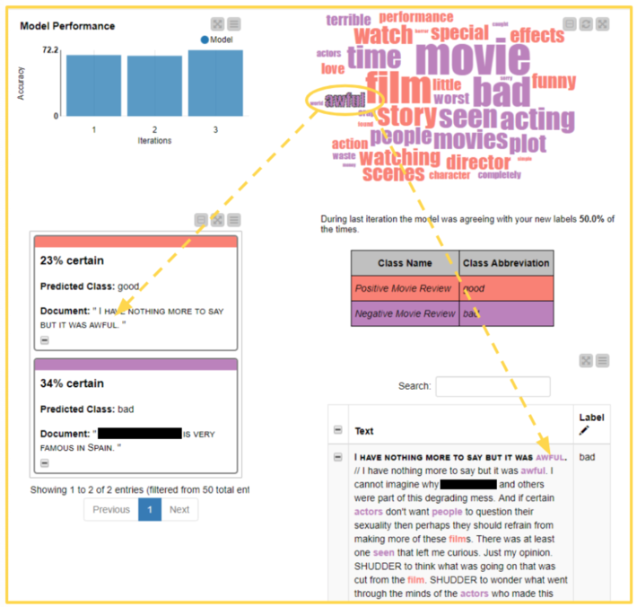
Notice that this second page can display a tag cloud of terms representative of the different classes. Tag clouds are a visualization used to quickly show the relevant terms in a long text that would be too cumbersome to read in full. We can use the terms in the tag cloud to quickly index documents that are likely to be labeled with the same class. Words are extracted from manually labeled documents belonging to the same class. The top most frequent 50 terms across classes are selected. Of those 50 terms, only the terms present in the still unlabeled documents are displayed in an interactive tag cloud and color coded depending on the document class.
There are two labeling options here:
- Label the uncertain documents one by one as they are presented in decreasing order of uncertainty. This is the classic way to proceed with labeling in an active learning cycle.
- Select one of the words in the tag cloud and proceed with labeling the related documents. This second option, while less traditional, allows the end user to save time. Let’s take the example of a sentiment analysis task: By selecting one “positive” word in the tag cloud, mostly “positive” reviews will surface in the list, and therefore, the labeling is quicker.
Note. This Guided Labeling application works only with text documents. However, this same three-stage approach can be applied to other data types too, for example, images or numerical tabular data.
Guided Labeling in Detail
Let’s check these three stages one by one from the end user point of view.
Stage 1: Data Upload and Label Set Definition

The first stage is the simplest of the three, but this does not make it less important. It consists of two parts (Fig. 4):
- uploading a CSV file containing text documents with only two features: “Title” and “Text.”
- defining the set of classes, e.g., “sick” and “healthy” for text diagnosis of medical records or “fake” and “real” for news articles. If too many possible classes exist we can upload a CSV file listing all the possible string values the label can assume.
Stage 2: Active Learning
It is now time to start the iterative manual labeling process.
To perform active learning, we need to complete three steps, just like in the diagram at the beginning of the article (Fig. 1).
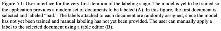
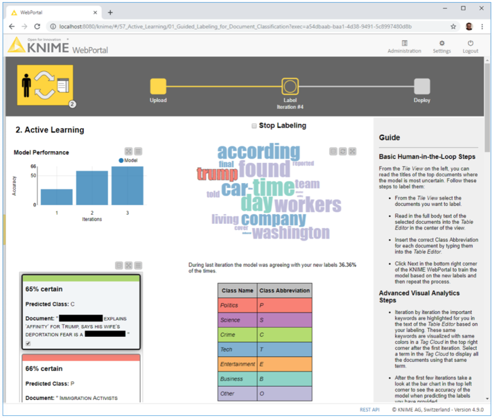
Step 2a –Manual labeling of a subset of data
The subset of data to be labeled is extracted randomly and presented on the left side (Fig. 5.1 A) as a list of documents.
If this is the first iteration, no tag clouds are displayed, since no classes have been attributed. Let’s go ahead and, one after the other, select, read and label all documents as “good” or “bad” according to their sentiment (Fig. 5.1 B).
The legend displayed in the center shows the colors and labels to use. Only labeled documents will be saved and passed to the next model training phase. So, if a typo is detected or a document was skipped, this will not be included in the training set and will not affect our model. Once we are done with the manual labeling, we can click “Next” at the bottom to start the next step and move to the next iteration.
If this is not the first iteration anymore and if the selected machine learning model has already been trained, a tag cloud is created from the already labeled documents. The tag cloud can be used as a shortcut to search for meaningful documents to be labeled. By selecting a word, all those documents containing that word are listed. For example, the user can select the word “awful” in the word cloud and then go through all the related documents. They are all likely to be in need of a “bad” label (Fig 5.2)!

Step 2b –Training and evaluating an XGBoost model
Based on a subset of the few labeled documents to be used as a training set, an XGBoost model is trained to predict the sentiment of the documents. The model is also evaluated on the same labeled data. Finally, the model is applied to all data to produce a label prediction for each review document.
After labeling several documents, the user can see the accuracy of the model improving in a bar chart. When accuracy reaches the desired performance, the user can check the check box “Stop Labeling” at the top of the page, then hit the “Next” button and get to the application’s landing page.
Step 2c –Data sampling
Based on the model predictions, the entropy scorer is calculated for all yet unlabeled data rows; uncertainty sampling is applied to extract the best subset for the next phase of manual labeling. The whole procedure then restarts from step 2a.
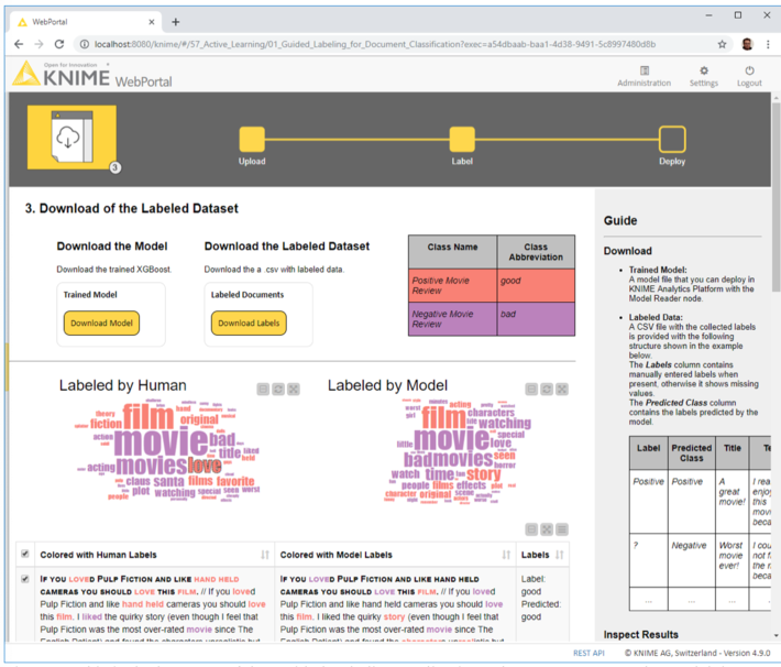
Stage 3: Download of Labeled Dataset
We reached the end of the application. The end user can now download the labeled dataset, with both human and machine labels, and the model trained to label the dataset.
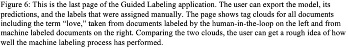
Two word clouds are made available for comparison: on the right, the word cloud of those documents labeled by the human in the loop and on the left, the word cloud of machine labeled documents. In both clouds, words are color coded by document label: red for “good” and purple for “bad.” If the model is performing a decent job at labeling new instances, the two word clouds should be similar and most words in them should have the same color (Fig. 6).
Guided Labeling for Active Learning
In this article, we wanted to illustrate how active learning can be used to label a full dataset while investing only a fractional amount of time in manual labeling. The idea of active learning is that we train a machine learning model well enough to be able to delegate it to the boring and expensive task of data labeling.
We have shown the three stages involved in an active learning procedure: manual labeling, model training and evaluation, and sampling more data to be labeled. We have also shown how to implement the corresponding user interface on a web-based application, including a few tricks to speed up the manual labeling effort using uncertainty sampling.
The example used in this article referred to a sentiment analysis task with just two classes (“good” and “bad”) on movie review documents. However, it could easily be extended to other tasks by changing the number and type of classes. For example, it could be used for topic detection for text documents if we provided a topic-based ontology of possible labels (Fig. 7). It could also be extended just as simply to other data types and classification tasks.
The Guided Labeling application was developed via a KNIME workflow (Fig. 8) with the free and open source tool KNIME Analytics Platform, and it can be downloaded for free from the KNIME Hub. If you need to perform active learning and label tons of data rows, we suggest downloading the blueprint workflow and customizing it to your needs. You could, for example, make it work for images, use another machine learning model, or implement some other strategy to train the underlying model.
It is now your turn to try out the Guided Labeling application yourself. See how easily and quickly data labeling can be done!
Paolo Tamagnini contributed to this article. He is a data scientist at KNIME, holds a master’s degree in data science from Sapienza University of Rome and has research experience from NYU in data visualization techniques for machine learning interpretability. Follow Paolo on LinkedIn.
For more information on KNIME, please visit www.knime.com and the KNIME blog.
MMS • RSS
Article originally posted on Data Science Central. Visit Data Science Central
Continued fractions are usually considered as a beautiful, curious mathematical topic, but with applications mostly theoretical and limited to math and number theory. Here we show how it can be used in applied business and economics contexts, leveraging the mathematical theory developed for continued fraction, to model and explain natural phenomena.
The interest in this project started when analyzing sequences such as x(n) = { nq } = nq – INT(nq) where n = 1, 2, and so on, and q is an irrational number in [0, 1] called the seed. The brackets denote the fractional part function. The values x(n) are also in [0, 1] and get arbitrarily close to 0 and 1 infinitely often, and indeed arbitrarily close to any number in [0, 1] infinitely often. I became interested to see when it gets very close to 1, and more precisely, about the distribution of the arrival times t(n) of successive records. I was curious to compare these arrival times with those from truly random numbers, or from real-life time series such as temperature, stock market or gaming/sports data. Such arrival times are known to have an infinite expectation under stable conditions, though their medians always exist: after all, any record could be the final one, never to be surpassed again in the future. This always happens at some point with the sequence x(n), if q is a rational number — thus our focus on irrational seeds: they yield successive records that keep growing over and over, without end, although the gaps between successive records eventually grow very large, in a chaotic, unpredictable way, just like records in traditional time series.
See also my article Distribution of Arrival Times for Extreme Events, here. It turns out that the behavior of the records in the sequence x(n) can be different from those of random numbers, offering a new, broader class of statistical models.
1. Theoretical background (simplified)
In some sense, continued fractions provide the best rational approximations to irrational numbers such as q. The successive approximations, called convergents, converge to q. Let’s look at the sequence of successive records for q = SQRT(2)/2, to see how they are related to the denominators of its convergents in its continued fraction expansion. This is illustrated in the table below.
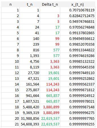
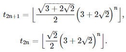
More details are available here. In general, if q is the square root of an integer (not a perfect square) the convergents can be computed explicitly: see here (PDF document). The interesting fact is that t(n), the arrival time of the n-th record, as n grows, is very well approximated by A * B^n (here B^n means B at power n) where A and B are two constants depending on q.
Now let turn to q = e = exp(1). The behavior is more chaotic, and pictured in the table below.
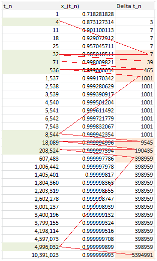
Follow the red path! The first 20 convergents of e are listed below (source: here). Look at the denominator of each convergent to identify the pattern:
- 8 / 3,
- 11 / 4,
- 19 / 7,
- 87 / 32,
- 106 / 39,
- 193 / 71,
- 1264 / 465,
- 1457 / 536,
- 2721 / 1001,
- 23225 / 8544,
- 25946 / 9545,
- 49171 / 18089,
- 517656 / 190435,
- 566827 / 208524,
- 1084483 / 398959,
- 13580623 / 4996032,
- 14665106 / 5394991,
- 28245729 / 10391023,
- 410105312 / 150869313,
- 438351041 / 161260336
The same patterns applies to all irrational numbers. Indeed, we found an alternate way to compute the convergents, based on the records.
2. Generalization and potential applications to real life problems
We found a connection between records (maxima) of some sequences, and continued fractions. Doing the same thing with minima will complete this analysis. Extreme events in business or economics settings are typically modeled using statistical distributions (Gumbel and so on), which did not live to their expectations in many instances.
The theory outlined here provides an alternative, with each number q serving as a particular model, with its own features distinct from all other numbers. In particular, the numerators and denominators of convergents of q can be used to model the arrival times of extreme events. While the records here are getting closer either to zero or to one, using a logarithm transformation allows you to model phenomena that are not bounded.
Note that the sequence x(n) has strong, long-range auto-correlations that are well studied (see appendix B in this book). One could try with the sequence x(n) = { b^n q } instead (b > 1) as it exhibits exponentially fast decaying auto-correlations, also studied in the same book. Even cross-correlations between two sequences have been studied: for instance, if x(n) = { nq } and y(n) = { nq * 12 / 35 }, then the correlation between the two sequences is 1 / (12 * 35). Replace 12 and 35 by any integers that do not share a common divisor, and as long as q is irrational, this result easily generalizes. For a proof, see here. This allows you to model multivariate time series and their cross-dependencies.
Finally, by googling some of the t(n) attached to q = log(3) / log(2) and discussed in the next section, I found that the associated convergents have some applications in music. See here for details.
3. Original applications in music and probabilistic number theory
We focus here on q = log(3) / log(2). The music application is discussed here, and in this section we focus only on the number theory application. The purpose is to prove that the binary digits of SQRT(2) are uniformly distributed, with the proportion of 0 and 1 converging to 50/50 as you look at increasingly longer sequences of successive digits. The use of convergents here helps only with a very specific, narrow part of the proof, but a critical one (assuming a complete proof is ever found – to this day it is still a mystery.)
Let’s look at the sequence z(n) = 2^x(n). with x(n) = { nq } as usual. Since x(n) is equidistributed modulo one, it is uniformly distributed on [0, 1]. Thus the distribution of z(n) is that of 2^(-X) where X is uniformly distributed on [0, 1]. and its median is thus SQRT(2)/2. If n is odd, the empirical median of (z(1), z(2), …, z(n)) is the middle value when these values are sorted, so it is also one of these values. The empirical median converges to the theoretical median SQRT(2)/2. Also, each z(n) is a rational number: the length of its period in base 2 is equal to 2 * 3^(n-1). In addition, the proportion of 0 and 1 in the binary expansion of z(n) and thus in the empirical median regardless of n, is always exactly 50/50. While this is true for all n, it does not mean that this fact remains true for the limit of any converging infinite sub-sequence of z(n) values. Take the sub-sequence z(t(n)) with t(n) the arrival time of the records of x(n). That sub-sequence converges to 1/2. This is a counter-example, and the link to the continued fractions discussed earlier. Sub-sequences having that defect can and sometimes do converge to a non-normal number as in our example, and they must be excluded by carefully removing an infinite number of x(n) without impacting the median. That’s where these records and associated continued fractions become handy.
But you don’t need to take all the x(n) into consideration. You can focus on a sub-sequence x(h(n)) where h(n) is an increasing sequence of integers, and as long as SQRT(h(n+1)) – SQRT(h(n)) tends to zero as n tends to infinity, the equidistribution theorem remains applicable, and thus the median will still be SQRT(2)/2. Hopefully one can find a sequence h(n) that avoids the problems mentioned in the previous paragraph.
The table for t(n) for q = (log 3) / (log 2) can be found here. Even though no one has ever fully proved that SQRT(2) has its binary digits uniformly distributed, a much deeper result is “known” (but of course, also unproved) and published here for the first time:
The proportion q(n) of binary digits of SQRT(2) (or any other normal number for that matter, say Pi or log 2), among the first n digits, satisfies
See here for details. In short, this is a consequence of a refined version of the Berry-Esseen theorem, itself a second-order approximation to the central limit theorem. It is true if the digits in question were distributed uniformly and independently with a Bernouilli distribution of parameter 1/2, as they appear to be. Empirical evidence seems to confirm this conjecture: the chart below shows the first 1,000,000 values of SQRT(n) * |q(n) – 1/2|.
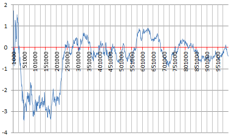
To not miss our future articles (more on this topic coming soon), subscribe to our newsletter, here.