
MMS • RSS
Article originally posted on Data Science Central. Visit Data Science Central
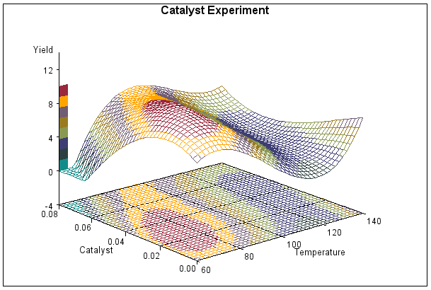
Here we ask you to identify which tool was used to produce the following 18 charts: 4 were done with R, 3 with SPSS, 5 with Excel, 2 with Tableau, 1 with Matlab, 1 with Python, 1 with SAS, and 1 with JavaScript. The solution, including for each chart a link to the webpage where it is explained in detail (many times with source code included) can be found here. You need to be a DSC member to access the page with the solution: you can sign-up here.
How do you score? Would this be a good job interview question?
Chart 1
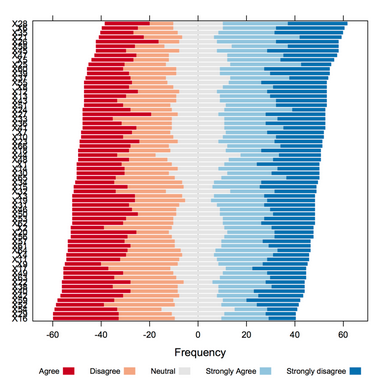
Chart 2
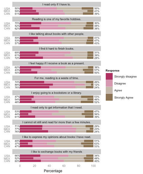
Chart 3
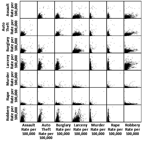
Chart 4
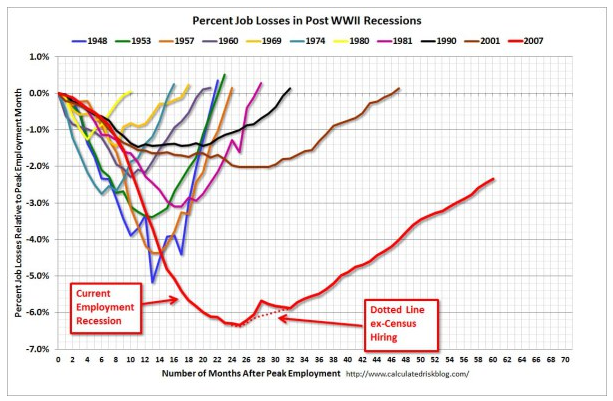
Chart 5
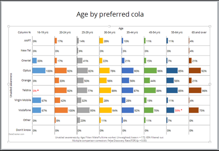
Chart 6
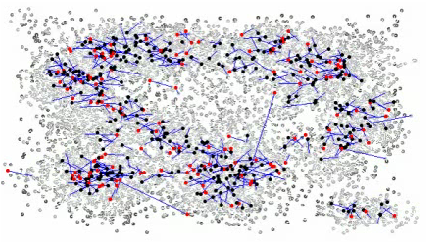
Chart 7
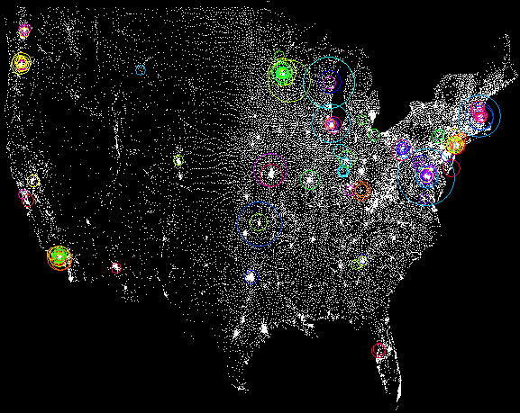
Chart 8
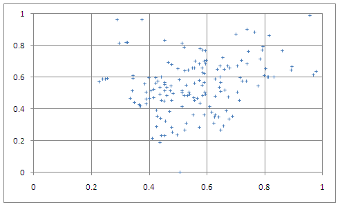
Chart 9
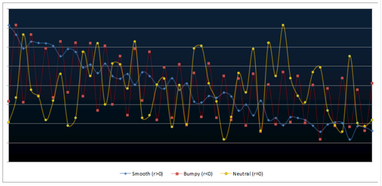
Chart 10
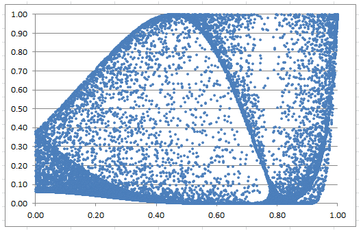
Chart 11
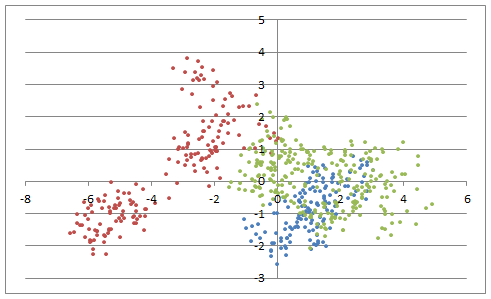
Chart 12

Chart 13

Chart 14
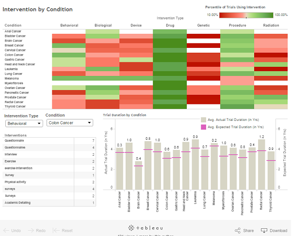
Chart 15

Chart 16
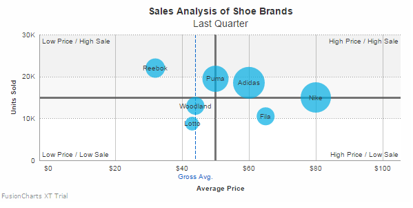
Chart 17
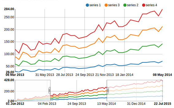
Chart 18
DSC Resources
- Career: Training | Books | Cheat Sheet | Apprenticeship | Certification | Salary Surveys | Jobs
- Knowledge: Research | Competitions | Webinars | Our Book | Members Only | Search DSC
- Buzz: Business News | Announcements | Events | RSS Feeds
- Misc: Top Links | Code Snippets | External Resources | Best Blogs | Subscribe | For Bloggers
Additional Reading
- 50 Articles about Hadoop and Related Topics
- 10 Modern Statistical Concepts Discovered by Data Scientists
- Top data science keywords on DSC
- 4 easy steps to becoming a data scientist
- 13 New Trends in Big Data and Data Science
- 22 tips for better data science
- Data Science Compared to 16 Analytic Disciplines
- How to detect spurious correlations, and how to find the real ones
- 17 short tutorials all data scientists should read (and practice)
- 10 types of data scientists
- 66 job interview questions for data scientists
- High versus low-level data science
Follow us on Twitter: @DataScienceCtrl | @AnalyticBridge