
MMS • RSS
Article originally posted on Data Science Central. Visit Data Science Central
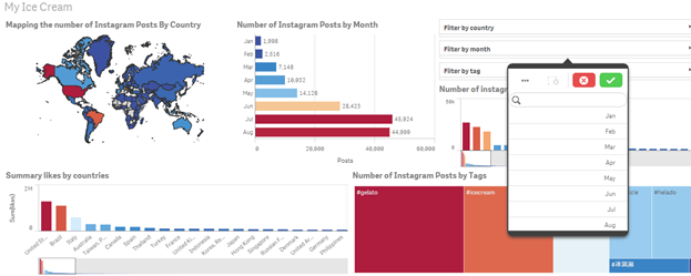
 Image credit: tinydesignr.com
Nowadays, there is a huge list of powerful visualization tools to help you illustrate your ideas, visualize your data, make it talk, share your significant analytics with customers and the global community. In this article, we will compare the most commonly used platforms and analyze their main features to help you choose one or several platforms that will provide indispensable aid for your work communication.
It is often hard to separate the facts from fiction when evaluating various business intelligence (BI) tools, as every BI vendor markets their product as the only “best” solution, often flooding the Internet with biased reviews. If you want to understand the functional product value, avoid the hype and useless clicking through endless pages of partial reviews, you’ve come to the right place.
We will guide you through special features, pros, and cons of all the primary tools, such as QlikView, Klipfolio, Tableau, Geckoboard, Power BI and Google Data Studio. We will also compare their key parameters including usability, setup, price, support, maintenance, self-service features, support of different data types, and more. Let us look individually at each tool.
We are going to compare in this article six BI and data visualization tools, you can move through the article using the list below:
1. QlikView
QlikView is a solution that focuses on the user as the receiver of data. It allows users to explore and discover your data in a workflow similar to the way developers work when processing data. To sustain flexibility in its approach to data exploration and visualization, this software strives to maintain the association between data. This facilitates the discovery of your data by the end-user seeking a certain piece of data with awareness of retrieval of any relevant items, in spite of any circumstances, even if the origins of the items applicable to the search are incredibly disjoint.
QlikView is incredibly flexible. It allows to set and tweak every little aspect of each object and customize the look and feel of any visualizations and dashboards. With such great deal of flexibility, there also comes an incorporated ETL (Extract, Transform, Load) Engine that enables you to conduct the ordinary data cleansing operations. However, it may turn out to be costly.
Product differentiators
Many Qlikview’s competitors in the BI field recognize the high value of differentiators and attempt to reproduce many of its features, unsuccessfully in most cases. The design of Qlikview was developed with the thought of avant-garde prebuilt dashboard applications and associative dashboards that are both innovative and intuitive to use. It also provides the ability to avoid using data warehouses and pull data in-memory with the use of associative dashboards, as described above, due to its advanced search capabilities.
Features
Qlikview’s great combination of uniqueness and flexibility wins it a strong place among other BI vendors and has a vast variety of useful applications for any business dealing with drastically different scales across various industries.
QlikView possesses a myriad of features that make it extremely useful for creating advanced dashboards based on data from multiple sources.
One of such features is QlikView’s ability to manipulate data associations automatically: it can recognize the relationships between various data items in a set without any explicit preconfiguration work by the user. The automation of this task greatly speeds up the process of dashboard development.
Another great feature is the way Qlikview handles data input – by keeping it in-memory for several users, i.e., in the RAM of the server. This allows faster queries and therefore quicker data exploration and amelioration of user experience with aggregations that are computed on the fly, rather than storage-based calculations. Since Qlikview preserves the data in-memory, it is much faster to compute an aggregation as needed, instead of querying precomputed aggregated values. Additionally, it is more memory-efficient.
Keeping your data in-memory is definitely a formidable advance, as it requires a huge volume of RAM to pertain all the data. QlikView resolves this issue through an incredible level of compression minifying the data to 10% of its original size. We believe it is one of the greatest Qlikview features obtained via heavy use of data dictionaries and utilizing only the most essential pieces of data necessary for analysis.
Usability
QlikView’s dashboards and reports are easy to navigate even for ordinary users. However, it can be quite challenging to build the reports, as it requires a high level of developer skills, proficiency in default SQL, as well as training with Qlikview’s proprietary query language to build the database interactions.
Pricing
QlikView is rated as one of the most expensive platforms in the BI field. The full pricing policy may be found following the link: www.qlik.com. The pricing scheme is quite complicated and may be confusing. Many new users fall into a costly trap through its “Document License” which expresses the work conditions in a somewhat vague manner. The initial pricing plan can actually cost you double, as the rate is valid only for one “document” (.tde file). Many customers discover this later as an unpleasant surprise, and it can also prod the per-user price almost twice. Other competitors have more straightforward pricing policies when compared to Qlikview.

QlikView is all about the destination, so you need to know exactly where you are going. If some questions remain vague, a great deal of time can be spent on trying to put multiple sheets together which may then have to be discarded in the end, as any piece of misinterpreted data can compromise the final results. QlikView allows you to do wonderful things with your data as long as you don’t change the original question.
To summarize, Qlikview may be an appropriate solution for you if you have the right mindset to apply a programmatic interface, as well as the ability to integrate the right questions from the very start in case your data is derived in different forms. You also need to be ready to invest in the extra efforts to maintain proper reporting.
2. Klipfolio

Klipfolio is a BI solution that resides 100% in the cloud (no desktop application is required) providing a genuinely insightful tool for data visualization and dashboard composition. This enables it to process data most efficiently, boosts the real-time solutions and optimization, rather than relying on a periodical regression model.
Klipfolio supports connectivity to a variety of data sources, both online and offline. The online sources integrate a range of cloud-hosted storages including Google Sheets, Relational DBs, and other services that provide data in all kinds of forms. The possibilities of connection span from Google Analytics tools, Trello, and Twitter to differing marketing tools like Oracle Sales Cloud, Mixpanel, and Radian6 Sales Marketing. The full reference of connectivity services may be found here, under the Services sector. It is also possible to hook up to your own data source with the use of RESTful API.
Klipfolio supports a great variety of offline service types: MS Excel, CSV, XML, JSON, and others. The full reference list can be found via the same link as for online sources mentioned above but in the Data repositories section.
All of these data sources, either separately or in combination, can be effectively used for integrating various metrics in order to extract a vision of data, create, transform, and share custom visualizations that will unveil the practical meaning behind any insipid numbers.
Klipfolio applies the principle of responsiveness to facilitate the discovery of dashboards with the use of diverse technological platforms, from smartphones and tablets, to desktop computers and smart TVs surmounted on walls of conference rooms.
Product differentiators
Klipfolio represents a powerful data dashboard building platform that enables access to the real-world, ever-changing lively data sources. It is best used for live monitoring and control over continuous data flows when their dynamics are of great importance and may require urgent decisions. The live data connection is a way of data retrieval that maintains the time consistency required for data accuracy and reliability, while responsiveness deposits into the time factor of the fast decisions.
Features
-
Integration of multiple data sources in a single report
-
Unlimited connection for as many users as necessary
-
Management of access rights and restrictions for important information
-
Mobile accessibility (iOS, Android, BlackBerry, Windows)
-
Flexible REST connector for setting up custom data sources
-
Secure connection to SQL databases
-
Support for Excel, CSV, JSON, XML file formats
-
Handy annotations to reports that are seen by users with whom the report is shared
-
Self-service KPI editing platform
-
Easy to use threshold indicators.
Usability
Klipfolio includes plenty of visualization types, including plain tables, bar charts, pie charts, line and area charts, a combination of those charts, as well as scatter plots. Additionally, with the use of some HTML and CSS users can forge their own, unique visualizations. All of these components are laid out on the composite dashboards with the help of WYSIWYG editor. Some of the more sophisticated elements of the visualizations are added with various formulas and functions.
Klipfolio dashboards feature an extensive collaboration framework for sharing information with other users based on permissions, enabling notification and distribution via email. The significant difference when using Klipfolio appears in building graphs and plots. Instead of simply dragging and dropping the fields from a data table into a worksheet, the user has to implement all the computations using different functions and formulas. In this way, you can create sheets with any type of visualization, but you need to think about how you can combine and change the data first.
Pricing
Klipfolio is one of the oldest players in the BI industry with extensive experience and expertise that has paved its way to the top by developing viable solutions. Klipfolio mostly bets on its cloud offering today, while also providing a premise solution option. Klipfolio Dashboard (as SaaS) is distributed using a user per month pricing policy, with some small variations of total depending on the volume and time commitments. Pricing starts at $19/month, providing multiple options with customizable payment plans. Klipfolio also provides a free trial period of 14 days for testing and learning purposes.
3. Tableau

Another big player in our scope today is Tableau. Like most other BI tools, Tableau zeros in on data analytics via visualization means. It is intended for easy creation and distribution of interactive data dashboards that provide an insightful depiction of dynamics, trends of change, and data density distributions via the convenient medium of simple, yet effective visuals.
As many other services, Tableau provides facility to connect to a variety of data sources with many systematic types, such as data systems organized in file formats (CSV, JSON, XML, MS Excel, etc.), relational and nonrelational data systems (PostgreSQL, MySQL, SQL Server, MongoDB, etc.), cloud systems (AWS, Oracle Cloud, Google BigQuery, Microsoft Azure).
The core distinction from competitors is that Tableau has a special feature of Data Blending. Another unique feature is the ability for collaboration in real time that makes it a valuable investment for commercial and non-commercial organizations alike. There are several ways to share the reports in Tableau: by publishing them to a Tableau server; via email Tableau Reader capability; by publishing Tableau workbook openly and giving access to anyone who has a link. This magnitude of options enables great flexibility and removes many restrictions.
Product differentiators
Tableau offers a broad variety of visualization capabilities with distinct features, enabling smart ways of data discovery and deep insight. The rich library of visualizations types includes “word clouds” and “bubble charts” that provide high levels of comprehension unique to Tableau. Tree diagram and treemap provide contextual information to the visuals. The latter is usually utilized for the depiction of parts categorical data, focusing attention on the most relevant pieces of the information.
Tableau dashboards are amazingly flexible. Its central features allow the remarkable ability to layout the dashboard in the desired way with any “overlaps”, which comes really handy in the screen space ergonomics.
Tableau is easy to apprehend as a working tool, its learning curve is pretty gentle, as it strives to provide all of its powers to any kind of users, even those who haven’t been previously exposed to technical details of visualization workflows. This objective is accomplished by using intuitive interface: everything is always no more than two clicks away; robust filters and drill-downs are easy to find and use; operations are well documented and labeled.
Tableau is not only easy and pleasant to use from the developer’s perspective, but also quite neat at its destination side, as it provides the ability to control the outcome through additional filtering with custom parameters. All data is communicated in a clear, attractive, and interactive manner. Tableau offers an insightful look at the data and allows to compress the complex decision-making process efficiently.
The sharing above system is notable for its great flexibility and variation with a myriad of choice for data sharing. Even the pickiest users are sure to find a proper solution that will satisfy their most capricious needs.
Features
-
Complimentary sharing ability (with certain limitations)
-
Support for connection to 30+ data source types
-
Mixing data sources
-
Support for cubes
-
Integration with R Excellent in mapping Ready-made drivers for many databases
-
Leadership in community building efforts (various training videos, blogs, forums, social network engagement).
Usability
Extraordinary ease of use, it is considered as the best of easy-to-use tools from this list. Taking into account these extensive Tableau features, its most convenient use case is the discovery of structured data through charts, graphs, and other visualization types. No other BI solution can make it easier than Tableau, giving amazing power to its users. It is easy enough for a casual business user, yet as powerful as the developer tools. Import data, build attractive visualization, share and publish them in a simple and straightforward form. Besides, the large number of tutorial videos, how-tos, blogs, and forums will save time, avoiding the long struggle of looking for right solutions.
Pricing
Tableau has different licensing plans similar to other BI solutions. Tableau offers three distinct products with drastically different prices.
The three products are the Tableau desktop, Tableau online, and Tableau server that come at different price points.The detailed pricing information can be found on the official website.
The Tableau desktop is intended for any individual user and distributed at $999 for a user per year for personal use, and $1,999 for enterprise use, covering support. Personal use implies that it is meant for an individual developer and supports 6 data sources. Enterprise use means that it is intended for business needs and allows up to 44 data sources.
Tableau Online is a cloud-based BI platform with web interface hosted by the Tableau vendor. Tableau may be used for free with its Public option, but it is important to remember that this solution is hosted on the public server and all reports are shared publicly. The Private Online version comes at 500 user/year price.
Tableau Server is a full-fledged business tool for companies that operate their own servers and want to have complete control over data flows and full security of on-premise hosting. However, it comes at the price of $10, 000 per 10 users. Customer support is provided for additional 25% of the annual cost.

4. Geckoboard

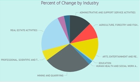
Image credit: geckoboard.com
Yet another cloud-based visualization solution. It can be an appropriate tool for you if you need to display some values using a basic predefined widget. Geckoboard provides an ability to compose dashboards with various widgets. It has a rich library of prepared integrations with facebook; twitter, Salesforce API’s so you can instantly visualize your social media engagements or business data.
It also provides an ability to create a custom integration with your own data sources in two ways: Pull or Push. Pull means that your widget makes a request for the data every N seconds (you can set up the N value) linked to a specific URL (which you can also set) from where it extracts the data. Push means that you can feed the widget with data manually by sending an HTTP request to the special widget URL. This will associate the data you have sent with that widget and showed it on the dashboard.
Geckoboard gives you few possible widget templates, like line charts or histogram, each of them has its own data JSON format which can be displayed. It’s important that your pull server or push feeder send the data in an appropriate format. Otherwise, it won’t show you anything on the dashboard. You can find much more information here.
You can also change the stylesheet for widgets, change the color schema, add two or more dashboards, or add multiple users. Geckoboard has a reliable support team that usually responds relatively fast and carefully guides you until your problem is fully resolved. When you register your company, they will usually call you on your phone a few days later to ask several questions about you, your company, and your business purpose in order to give useful advice about their relevant services and pricing.
Product differentiators
It is one of the most democratic tools for visualizations as popular among individual users and freelancers, as among business and corporate users. Nonetheless, pricing is not very democratic, we will elaborate more on this later.
Geckoboard allows work on raw data and transforms metrics to fit visuals and make sense of your data. The metrics may also be chosen and focused to depict the frames of data that are most relevant.
The Geckoboard’s interface is a fine piece of work. The design pattern of drag and drop workflow is seamless and easy to follow. This type of interface makes it very simple to create any visualizations. Furthermore, the nice layout promotes navigational comfort while working with Geckoboard, and all the styles are magnificent. The themes give us both light and dark options. Additionally, the custom CSS styles can be applied to dashboards.
Features
-
Integration to a variety of services such as Google Analytics, Zendesk, Bitium, etc
-
An attractive, user-friendly interface
-
Data transformation support
-
Collaboration facilities
-
Customization of visualizations
-
Fused responsiveness
-
Customer support and documentation are really helpful.
Usability
The overall evaluation of Geckoboard shows that the tool satisfies most of the needs of business users. First of all, the supported integrations make it easy to connect with the demanded data sources. The data visualization is accomplished by dragging the desired types onto the area of the report, dropping it there, and then dragging/dropping data that needs to be visualized. Finally, bringing the team to work on the report is as straightforward as creating this report.
Pricing
The detailed information about pricing can be found here. When you sign up, you have 30-days trial to train with the Geckoboard features and consider whether it is worth to spend money on buying it.
The pricing schema is broken into three main plans:
-
The Starter pack at $25 per month, or $275 per year is the least flexible option which also includes the Geckoboard branding styles. It allows for work of one user and the creation of 1 dashboard, which is a perfect offer for startups, or projects with a strict budget.
-
The Growth pack at $149 per month, or $1,639 per year gives more flexibility with styling, priority customer support, and, more importantly, extends the use to 5 dashboards with an unlimited number of users.
-
The Company pack at $599 per month, or $6,589 per year is a corporate version of the tool designed for work with company-wide metrics. It allows for unlimited dashboards and users, and dedicated customer service is provided to the subscriber.

5. Power BI
Power BI is the software solution, developed and supported by Microsoft, for business intelligence and analytics needs. At the core of Power BI is an online service with various options for interaction, also featuring several outlets for connection to data provided by a third party software and services.
Power BI provides a simple web-based interface with a plenitude of useful features varying from customizable visualization to certainly limited controls of data sources. The desktop application expands the available functionality to an even larger extent with the addition of tools for data cleansing and normalization.
Another way to work and make data-driven decisions on the go is through the mobile app, which is available for multiple platforms. It is also amazingly simple to share insights by publishing your work to Power BI service and forming lively dashboards from a combination of reports which makes the data communication centralized and easy to follow up for all the participants.
Power BI is concise and minimalistic, yet powerful and robust. However, like any other software, it also has its ups and downs which must be carefully considered.
Product differentiators
What makes Power BI different from other solutions?
First of all, as it is a Microsoft product, it follows a philosophy, principles, and architecture similar to other major Microsoft products. It also exposes a familiar interface for the Windows users.
Power BI was created and designed with the aim to build upon the functionalities of MS Excel, upgrade it to the next level, extend its operability even further to unlock new use cases, cover more platforms, and reach out to the cloud.
As a Microsoft product, Power BI has connections to some other software from the Microsoft’s toolbelt but goes much farther than that by utilizing a whole suite of novel business analytics tools. Thus, Power BI is not just related to other products; it is tightly integrated with the main Microsoft tools including MS Excel, Azure Cloud Service, and SQL Server.
Features
-
Power BI has a free basic version, giving users a chance to explore it first
-
It supports plenty of ways to incorporate or import your data (streaming data, cloud services, excel spreadsheets, and third-party connections)
-
It has interactive dashboards with real-time feed of data
-
Simple API for integrating Power BI with your applications
-
Different ways to share reports and dashboards
-
Multiplatform support (Web, Desktop, Mobile).
Usability
The interface is straightforward for all users familiar with Windows (i.e., almost everyone), so working with Power BI is usually highly intuitive.
Many controls and depictions have a similar outlook on MS Excel and other MS Office products that provide a profound understanding of your progress while working on a report.
The visualizations are created with the use of good old drag-and-drop. All you need to do to build a new chart or visualize a piece of data is just drag and drop a visual type onto the blank area of the report. This will create a placeholder for the future visualization in the form of a blank visual with the default look. The same technique comes to play when you choose what data (the exact fields or pieces of data) to be presented in this visual by simply dragging and dropping the fields of data onto the placeholder itself or into its properties (they will be available when highlighted).
Pricing
Microsoft Power BI is considered as a decent analytics tool, and its pricing policy is highly democratic.
The pricing structure is simple and offers two options: a free version of Power BI with somewhat limited abilities, and an enterprise version of Power BI Pro with a full-fledged set of services.
The free option is available for any single user and has a 1 GB data capacity limit, 10K rows/hour of streaming data in total for your dashboards and reports, along with limited capabilities of data refreshing and collaboration.
Power BI Pro costs $9.99 for one user per month and expands the capacity limits to 10 GB data per user with up to 1M rows/hour of streaming data which is the maximum rate of their API). It also enables connection to the data sources directly and provides access to your on-premises data with the Data Connectivity Gateway, as well as advanced collaboration tools such as Office 365 Groups, content packs, Active Directory groups, row-level security measures, and Data Catalog.

6. Google Data Studio

The youngest tool on our list today is a part of Google’s analytics solutions – Google Data Studio. Being relatively new to the field, it strives to take its position among many competitors via ease of usage, simple yet beautiful design, innovative problem-solving, and straightforward, habitual ways to share dashboards (just as you usually share documents).While still being in Beta, Google Data Studio gives an interesting insight into how it can process the data. It is a fully web-based solution, and there is no desktop version (unlike other BI solutions). The tool had a pretty decent start, but time will show whether it will perform well in the long run.
Product differentiators
Google aspires to hit the right spot on the market with not just going for a single BI tool, but also promoting all their other tools for working with data by conveniently combining them into the Google Analytics Solutions data toolkit, a software suite for analyzing data and facilitating data-driven solutions.
Google typically strives to achieve maximum simplicity and intuitiveness in all their products. You will be pleasantly surprised to find how easily a plain dashboard can be put together.
However, some parts may still be quite challenging, especially when it comes to data manipulation. Please note that the tool is still in Beta, so many things are not supported, and it is not quite clear whether this is just a limitation of an early version or the tool’s permanent flaw.
Google Data Studio allows for the transformation of raw data to present it in interactive visualizations that will be compiled into dashboards. In addition, the tool is perfectly accommodated for use with Google specific data sources. It provides easy access to the data through the convenient facility of data connectors.
Finally, one of the best parts concerns the collaboration techniques that are used in Google Data Studio, bringing the team of developers to work together on a single problem. With Data Studio, you may allow others to view and edit the dashboard you are working on in the same way as in Google Docs.
Features
-
Connectors to Google Data Sources
-
Transformation tools for working with raw data
-
Decent library of built-in visual types
-
Great teamwork capabilities.
Usability
As we have already discussed, the tool is incredibly easy to use. It is quick to connect to data and figure out how the interface works. You will enjoy creating reports and dashboards as it is straightforward and fun. It is done in three simple steps: pick the type of a visual, drag and drop it into the report area positioning it in the desired location, then set up the metrics for visualization.
Nonetheless, certain parts are not so easy to accomplish. It may be quite puzzling to figure out how to personalize and tweak formatting of visuals and charts. However, though it may not be obvious for the first time, you will likely get the hang of it after practicing several times.
Sharing is straightforward and functions analogously to Google Drive, so you will not have to get used to it anew since you probably have the same experience. The control of access levels also works similarly: you can send invitations to access a report or a folder of reports via either email, or a shareable link, and choose to either grant permission to view only or allow editing.
However, be advised that the overall capabilities are still limited. In particular, you will not find any support for rich interactivity of reports, like letting users drill in on some parts of data or click and focus visuals on highlighting the parts that they want to check out. Also, the ability to customize visuals is narrow, as you can only pinch some of the settings. And finally, calculations only provide around 50 functions, which is a small choice, in comparison to other BI tools.
Pricing
Google Data Studio is distributed on the free basis. Initially, at the launch of Data Studio, there was a limitation of only 5 reports per user, but starting from February 2017 this bar has been lifted, and now users can enjoy unlimited access to the tool.

Summary
All of the highlighted visualization platforms have their own pros and cons, but all of them can also make your data talk and show its hidden values. For your convenience, we have summarized the key information about each product in the table below.
Now you are ready to try any of these tools for yourself and decide which platform will be the best solution for your project depending on your tasks and business style. We hope that this overview will help you to discover your perfect visualization tool and wish you good luck!
For further professional guidance and technical help with your individual project, please contact our expert team.
