
MMS • RSS
Article originally posted on Data Science Central. Visit Data Science Central
I don’t believe the issue of stock market noise has received much attention from professionals in the investment industry. I am uncertain if it is much of a topic even among traders. It certainly wouldn’t be unusual for noise to be discussed among data scientists. Consider the implications of the suggestion that some trading days provide better guidance than other days – and that analysts should be focused on days that contain less “noise.” The quality of one’s guidance becomes dependent on the algorithm used to gain clarification. In this blog I apply a couple of noise reduction techniques to a banking stock. I am not trying to make any assertions about the future of the stock. My objective is to discuss noise reduction and its possible merits.
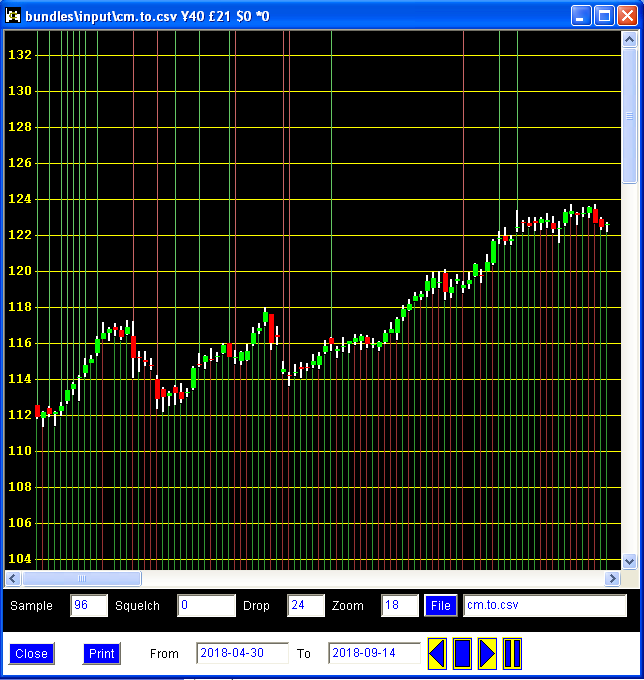
I created my own program to present stock market data – using a modified “candlestick” theme or format. I once read that candlestick charts were invented by the Japanese hundreds of years ago. However, I don’t have any reliable insights on the origin. I wrote the program in the Java programming language over several evenings. It is quite easy to construct customized GUIs using Java. Coincidentally, I worked in the financial industry when I was teaching myself to program in Java in the 1990s. Some of the coding for the program is from that period of my life: specifically, the part that renders the chart is taken from a website applet that I wrote.
The stock is called CIBC, which stands for the Canadian Imperial Bank of Commerce. This is the first publicly traded stock I ever purchased. I think when I was 18 years old at the time. I should have held on to my shares. Being young, I had a perpetual need for money. I think some readers might find my rendition of a candlestick chart busy and perhaps difficult to interpret. Not a standard feature among candlestick charts are “tendrils”: these are the lines that extend from the top and bottom of the candlestick – used by me to provide more trading information. Notice the prevalence of green tendrils on the left possibly indicating a trend of increasing prices. The question for those reaching the right side of the chart might be whether or not this stock is going to continue to increase in price. Well, I am not writing this blog to provide investment advice. However, I believe it might be worthwhile to consider such a question using a chart with its noise reduced.
I call the program “Tendrils and Candlesticks” or just TC for short. One approach to reduce noise is by setting a minimum for the trading volume: the argument here is that trading having small volumes might not matter as much as those having large volumes. Whether or not this is true is debatable. I suspect it is probably untrue. Since there must be a buyer for every seller, trading sentiment remains in question irrespective of trading volume. This is obviously a subjective comment for me to make. Nonetheless, for the sake of demonstrating this type of noise reduction, I set the minimum volume of the stock to 900,000. The results are shown below. There are lots of green tendrils – perhaps the most important being on the left. However, this was also true before the filtering process.
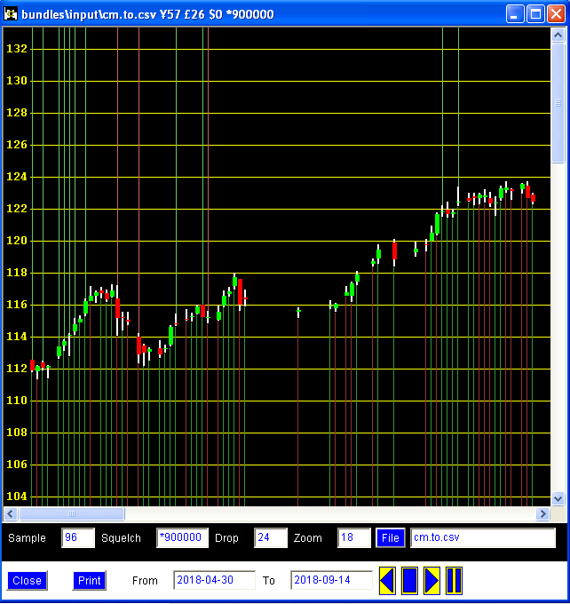
We see that a fairly noticeable rise in price resulted from many days of light trading – as there is now a patch of empty space near the middle of the chart where increases occurred. Using an analogy, perhaps volume tends to be higher during periods of acceleration and braking. It would certainly be interesting to see high trading volumes during aimless or directionless price fluctuations; yet I do not dismiss the possibility of this. An alternative thought is that prices can both increase or decrease even on low volumes; and so volume doesn’t seem to be particularly relevant in an analysis of price trends. Nonetheless, the “potential” benefits of noise reduction become apparent if it can genuinely reduce superfluous signals. The problem is how to best go about the filtering process so that the reduction in noise contributes to a better analysis.
Another type of noise reduction can be based on the candlestick itself. A candlestick is made up of the high, low, opening, and closing prices. Each candlestick therefore contains lots of information. In certain respects, a candlestick might provide conflicting signals. The stock might open at a higher price and yet reach a low far below it. Or it might close below the opening price despite reaching a price high above it. The noise reduction algorithm can therefore be used to select only those candlesticks that seem to demonstrate less conflict. With the squelch control set at 50 (the highest being 100), a majority of the original candlesticks are taken off the screen. Combined with the volume criteria, the new results are shown on the next chart.
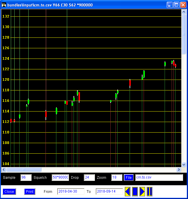
Now the chart is almost as simple as pieces of building blocks. This is much less busy than the original chart. The question is whether or not this simplification now provides improved guidance. It is now clearer to me what I am trying to find. I would be wary of full red tendrils emerging on the right – given how long ago full green tendrils appeared on the left. I cannot say this is much of a science. It is probably more art. The underlying source of the data is public sentiment. If anyone in the world has a full understanding of public sentiment, I certainly want to meet this individual. It is not my intention to present myself as a trading expert. I would describe myself as an enthusiast. There is an enormous amount of publicly accessible historical data pertaining to stocks. So a person who is interested in data manipulation and visualization can develop all sorts of portable skills by making use of stock data.
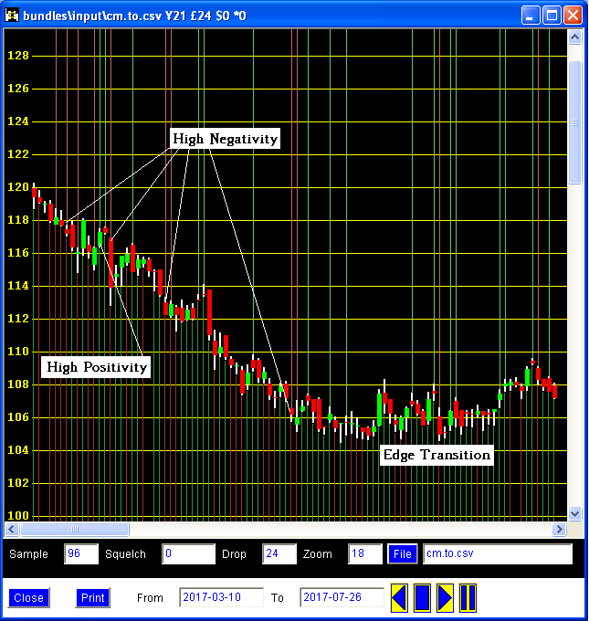
I will now remove the noise reduction and select a tricky trading period. Although this blog is about noise reduction, I admit that I sometimes like noise. I developed a tolerance for busy charts after years of analyzing production and operational metrics. An important reason to bring back the noise is to ensure that none of the tendrils get left out. It is an interesting narrative as one follows the tendrils and candlesticks from left to right. On this next chart, the question is whether or not the pattern on the right represents the bottom. Nobody wants to catch a falling knife as they say. Who says this? I am not exactly certain. I remember the expression from the dot-com crash. Perhaps many colourful expressions emerged from that period in trading history. CIBC is hardly a falling knife. Still, I suspect that many people want the best deal possible when buying shares in a company. They might even be willing to accommodate some knife-catching injuries for a good price.
This brings me to a story about waking up one morning and placing a buy order for a stock that had already risen 3.5 percent – just that morning. The expression “You snooze, you lose” seems particularly relevant since I had decided to buy the stock the previous evening. I thought to myself that I would have to be psychotic to proceed with my purchase after such a jump. Although it was totally out of character for me, I bought the stock anyways at market. By the end of the day, the stock had risen I believe about 9 percent. The stock generally kept on rising over a number of weeks. I think I was up about 31 percent over 19 days. This is a scenario where the signals from the market were fairly unified. Generally speaking and rather sadly so, this kind of clarity is usually not present. But arguably, there are signals available for those that wish to take a “reactive” position – that is to say, in response to market developments. Anyways, I return to the chart of CIBC this time without any noise reduction.
I am going to spare readers from the intellectual soup of assertions on how to interpret tendrils and candlesticks combined with noise limiters. However, I will offer a few general points. A signal – using tendrils and candlesticks – is strongest when the colour is the same all over: this includes the tendril at the base, the candlestick itself, and the tendril at the top. If just the opposite signal occurs the next day or a few days later, it is a judgment call. Actually, it is always a judgment call regardless of signals; there is simply more judgment warranted when signals conflict. Seeing a number of full green tendrils along with green candlesticks – and also red candlesticks with green tendrils – it wouldn’t be unreasonable to call the formation towards the right of the chart above a “bottom.” I am not going to bother going back to check if I am correct since this would be cheating.
It is important not to ignore the candlestick itself – and the more common single tendril. It is generally rare to have full tendrils of a single colour and a matching candlestick (i.e. of the same colour) having minimal white. Technical traders viewing my candlesticks should understand what I mean by minimal white. To me if the high and low for the day (white bars) is quite different from the opening and closing prices (coloured bars), there is a relatively high level of disagreement among traders. As a side note, I feel that the candlesticks more closely resemble rolling pins. I guess Japanese traders didn’t want to use “rolling pin charts.” I am fascinated by Japanese anime, monster and horror movies, and indigenous Shinto. I therefore add candlesticks to my list of interests involving Japan, if indeed this is the origin of candlesticks.
An interesting and perhaps unconventional approach is to do the exact opposite of noise reduction: “I understand what you are saying. But I want to look only at the noisy days of that last chart – and I want light trading days.” Although I question the significance of the results, the programming involved is simple enough. I think one of the earliest anthologies that I ever read was called “Driftwood and Dandelions.” Such is my childhood recollection of opening this book that it feels like I was just reading it yesterday rather than decades ago. Perhaps from a conceptual standpoint, this sort of approach is intended to spot the “driftwood.” These are the bits and pieces of wood that might float in or on the water, being conveyed by the tide, maybe washing up ashore. I suppose some traders or investors are like this. Or maybe on a deeper level we are all like this.

Above are the puny trading days having both light volumes and candlesticks in disagreement. Notice that they show lots of white. One way to think about this depiction – although I am uncertain if this is true – since we are dealing with driftwood, these might be lagging indicators. They move in response to the tide. Notice the two candlesticks near the bottom with red tendrils at the base – long after the decline in prices started occurring at $120. We also have a patch of timid green tendrils further to the right, pensively wondering if the ride up will soon begin. After the market rises a bit, some investors already want to jump ship. There is a lot of ambivalence and indecision. I find it difficult to believe that tiny birthday cake candles can drive the market.
Noise reduction is therefore a worthwhile consideration. I am not making a strong argument for or against its use. I would use both types of charts – those having noise reduction and those without it. And for the sake of argument, I would also look at noisy charts. It is a great mental exercise following the tendrils and candlesticks. It is like reading a story. I have other types of charts that are much more unusual – e.g. containing relational and displacement plumes. I think it is important to have diverse tools and the willingness to use them. When there is too much information or too many conflicting signals, noise reduction can play an important role in analysis. It could be used filter out potentially non-representative trading events. At the same time, I believe that there has to be more research done on the reduction of noise as it applies to the stock market since for me the exact significance at this time is subject to debate and a high level of speculation.