
MMS • RSS
Article originally posted on Data Science Central. Visit Data Science Central
Introduction of the first Microsoft Power BI custom visual tool from 3AG Systems.
(This article first appeared on the 3AG Systems blog, here.

Last month, 3AG Systems published its first custom visual for Microsoft Power BI, Column Chart with Variance. Our approach for this tool is perhaps counterintuitive: we provide lots of data while simultaneously maximizing information processing for our users.
The need to “simplify things for senior leadership” is a common myth in industry. On the surface it makes sense, as executives are too busy to dig into the details for every issue. But does it really make sense? In crisis situations, don’t senior leaders assemble tiger teams and task forces whose sole purpose is to dig into the details to understand what’s going wrong? What if it turned out that a lack of details in the first place precipitated these crises?
At 3AG Systems, we believe that the issue is rarely about too much data, but rather suboptimal data processing for the users. With modern visualization platforms like Microsoft Power BI, it’s possible to provide information-dense content that still conveys the important insights. Dumbing things down made sense in a world where it was a herculean task to create reports and visualizations, but modern cloud tools have simplified the job.
Our new custom visual, Column Chart with Variance, allows users to easily compare and track the difference (variance) between two time series. For example, users can track variance between forecast and actual sales results. For any point in a time series, we can immediately see whether the organization is above or below forecast. And if required, users can dig deeper into the numbers, reviewing the actual time series on the same chart.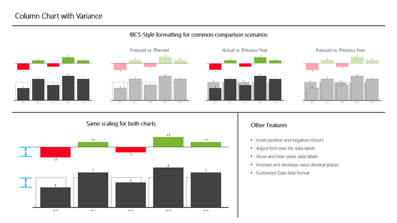 To maximize information processing, we are applying a well-defined formatting methodology, or notation, to get users to process multiple data points in parallel. If you look closely you will notice that we use shades of black and white to identify series data, but red and green to bring your attention to the most important info, the variance. Actual data is represented by solid boxes, previous results by grey boxes, and plan numbers by white boxes. These subtle decisions maximize the amount of information that you can process at one time; this really means that we can present more data without losing the key message. Interestingly enough, books in the Where’s Waldo series apply these same concepts, just in reverse.
Our new custom visual is now available from Microsoft AppSource. You can also learn more about our tool from the August 2018 update of Microsoft Power BI on the Microsoft Power BI blog. We’re also featured in the update video starting at 19:48.
Make data-driven decisions. At 3AG Systems we help businesses improve by transforming their data into actionable insights. Learn more at https://www.3agsystems.com