Month: February 2019

MMS • RSS
Article originally posted on Data Science Central. Visit Data Science Central
The post is devoted to select the most popular ad to display on a webpage to gather the most clicks. The rate at which the webpage visitors click on an ad is called a conversion rate for the add.
Assume that we have several ads and a place on a webpage to show one of them. We can display them one by one, record all the clicks, analyse the results afterwards and figure the most popular. But an ad display may be pricey. It would be more efficient to estimate rates in real time and to display the most popular one as soon as rates can be compared. Especially if an ad leads to a page for a visitor to buy something. There are couple of method for such estimations: Upper Confidence Bound method and Thompson Sampling method.
The first one is based on an confidence interval concept which is studied in a Statistics course and has a good intuitive explanation. Roughly speaking a confidence interval is a numeric interval were our value is supposed to lie with some probability, usually 95%. (The real statistical definition is more technical and means not quite this, but it practice the above explanation is close enough.)During our ad displays we can compute average rates at each step with corresponding confidence intervals and pick up for next display an ad with a highest upper confidence bound You can see how it happens in the video below.
The method has some drawbacks. It does not take into account that our rates must be between 0 and 1, so initial confidence intervals usually are much greater. It means that we loose some time on getting realistic values for our intervals. The worse thing is that if we throw in an additional ad then the process takes a lot of time to recover.
Here is another method which is more efficient, Thompson Sampling Method. It constructs Beta distributions for each ad rate and instead of computing averages draws a random number in accordance with the distribution. There is a picture how it goes for one ad, with a blue vertical line marking a mean and the red line for a random value:
As you see since a random value has more probability to appear were our line is higher, then it get closer and closer to the mean at each step. You might view the area where a curve appears higher than horizontal axis as a confidence interval analogue.
Here how it works for a few ads (I dropped means to make picture more clear):
In addition it accommodates an additional ad in the middle of the process more easily.
Do not hesitate to ask questions and point out mistakes!
(the post originally appeared here: Mya Bakhoava’s blog
On the road to Python 3.8: Assignment Expressions, Merging typed_ast and Multiprocessing Improvement
MMS • RSS
Article originally posted on InfoQ. Visit InfoQ
The first two deployments of the Python 3.8 development branch were released this month, on the road to releasing the final version later this year. The fastest growing programming language as measured by Stack Overflow is starting development on the next major version a few months after 3.8 was released in June 2018.
The most notable addition up to date is PEP 572, assignment operators. Assignment operators was one of the most controversial features in Python’s history and led to Guido stepping down as the BDFL (Benevolent dictator for life) last July. Assignment operator also known as Walrus operator allows a named expression of the format NAME := expr to appear in the context of a Python expression. The target is assigned the value of the expression which is the same as the incorporated expression. In layman’s terms, we can now have a condition with an expression that evaluates and can be used inside the condition’s code.
Other improvements include merging the typed_ast project into CPython and performance improvements for multiprocessing. The typed_ast project is used by flake8, mypy, pytype and other highly visible Python projects. As a fork of CPython’s ast it provides in Guido’s words “fields to certain nodes that hold the type comment, and it adds a bitmap indicating which lines contain # type: ignore comments (which look like type comments but really are a different thing – they can occur in places where a type comment would not be legal)”.
Python 3.8 alpha 3 and 4 will be released in the next two months. Four beta versions and two release candidates will be released in the following six months with the 3.8.0 final release expected around October 20, 2019.
MMS • RSS
Article originally posted on InfoQ. Visit InfoQ
Playful leadership is a serious topic, says Portia Tung, executive and personal coach, play researcher and storyteller. In her talk Playful Leadership: How to Enable Transformational Change and Have Fun Doing It at the upcoming Aginext.io conference she will explore why play is the most effective and efficient way of enabling individuals to learn, lead and work together. Playful Leadership draws on research from a range of disciplines such as psychology and neuroscience as well as Play science and personal/group coaching. It fosters a growth-oriented approach that enables people to change with relative ease and even joy instead of resistance and anguish. Portia points out that research shows that getting your daily amount of play is at least as important as taking your vitamins or ensuring you have a healthy diet and plenty of exercise.
The Aginext conference runs in London on 21-22 March and is focused on looking at the future of agile, lean, CI/CD and DevOps transformations.
InfoQ spoke to Portia about what playful leadership is, why it matters and some of the techniques individuals and organisations can use to bring in more playfulness.
InfoQ: Why “playful leadership”? Isn’t leadership a serious topic?
I couldn’t agree more! It’s precisely because leadership is a serious topic, especially when we consider what’s at stake: our lives, our well-being and our happiness and that of our colleagues, our friends and our loved ones, that we need to think afresh about leadership. What it really means, what it really takes and how to really lead. And that fresh thinking begins with thinking for ourselves.
In my experience, Play is the most effective and efficient way of enabling individuals to learn, lead and work together, to think for themselves and make best use of all the resources they have available. Think back to a time when you learned lots and learned quickest. It’s no coincidence that we develop so much so quickly in our early years. We were experiencing the transformative nature of Play.
InfoQ: What is Playful Leadership, and what types of organisations is this appropriate for?
We have a leadership crisis on our hands. The problem is multifold like a scrunched-up-sorry ball of over-pleated origami paper.
So much potential as a fresh piece of origami paper requires kindful crafting before a masterpiece emerges… And I’m not just referring to the finished folded creation. In my experience, the heart of origami mastery, like leadership mastery, lies within the origamist (the individual) mastering themselves through the craft of seemingly simple paper folding (the craft of leadership).
What I call Playful Leadership has emerged in response to the two elements that have resulted in a leadership plateau in so many organisations. Large and small.
The first element is the “academic” approach to leadership. As sapiens (“wise men”) we have used many words to describe leadership. Did you know a simple search of “leadership” brings back 100k+ results on Amazon alone? And yet, in spite of our verbosity, little advancement has been made in terms of leadership in organisations.
The second element is the lack of leadership role models. People we can learn from who don’t just talk but walk the walk of leadership. Better still, we would be able to learn from leaders who shuffle and twirl to the dance of leadership. Now that would be something to behold in an all-hands meeting, wouldn’t it?
Mix these two elements together, all talk and no walk, and it’s no wonder we’ve got what we’ve got. Obese organisations that stumble about blindly, continuously gorging on recycled leadership platitudes with values carved in glass displayed at office receptions, seen by everyone and lived by only a few, fuelling increasing cynicism and resentment.
Playful Leadership is a fun and energising approach to leadership based on the latest research from a range of disciplines such as psychology and neuroscience as well as Play science and personal/group coaching.
Playful Leadership enables people to do their freshest thinking through becoming their whole selves. This may sound like hardwork, but in practice it’s one of the most courageous, exhilarating and rewarding things you’ll probably ever do. It’s a lot like the nail-biting, heart-pounding, tear-jerking adventure of parenting (and/or management), growing the next generation of citizens of the world.
InfoQ: What are the benefits that individuals and organisations will get from bringing in more playfulness?
Imagine. What if… instead of discarding our playful mindset we retained it throughout our childhood and adulthood? Just think of the fun we could have cultivating many of the desirable attributes of a mature human being while achieving seemingly impossible things: from creative problem solving to hopeful thinking, from flow to resilience, from mindfulness to powerful listening in even adverse circumstances. That’s True Play as defined by Dr Stuart Brown in his book Play: How it Shapes the Brain, Opens the Imagination and Invigorates the Soul as “fair play, safe play and being a good sport”.
In addition to Dr Stuart Brown’s definition of Play as “fun, flexible and freely chosen”, through my work as an organisational change agent, I’ve discovered Play works even better when we have more fun than purpose, a key element to Playful Leadership.
This growth-oriented approach when applied to organisational change enables people to change with relative ease and even joy instead of resistance and anguish. Given we spend more than 70% of our waking hours doing work or work-related activities, who doesn’t want to have more fun in their lives given half a chance?
InfoQ: What are some of the techniques to bring more playfulness into organisations today?
Group Play
A popular one is start off a meeting with a warmup exercise that lasts at last a few minutes – long enough for people to receive your play invitation and respond once they experience the liberating psychological safety that comes for free with True Play.
1. Give people long enough to switch on their playful mindset (some will take longer, others will be quicker – everyone’s different when it comes to play).
2. Be super clear about the goal and success criteria of your meeting – writing a user story for a meeting and sharing it upfront is a great way to create alignment. And, of course, reiterate it after the warmup to ensure group alignment.
3. Create an environment where everyone gets equal chance and amount of time to speak so that people can do their best thinking.
What does such a meeting feel like? Much like girls and boys at the modern King Arthur’s Round Table (see “The Kid Who Would Be King”).
Remember to stay playful yourself… and keep your eyes and ears peeled to bear witness to the magic that unfolds!
Solo Play
As for play for one, I recommend every adult plays for at least 5 minutes once a day. Fifteen minutes is ideal. You decide what’s fun, flexible and safe for you (and safe for others) when it comes to play.
It could be having a chat at the water cooler with a colleague-friend or skipping to school with your child from the school car park all the way to the school entrance. I guarantee that after skipping to school (while singing a song out loud) previously impossible things may suddenly seem possible!
InfoQ: Tell us a bit more about the School of Play?
I have a dream. One day, just before my daughter boards her spaceship to maintain intergalactic peace and make new friends, she says to me, “Mama, I remember growing up, you’d talk about how Play is the catalyst for self-actualisation and that we, as a species, need to change our relationship with work and play in order to realise our collective potential.”
She smiles then continues. “I have never worked a day in my life since I have more fun than purpose, I love my colleagues as dear friends and I continue to learn and grow every day.”
That’s when I know my job is done. The School of Play is my gift to my little girl and all the children out there, both young and older (there’s no need to count the years between friends – after all, time is relative). Consider it a gift to all those who dream of making a living through living their purpose and with the option to become fully themselves.
In spite of my compulsion to achieve all the time, I’ve come to recognise there is a direct correlation between how much I play and the amount of energy and happiness I feel. In fact, the more I play, the more energy I have, the happier I feel and the more I grow, the more I achieve. And that’s why I make sure I play at least once a day for at least 15 minutes.
Why? Because research shows that getting your daily amount of play is at least as important as taking your vitamins or ensuring you have a healthy diet and plenty of exercise. It’s not always easy to find the time to play, but I know I’ll feel better for it when I’ve played. After all, there’s a great deal at stake: I’m playing to change the world for the better.
The School of Play takes play seriously, visit their Play Manifesto, the school’s pledge to play.
You can find out more in my talk on “The Power of Play – Making Good Team Great“
MMS • RSS
Article originally posted on Data Science Central. Visit Data Science Central

Sometimes it is complicated to choose the most suitable and handy chart for your dataset. The infographic below can help you find out what type of chart you should use. All that you need is to have information about your variables. After that, you should answer the given questions. These questions will serve as a framework that will help you to tell a compelling story to the customer. Consequently, we give you pieces of advice about a suitable chart.
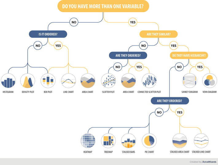
Let’s take a closer look at the charts and define the key navigation rules. The branches of our infographic are built hierarchically, that’s why you should start from the top. Firstly, answer whether you have one or more variables. In case you have only one variable move to the left. Then, decide whether this variable is ordered or not. So, if you have only one variable, you can choose your perfect chart among the following types:
Line chart
Line chart displays the data as a series of points, connected into lines. This type of graph is usually used to show some changes and trends in the data.
Area chart
This type of chart is based on the line chart. Thus their functions are quite similar. An area chart is used to illustrate quantitative data graphically by plotting the data points and connecting them into line segments.
Box plot
Box plot is usually used to depict the groups of numerical data with the help of their quartiles. Box plot often has the whiskers extended vertically to illustrate variability outside the quartiles.
Histogram
The histogram is widely applied as a representation of numerical data distribution. Each bar in the histogram represents the data distributed in a single category, a continuous range of data or frequencies for a specific data point.
Density plot
The density plot is a visualization of data distribution over a continuous period. The peaks of the density plot reflect the concentration of the values over the interval.
In addition, we should mention that the box plot can be used in both cases.
Now, let’s look at the right side. The starting point remains the same – defining the feature of variables. If the features are not similar, then we go left and define whether the variables are ordered data or not. If not, we should use scatter plot; if yes – choose from area chart or connected scatter plot.
Scatter plot
Scatter plot or scattergram is a type of diagram that uses Cartesian coordinates to illustrate values of two common variables for a data set. In this case, the data is represented as a collection of points.
Connected scatter plot
Connected scatter plot is very similar to the previous type mentioned above. The only difference lies in the fact that the points on the diagram are linked to each other.
Now, let’s look closer at the case when the features are similar. The next step is to decide whether the variables have a hierarchy feature. If yes, then there are two options – Sankey diagram and Venn diagram.
Sankey diagram
Sankey diagram belongs to the class of flow diagrams. This type of charts uses arrows to show the flow quantities proportionally.
Venn diagram
Venn diagram is also called primary set or logical diagram. It is used to show all possible logical relations existing between the finite collection of various datasets. The elements are pictured as points in the plane and the sets as regions.
If there is no hierarchy feature, your path goes left to the question about the order. If the variables aren’t ordered, the options are heatmap, treemap, stacked bars, and pie chart. If the variables are ordered then these are stacked area chart and stacked line chart.
Heatmap
Heatmap is such a graphical representation of data where individual values within the matrix are depicted as colors. Larger values are represented by dark pixels, where smaller values are pictured with lighter colors.
Treemap
Treemap pictures the data in the form of rectangles of bigger and smaller sizes. The size of each rectangle shows whether it belongs to set or to one of the subsets.
Stacked bars
In case of stacked bars, parts of the data are adjusted or stacked (horizontal bars, vertical bars or columns) representing the whole amount of data broken down into sub-amounts. Equivalent sections in each bar are colored similarly.
Pie chart
Pie or circle chart is a circular statistical graph, which has sectors or slices representing the proportion of data. The arc length of each sector represents the quantity proportionally.
Conclusion
In this article we presented an infographic which shows the possible chart types you can use depending on the data you have. The variety of different graphs should not confuse you as choosing the right one comes down to answering a few simple questions about your variables.
Hopefully, this article was informative and useful for you. Now you have a better understanding of the types of charts and how to find the best-fitting kind of chart in your case.
MMS • RSS
Article originally posted on InfoQ. Visit InfoQ
Data centres create more emissions than the aviation industry due to their energy usage and 24×7 availability, and the growth of the cloud computing and the mining of cryptocurrencies is increasing the impact technology is having on our climate. Moving existing servers to providers who use renewable sources of electricity could lead to planet-wide climate improvements. Jason Box, climatologist & professor of glaciology at The Geologic Survey of Denmark and Greenland (GEUS), and Paul Johnston, CEO at roundaboutlabs, will talk about the risk of climate change and what tech can do at QCon London 2019.
Many tech people are unaware of the huge impact that technology has on the Greenhouse Gas Emissions globally, and even those who are aware feel hugely disempowered in the area of climate change. However, several major cloud providers are starting to act. Google offset 100% of their cloud usage with renewable energy, Microsoft purchases carbon credits to offset 100% of their cloud usage, and AWS have four public regions that are powered by 100% renewable energy. Users of these cloud computing vendors can now begin to make an informed choice with regards to environmental impact.
Box and Johnston argue that people who are currently working with vendors that do not offer such programs should start to ask for their data centres and cloud infrastructure to be powered by renewable energy. This should significantly increase requirements for renewable energy, which in turn should increase the demand across the network. Customers should also ask for increased transparency on environmental impact, and request public disclosure of associated data, such as the carbon footprint as a line item on each account.
Individual organisations can also contribute to reducing the impact of emissions. For example, the QCon team wants to offset carbon from flights into the host city of the conference, and is matching funds with attendees who offset their carbon footprint by contributing to the Greenland Reforestation program.
As part of QCon London, taking place in the Queen Elizabeth II Conference Centre, March 4-8th, InfoQ spoke with Jason Box and Paul Johnston about what is causing climate change and what tech can do to reduce it.
InfoQ: Why is our climate heating, and what is causing this?
Jason Box: Mainly fossil fuel combustion and secondarily deforestation and biomass burning have elevated atmospheric CO2 by 50% since year 1850. The radiative effect is equivalent to 1.7 W light bulbs shining downward over every square meter of the Earth’s surface. Earth orbital changes had the climate cooling over the last 2000 years until ~1850 when a sharp warming began and forestalled the next Ice Age, by a large margin.
Paul Johnston: It’s pretty clear to me from the evidence I’ve seen that it’s humanity that is causing these changes in our climate, and it’s largely through the burning of fossil fuels. This is backed up by 97% of scientists too, so this isn’t just us saying it.
InfoQ: What can be done to slow down the pace of climate change?
Johnston: We need to make big changes, and very quickly. For that, we need broad agreement and political will across the major countries of the world to implement the Paris Agreement, although even that is probably only the minimum that we need to do. However, that’s a big answer, to a big question. A better answer is probably to make your voices heard in the right forums and vote for parties in elections that best describe these values.
Box: Limiting emissions will slow the increasing intensity of climate change. However, not without removing several hundred Gtons of carbon from the atmosphere will we have a stable climate. How to drawdown atmospheric carbon will require a portfolio response, that is, no single solution can do it. Massive reforestation won’t get us there. I think other stabilization wedges will come from biotechnology, meaning, plant-based CO2 sequestration. Nature developed a high tech solution that sucks carbon from the atmosphere. This technology is self-replicating and needs only sunlight and water to do its thing. This tech is called photosynthesis… It’s the OS of plants.
InfoQ: How can tech help to reduce climate change?
Johnston: Most tech people feel hugely disempowered in the area of climate change. Most are also unaware of the huge impact that technology has on the Greenhouse Gas Emissions globally. Data centres create more emissions than aviation due to their energy usage and their constant 24×7 availability. The growth of the cloud is a driver of growth in this area too. Cryptocurrencies and mining of cryptocurrencies have also seen a huge spike in data centre energy usage over the past few years, with Bitcoin mining currently using around the same amount of electricity as Singapore daily (and Bitcoin is definitely not incentivising green energy as many believe). So there is something simple that the tech world can do:
Move their servers to data centres and cloud providers who use renewable sources of electricity.
A quick answer is to look at Google who offset 100% of their cloud usage with renewable energy, Microsoft who purchase carbon credits to offset 100% of their cloud usage and AWS who have four public regions that are powered by 100% renewable energy: Ireland, Frankfurt, Montreal and Oregon.
Box: The outlook is good for the small country of Greenland. Greenland has a large and unexploited hydropower potential and a government very interested in increasing its economic sovereignty through data centers. The water is cool and the political system is willing.
InfoQ: What can be the impact if a majority of the data centres migrates to renewable energy?
Box: We have more of a chance of meeting the Paris Climate agreement. Right now limiting global warming to under 2 C looks doubtful. Data Centers must and already are going renewable.
As attention turns to the overlooked north, as the Arctic opens up, we’ll see the Arctic more on the geopolitical agenda.
Johnston: If customers start to ask for their data centres and cloud to be powered by renewable energy then it should significantly increase the data centres requirements for renewable energy, which should in turn increase the demand across the network. As the data centre market is a growing market within the energy sector, this means that it should increase investment in renewable technologies, and that would only improve the chances of better technologies reaching the wider market more quickly.
It’s not only a win for the customer, but could well lead to planet wide improvements. My hope is that it will also bring the very wealthy tech companies who run the major cloud services into the equation in terms of innovation and resources as well.
InfoQ: How can companies know for sure that providers will use renewable sources of energy for the servers where their applications are running?
Johnston: We can’t without data. At present, we are reliant upon the companies themselves sharing their own data with customers. Unfortunately, the data is relatively difficult to understand as well, although giving percentages is helpful, and 100% is a useful number, although most ordinary people don’t understand what “100% offset” really means. This would be significantly improved though, if the providers gave the carbon footprint as a line item on each account, because it would allow customers to both see the impact of their technology and give them a way of mitigating their impact. I am not sure if that will ever happen though.
Some of the providers, e.g. Google and Microsoft, would be able to state that their cloud services are 100% offset and so an account carbon footprint could be zero, although even that is contentious as it depends on how an offset is used as to whether it truly offsets the carbon that is used. It is an area that really needs work.
Box: Does tracking electrons require cryptocurrency?
InfoQ: Can you tell us about Greenland Trees? Who are they and what’s their mission?
Box: Since 2015, I’ve been busy with tree planting already in S. Greenland, and the trees are thriving. In fact, people have planted 300k trees since the 1970s. Several trees planted more than a century ago in 1892 remain alive.
Picture the climate of Oslo. It’s the same latitude. The climate at the top of the fjords in Greenland is sunny.
In partnership with QCon, we’ve established a carbon drawdown/ carbon offset service, a charity with dual EU charity and 501c3 US tax status. Go to GreenlandTrees.org to offset your air travel and watch our forests grow. We’ll be reporting on the progress of growth for the indefinite future.
I’m very familiar with the logistics to get seedlings from Icelandic nurseries to Greenland at a cost of 3.5 euros per seedling. So, you can offset a San Francisco<>London for 40 EUR with 10 seedlings. Please folks, get on your phone and set your legacy. The trees will be there after we are.
InfoQ asked Roxanne Beverstein, co-founder of and VP of sales for C4Media, about the collaboration between QCon and Greenland Trees:
Roxanne Beverstein: We think that it’s our responsibility as a business to consider our impact on the environment; this is why we’ve started the Carbon Offset program for our QCon events. We know that the single largest component to our carbon footprint is from those who fly in to attend the conference. Therefore, we’ve chosen to focus on offsetting carbon from aviation and will be contributing to Jason’s Greenland Reforestation program called Greenlandtrees.org.
QCon will be contributing up to $5K USD in matching funds to those attendees who offset their carbon footprint by contributing to Jason’s Greenland Reforestation program. This is a crowdfunded program with a goal of $40K USD, which will allow Jason and his team to plant 10K trees or offset the carbon created by 1,000+ round trip flights from San Francisco to London. As per Jason, “This program will help bring down the atmospheric carbon and put a dent in climate change.” The current funding for the program stands at $5,159.
There is information on this program on the QCon London site with a link to the reforestation project in the “unofficial event” section of the site. We are hosting a breakfast with Jason on Wednesday, March 6, from 7:15-8:20am at QCon London (Windsor room on the 5th Floor), which we’re calling “Breakfast with a Climatologist“
MMS • RSS
Article originally posted on InfoQ. Visit InfoQ
For global businesses to meet today’s architectural challenges with constant change and extreme scale, we need to go back to the basic principles of system design. The common element in the problems we face is the notion of events driving both actions and reactions, Neil Avery writes in a series of blog posts describing why events are important and the advantages of an event-first approach that also supports an evolutionary architecture.
Avery, author at Confluent, a provider of an event streaming platform based on Kafka, notes that it has taken us 25 years to realize that events should be a core principle in system design. Back in 2002 he built a commercial messaging system based on Staged Event-Driven Architecture (SEDA) and that’s when he understood the importance of events. In an increasingly digital world, organizations must be more real-time oriented and to succeed with this he believes they must be event-driven:
There has been a revolution; organizations must become real time; to become real time, they must become event driven.
When transitioning to an event-driven architecture, Avery’s experience is that this often is a move from simple use cases to a deeper understanding of processes and operations, and how to reason about the architecture. After a while, teams discover that although the events are useful, it’s the stream that enables them to really improve. He emphasizes that the value of an event lies in the fact that a sequence of events (a stream) represents behaviour, for instance describing how a user clicks her way through a site, or adds and removes items from a shopping basket.
To become event-driven, Avery describes two alternatives. The first uses commands as events to describe something that should be done — an event-command approach. One example of this is a traditional REST application using synchronous calls. Problems with this approach include that both the endpoint and the method being called must be known, and that changes must be made in existing parts when a new event processor is added.
The second approach uses the messaging paradigm with pure events to describe something that has happened — an event-first approach. This is what Avery recommends and notes that this moves the responsibility for dealing with an event over to the consumer. Here an event is published without any coupling to an API. The publisher of the event is not aware of any consumers of the event, which means that these can change over time with no effect on the publisher. He emphasizes by writing:
The event-first approach forces an inversion of responsibility; it is a fundamental paradigm shift of how applications are developed.
This may look more complex, but Avery points out that when trying to enhance a system built this way, the benefits will be clear. He also notes that an evolutionary architecture is a benefit from this way of thinking.
In a blog post early 2018, Randy Shoup discussed how events should be a first-class tool for developers, and noted that developers often underestimate the value of events as a tool, and consequently often miss the advantage they could give. He also pointed out that the events should be included when an interface is defined. Shoup has a long experience working for eBay, Google and Stitch Fix, and is currently VP of engineering at WeWork.
Bernd Rücker, co-founder of Camunda, the company behind the Camunda Workflow Engine, claimed in a presentation at DDD eXchange 2017 that although publishing events keeps domains decoupled from each other, if there really is a logical flow of events, this flow may become implicit and hard to follow. In such cases he prefers using a process manager to keep track of the overall process.
In a second blog post, Avery looks into the details of different styles of event-driven, streaming architectures and compares a reactive architecture, possibly using the actor model, with a streaming architecture. He also compares the different persistence models used. Today, many organizations use a microservices framework and often believe they can be improved by adding streaming, but Avery emphasizes that this is not true — an event streaming platform will replace the microservice framework, because he thinks of stream processors, producers and consumers as microservices.
Avery is also in the progress of writing more posts: part 3 with a focus on serverless, and part 4 where he will discuss the art of the event streaming application.
MMS • RSS
Article originally posted on Data Science Central. Visit Data Science Central
Here is one of the most viral videos about data science posted in the last few months, with over 500,000 views. I could not locate the original copy; I found it in a re-tweet by Kirk Borne. See link to the video below the picture. However, I was able to find who created it (Welcome.ai) and it turns out that they have a YouTube channel with plenty of even more interesting videos. To search these videos by keyword, click here. The search results below is a selection for the keyword Machine Learning.
- DataRobot – Automated Machine Learning Platform
- What is Machine Learning? – Google AI
- Artificial Intelligence Trends in 2019
- MIT’s New $1 Billion Artificial Intelligence College
- What is Machine Learning, and preventing Human Bias
- Jeff Bezos – Golden Age of Artificial Intelligence
- NVIDIA – Deep Learning Demystified
- Elements of AI – Free Artificial Intelligence course for beginners
- Facebook’s Head of AI Research, Yann Lecun, Explains AI
- Andrew Ng – AI For Everyone course
- Real-time code generation using computer vision
More videos available here. For DSC videos, follow this link.

To watch this viral video (about ML / AI terminology), click here
DSC Resources
- Book and Resources for DSC Members
- New Perspectives on Statistical Distributions and Deep Learning
- Comprehensive Repository of Data Science and ML Resources
- Advanced Machine Learning with Basic Excel
- Difference between ML, Data Science, AI, Deep Learning, and Statistics
- Selected Business Analytics, Data Science and ML articles
- Hire a Data Scientist | Search DSC | Find a Job
- Post a Blog | Forum Questions
MMS • RSS
Article originally posted on Data Science Central. Visit Data Science Central

The Graphical Kernel System (GKS) is a document produced by the International Standards Organization (ISO) which defines a common interface to interactive computer graphics for application programs. GKS has been designed by a group of experts representing the national standards institutions of most major industrialized countries. The full standard provides functional specifications for some 200 subroutines which perform graphics input and output in a device independent way. Application programs can thus move freely between different graphics devices and different host computers. For the first time graphics programs have become genuinely portable.
However, one should point out that GKS itself is not portable. Individual GKS implementations will vary substantially as they have to support different graphics devices on different computers. Moreover, GKS is a kernel system, and thus does not include an arbitrary collection of functions to produce histograms or contour plots, etc. Such facilities are regarded as applications which sit on top of the basic graphics package and, at CERN, they are provided by the Graphical Extensions to the NAG Library, or the HPLOT package.
In order to allow particular applications to choose a graphics package with the appropriate capability, GKS has been defined to have different levels. The level structure has two dimensions, one for output (0, 1, or 2) and one for input (a, b, or c). Higher levels include the capabilities of lower levels. In the United States, ANSI has defined also a level ‘m’, for very simple applications, which sits below output level ‘0’. Most implementations provide all output (level ‘2’) and intermediate input (level ‘b’). The reason input level ‘c’ is not usually supported is that it requires asynchronous input facilities not found in all operating systems.
The GKS functions have been defined independently from a specific programming language, and bindings to individual languages are subject to separate standards efforts which have been undertaken for all the major languages.
The Graphical Kernel System for two dimensional graphics was adopted as an ISO standard in 1985, and since that date work has been in progress to define a three dimensional super-set which was accepted as an International Standard during 1988. The FORTRAN binding to GKS-3D has also been published as a Draft International Standard.
Are we following GKS standard in data science for data Visualization?
MMS • RSS
Article originally posted on InfoQ. Visit InfoQ
The recent 7.2 and 7.3 versions of Google’s V8 JavaScript engine improve JavaScript parsing performance, new JavaScript language features, and WebAssembly performance.
Significant performance attention has turned to JavaScript parsing time recently with the introduction of the binary-ast proposal.
Per the V8 7.2 release announcement, typical web pages spend around 10% of their V8 time parsing JavaScript resources at startup. Between versions 7.0 and 7.2, the V8 desktop parsing performance has improved by approximately 30%, resulting in a typical JavaScript parsing time of around 7.5%.
Recently announced improvements to optimize async functions and promises have arrived in the V8 7.2 release. The V8 7.3 version enables async stack traces to improve developer experience when debugging asynchronous code.
The 7.2 release also improves the performance of spread elements when they are the first item of an array literal, e.g. [...foo, 42, 75]. As explained by the V8 team:
The improvement benefits several use cases including spreading arrays, primitive strings, sets, map keys, map values, and — by extension — to
Array.from(x).
V8 7.2 also adds support for several JavaScript language proposals. The TC39 Stage 3 proposal for public class fields is now supported, with private class fields planned for a future V8 release. [Intl.ListFormat support](https://github.com/tc39/proposal-intl-list-format) allows for localized list formatting. And the Stage 1 proposal for module namespace exports, export * as utils from './utils.mjs';, is also part of this release.
The 7.3 release adds support for Object.fromEntries, a Stage 4 proposal that is part of the ES2019 specification. The release also includes support for the Stage 3 String.prototype.matchAll proposal, making it easier to iterate through regular expression matches with capture groups.
WebAssembly also received attention with these V8 releases. As explained by the V8 team, Version 7.2 receives many improvements:
We analyzed a number of WebAssembly benchmarks and used them to guide improved code generation in the top execution tier. In particular, V8 v7.2 enables node splitting in the optimizing compiler’s scheduler and loop rotation in the backend. We also improved wrapper caching and introduced custom wrappers that reduce overhead in calling imported JavaScript math functions. Additionally, we designed changes to the register allocator that improve performance for many code patterns that will land in a later version.
In version 7.3, WebAssembly compilation time gets reduced by 15–25% without regressing the quality of generated code.
Significant work is underway to improve WebAssembly throughput code with trap handlers. Support has landed for Windows, macOS, and Linux in V8 v7.2.
Google creates branch releases of its V8 JavaScript engine every six weeks to coincide with Google Chrome releases. Version 7.2 of V8 ships with Chrome 72 and 7.3 with Chrome 73. V8 also powers the Node.js JavaScript runtime.
V8 is open source software with several applicable licenses to subsets of the codebase due to external dependencies. Contributions are welcome via the V8 Git project and should follow V8’s contribution guidelines and Google’s open source conduct guidelines.
MMS • RSS
Article originally posted on InfoQ. Visit InfoQ
In a recent blog post, Microsoft announced a public preview of Azure Integration Service Environment (ISE) for Logic Apps, an integration Platform as a Service. ISE provides customers with a fully isolated and dedicated environment for integration services. Isolation is achieved by injecting ISE into an Azure virtual network, which allows for VNet connectivity within Azure and to data centers that are connected through an Express Route or VPN connection.
Since ISE runs within dedicated Azure capacity, customers can expect predictable performance. Kevin Lam, a principal program manager at Microsoft explains:
[Using ISE, customers] avoid the noisy neighbor issue, removing fear of intermittent slowdowns that can impact business critical processes with a dedicated runtime where only your Logic Apps execute in.
Additional capabilities include isolated, private storage where sensitive data is kept private and predictable monthly pricing which includes 1 Standard Integration Account and 1 Enterprise connector, such as SAP.
InfoQ recently had a chance to speak with Jon Fancey, principal pm manager at Microsoft, about the ISE release. Here is what he had to say:
InfoQ: What is Azure Logic Apps ISE and what was the motivation for building it?
Azure Logic Apps Integration Service Environments (ISE) are a new offering now in public preview designed to address the great customer feedback we’ve had over the past couple of years. We heard that customers wanted the ability to connect their Logic Apps directly to their virtual networks (VNETs) for more control and isolation with dedicated resources such as the underlying storage and compute as well as more predictable billing, while enjoying less variance in execution performance. An ISE provides all of this and more, giving more control to our customers while still providing the benefits of a PaaS Serverless-based offering. It’s still just as easy to create a new Logic Apps, instead of choosing which region to create it in, simply select your ISE from the dropdown instead.
InfoQ: You recently completed a Private Preview with a set of customers, what were some of the drivers for those customers to participate in the private preview?
Yes, we were conscious that this was a new offering for Logic Apps so wanted to take the time to make sure we got it right and get as much feedback as possible with the primary goal, as always for Logic Apps, to ensure ease of use. The main driver for customers was to connect to their VNETs, which makes sense, particularly when connecting to sensitive systems and data on-premises.
InfoQ: Based upon the documentation, it looks like some connectors have implementations specifically for ISE environments. What is the nature of these types of connectors?
Correct, ISE customers get two flavors of connector, they get all the 230+ existing connectors, but also get a set designed specifically for ISE usage. These connectors are designed to operate inside of the customer’s VNET so in that context, things like SQL Server, FTP and AS2 make sense because these endpoints are often on-premises. We also have ISE connectors to many other Azure services as well, such as Service Bus, Azure File, BLOB and Table Storage, ensuring network traffic is kept within the VNET. And there are more coming soon including, SAP, on-premises File System access and Oracle DB.
InfoQ: Traditionally, Azure Logic Apps customers were able to access on-premises systems using the On-premises Data Gateway. How does that change with Azure Logic Apps ISE and VNet connectivity?
Great question. The On-Premises Data Gateway is no longer needed with ISE as network resources are directly addressable in the VNET which customers have full control of. Some of our large enterprise customers are already finding that this simplifies their security and network infrastructure by needing fewer components for their hybrid integration needs.
InfoQ: Azure Logic Apps is a serverless technology where customers let Microsoft deal with scaling to accommodate additional load. Are there scaling capabilities in Azure Logic Apps ISE? If so, how does it work?
Yes, customers get the benefits of Serverless as well as more control – essentially the best of both worlds. The way this works is that customers allocate units of consumption with each one roughly equating to a ‘block’ of Logic App action executions. If a customer needs more capacity they can scale up to meet the demand and even set auto-scaling rules to do it automatically. We surface metrics to the customer in the Azure portal to enable them to see the utilization, not in terms of servers, but an abstraction generalizing the compute. A customer can set up their scaling based on these metrics to ensure they always have enough capacity – but only when they need it.
InfoQ: Is there anything different in how developers develop logic apps for Azure Logic Apps ISE?
No, once the ISE is provisioned, creating a Logic App is just as easy as before. Instead of choosing the regional location to deploy to, you simply pick your Integration Service Environment from the same list and click Create. As well as the additional environment monitoring metrics, the only obvious difference is that the ISE-specific connectors are tagged in the designer so that you always clearly know which ones you are using in your logic apps.
Azure Integration Service Enviornement for Logic Apps is available to customers by deploying the resource from the Azure Portal.