Month: August 2018

MMS • RSS
Article originally posted on InfoQ. Visit InfoQ
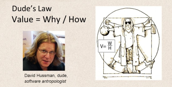
Product development expert and agile (“with a small a”) practitioner, community builder and stalwart David Hussman (“The Dude”) passed away on 18 August 2018. David was the founder of DevJam, known for expressing Dude’s Law to succinctly express the value in a product or idea, and a strong advocate of pragmatic approaches to software development drawing on the ideas embodied in the Agile Manifesto without being tied to any particular framework or methodology.
He was one of the first to advocate and use Story Mapping, working with Jeff Patton to explore the ideas and share them with the community as far back as 2009. He produced a tool CardboardIt to enable teams to produce story maps electronically.
He received the Gordan Pask award in 2009 for his contribution to the agile community. JB Rainsberger said of David at that time
“David is not just someone who builds agile communities, but someone who is building community builders”
Dude’s Law is a deceptively simple construct that he devised, inspired by Ohms Law, it states that Value = Why divided by How.
He explained the thinking behind Dudes Law here and spoke about it in this episode of the InfoQ Culture Podcast.
He freely shared his knowledge, as a speaker, coach and educator. He was regularly featured in InfoQ for his talks and presentations
In February 2018 he spoke to the Developer on File podcast about his life, as a musician, father, entrepreneur and community builder, and his battle with lung cancer.
The DevJam tribute to David says:
David Hussman was a thundering catalyst and pioneer for the agile community. More importantly, it was his coaching, mentoring, and sharing of ideas and techniques that will forever leave his imprint on all of our lives. His ability to string together chords of pragmatism and sustainability pushed product learning to new heights and brought together product communities. David is survived by his loving wife and two daughters.
For his impact on the community and on our lives, we honor his memory today and always.
We invite you to add your memories of David to the comments.
MMS • RSS
Article originally posted on InfoQ. Visit InfoQ
Microsoft has officially released their 8th update to VS2017, bringing to fruition many new features they have been previewing over the summer. This includes Code Cleanup, multiple caret support in the IDE, and profiles for both Visual Studio Code and ReSharper keybindings. With the advent of 15.8 several additional items are now available for use that benefit a variety of develpoers.
Git branch checkout and branch switching now occur much faster for C#/VB/C++ projects since reloading the solution after those operations is no longer required. F# developers will appreciate 15.8’s support for the new 4.5 release of that language. IntelliSense for F# projects has received performance improvements and overall support for F# has improved.
A great new ability for developers who write Visual Studio extensions is the ability to target what instance of VS2017 that you would like to use for debugging. This requires multiple instances of VS2017 to be installed but the advantage is that it provides the ability to write the extension in one instance (say RTM) and deploy into another (preview channel).
Performance profiling is easier now with the ability to start the CPU Usage tool in a paused state. During your program’s execution you can then start the tool when events happen for which you want to record data. Collection can be toggled as needed throughout the program’s execution to record areas of interest.
Many user-reported bug fixes have been corrected, including some long time problems. Previous versions of Visual Studio would remember IDE window placement when using multiple monitors, but VS2017 lost this ability. Developer Les Caudle reported this shortcoming and it has now been corrected in 15.8.
A code generation problem reported by user Marian Klymov that has affected several recent versions of Visual Studio (going back to VS2013) has been corrected. Due to a bug in the C++ compiler’s loop optimizing code, a crash would occur would this bug was triggered. (This is also reported to affect VS2015 and VS2013).
As usual, Microsoft has provided full release notes for this release. Since 15.8 was introduced there have been a couple of minor releases that provide several additional bug fixes. At the time of this writing 15.8.2 is the latest, and should used to avoid running into these problems. New users may download VS2017 15.8 from Microsoft while existing users can upgrade from within their IDE.
MMS • RSS
Article originally posted on Data Science Central. Visit Data Science Central
General Data Protection Regulation (GDPR) came into force in European Union (EU) member states from 25th May 2018. It has far reaching ramifications for businesses and organizations given that data is ubiquitous and all businesses today rely on customer data to remain competitive in their industry and relevant to their customers.
In this blog we will examine some of the challenges that businesses in certain industries can face and what businesses can do about it. GDPR restricts itself to personal data thereby limiting its regulatory reach to all such companies and organizations that are serving direct consumers of their services.
In this era where advertisements on social media, advertisements on web pages, advertisements on mobile applications are personalized by gathering and processing information about the specific user how can companies that use these media of connecting with their customers continue to send pertinent communication/messages to their customers.
In retail ecommerce customers are shown recommended products using association rules and recommender systems. This is possible because the company keeps track of customers past purchases (past buying behaviour) so as to recommend new products to the buyer.
After implementation of GDPR the following can happen
- The buyer can refuse the ecommerce company to control and process his/her data. This at once nullifies all the investment it has made in processing this buyer’s data as it is brick-walled from its customer.
- On the flip side it gives a level playing field to other ecommerce companies as every buyer out in the market is anybody’s customer. In short, customer loyalty will be short lived.
So how can organizations and companies insulate themselves from losing out their customers? The answer is simple and has stood the test of time – roll out the best service to each customer whether the customer is buying from them for the first time or the hundredth time. Companies will have to relentlessly satisfy customers in every transaction so that customers willingly share their data. Period.
According to Epsilon research, 80% of customers are more likely to do business with a company if the company provides personalized service. With a possible destruction of customer data after completion of transaction as stipulated in GDPR
- It is difficult for companies to personalize their offerings to “customers”.
- Customer profitability KPIs like Life time Value(LTV) may not be meaningful anymore as the same buyer is a new customer each time if the buyer chooses to annul his/her personal data after completion of every transaction.
- Newer catch-phrases like Customer Journey Mapping fall off the grid as the “traveler” in the “journey” is temporary and companies may not even know the “traveler” i.e. the customer.
So how can companies personalize their services to customers? Prudent companies can anonymize customer data by encrypting it immediately after sourcing it. Though this will not help them decrypt to find the specific customer the still company has some sort of a handle on its customer.
Companies in the financial services rely on accurate, updated and complete customer data to discern genuine customers from fraudulent ones. To keep good customers separate from bad ones companies will have to be innovative to “pseudonymize” customer data.
So how does this work?
GDPR only regulates personal data and not transactional data. So financial service organizations will have to “pseudonymize” customer data using new technology mechanisms (which may or may not exist today) so that customer data is also treated as transactional data. Such transactional data can then be trained using Machine learning/Deep learning algorithms to spot fraudulent customers from reentering the financial services market.
All data is stored in servers and server farms on the cloud or in in-house data centres. As the financial cost of misdemeanor in following the GDPR is very high (ban on customer data processing and a fine of up to higher of €20 million or 4% of the business’s total annual worldwide turnover) the IT and ITES industry may also not be immune to impacts. The following impacts may be notices
- There may be instances where the processor of the data (the organization that defines the how and why of customer data) may move the data on-premise thereby playing the role of controller of data as well. The controller is the one holding the data like AWS.
- Small businesses may be tempted to move from cloud to on-premise to reduce chances of data theft or rework their contracts with data controllers to insure themselves.
With the widespread use of data science and machine learning in business, companies would have to be very diligent in deleting customer data from training data that is used to build supervised algorithms if a customer asks for deleting his/her personal data that is part of training data. If many customers follow suit then the model so built is itself now rendered inefficient as the training data has changed and patterns have to be learnt again. Companies will have to keep their learning algorithms and models updated regularly so that their outputs are pertinent.
GDPR puts the onus of processing data on companies and organizations and awards private individuals complete rights over the way their data can be stored and processed. As individuals become custodians of their data they may choose with whom and for how long they may share their data. Is it possible in the future that large groups of users form cartels and charge businesses for using their data?

MMS • RSS
Article originally posted on Data Science Central. Visit Data Science Central
You can also fork the Jupyter notebook on Github here!
The goal of this post/notebook is to go from the basics of data preprocessing to modern techniques used in deep learning. My point is that we can use code (Python/Numpy etc.) to better understand abstract mathematical notions! Thinking by coding!
We will start with basic but very useful concepts in data science and machine learning/deep learning like variance and covariance matrix and we will go further to some preprocessing techniques used to feed images into neural networks. We will try to get more concrete insights using code to actually see what each equation is doing!
We call preprocessing all transformations on the raw data before it is fed to the machine learning or deep learning algorithm. For instance, training a convolutional neural network on raw images will probably lead to bad classification performances (Pal & Sudeep, 2016). The preprocessing is also important to speed up training (for instance, centering and scaling techniques, see Lecun et al., 2012; see 4.3).
Here is the syllabus of this tutorial:
1. Background: In the first part, we will get some reminders about variance and covariance and see how to generate and plot fake data to get a better understanding of these concepts.
2. Preprocessing: In the second part, we will see the basics of some preprocessing techniques that can be applied to any kind of data: mean normalization, standardization, and whitening.
3. Whitening images: In the third part, we will use the tools and concepts gained in 1. and 2. to do a special kind of whitening called Zero Component Analysis (ZCA). It can be used to preprocess images for deep learning. This part will be very practical and fun !
Feel free to fork the notebook associated with this post! For instance, check the shapes of the matrices each time you have a doubt 🙂
You can
1. Background
A. Variance and covariance
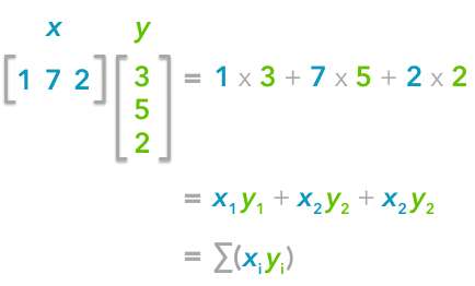
The variance of a variable describes how much the values are spread. The covariance is a measure that tells the amount of dependency between two variables. A positive covariance means that the values of the first variable are large when the values of the second variables are also large. A negative covariance means the opposite: large values from one variable are associated with small values of the other. The covariance value depends on the scale of the variable so it is hard to analyze it. It is possible to use the correlation coefficient that is easier to interpret. It is just the covariance normalized.
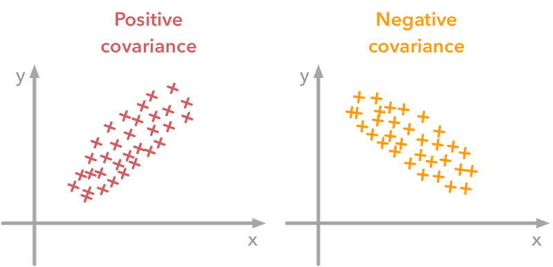
A positive covariance means that large values of one variable are associated with big values from the other (left). A negative covariance means that large values of one variable are associated with small values of the other one (right).
The covariance matrix is a matrix that summarises the variances and covariances of a set of vectors and it can tell a lot of things about your variables. The diagonal corresponds to the variance of each vector:
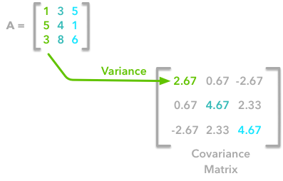
A matrix A and its matrix of covariance. The diagonal corresponds to the variance of each column vector.
Let’s just check with the formula of the variance:

with n the length of the vector, and x bar the mean of the vector. For instance, the variance of the first column vector of A is:

This is the first cell of our covariance matrix. The second element on the diagonal corresponds of the variance of the second column vector from A and so on.
Note: the vectors extracted from the matrix A correspond to the columns of A.
The other cells correspond to the covariance between two column vectors from A. For instance, the covariance between the first and the third column is located in the covariance matrix as the column 1 and the row 3 (or the column 3 and the row 1).
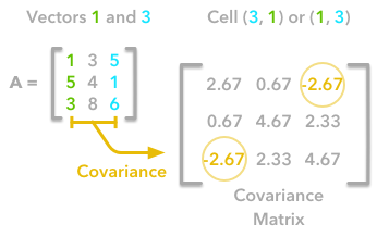
The position in the covariance matrix. Column corresponds to the first variable and row to the second (or the opposite). The covariance between the first and the third column vector of A is the element in column 1 and row 3 (or the opposite = same value).
Let’s check that the covariance between the first and the third column vector of A is equal to -2.67. The formula of the covariance between two variables X and Y is:

The variables X and Y are the first and the third column vectors in the last example. Let’s split this formula to be sure that it is crystal clear:
![]()
- The sum symbol means that we will iterate on the elements of the vectors. We will start with the first element (i=1) and calculate the first element of X minus the mean of the vector X.
![]()
2. Multiply the result with the first element of Y minus the mean of the vector Y.

3. Reiterate the process for each element of the vectors and calculate the sum of all results.

4. Divide by the number of elements in the vector.
Example 1.
Let’s start with the matrix A:

We will calculate the covariance between the first and the third column vectors:

and

x bar=3, y bar=4, and n=3 so we have:
![]()
Ok, great! That the value of the covariance matrix.
Now the easy way! With Numpy, the covariance matrix can be calculated with the function np.cov. It is worth noting that if you want Numpy to use the columns as vectors, the parameter rowvar=False has to be used. Also, bias=True allows to divide by n and not by n-1.
Let’s create the array first:
A = np.array([[1, 3, 5], [5, 4, 1], [3, 8, 6]])A
array([[1, 3, 5], [5, 4, 1], [3, 8, 6]])
Now we will calculate the covariance with the Numpy function:
np.cov(A, rowvar=False, bias=True)

 array([[ 2.66666667, 0.66666667, -2.66666667],
 [ 0.66666667, 4.66666667, 2.33333333],
 [-2.66666667, 2.33333333, 4.66666667]])
Looks good!
Finding the covariance matrix with the dot product
There is another way to compute the covariance matrix of A. You can center A around 0 (subtract the mean of the vector to each element of the vector to have a vector of mean equal to 0, cf. below), multiply it with its own transpose and divide by the number of observations. Let’s start with an implementation and then we’ll try to understand the link with the previous equation:
def calculateCovariance(X):     meanX = np.mean(X, axis = 0)     lenX = X.shape[0]     X = X - meanX
     covariance = X.T.dot(X)/lenX
     return covariance
Let’s test it on our matrix A:
calculateCovariance(A)array([[ 2.66666667, 0.66666667, -2.66666667], [ 0.66666667, 4.66666667, 2.33333333], [-2.66666667, 2.33333333, 4.66666667]])
We end up with the same result as before!
The explanation is simple. The dot product between two vectors can be expressed:

That’s right, it is the sum of the products of each element of the vectors:
The dot product corresponds to the sum of the products of each element of the vectors.
If n is the number of elements in our vectors and that we divide by n:

You can note that this is not too far from the formula of the covariance we have seen above:

The only difference is that in the covariance formula we subtract the mean of a vector to each of its elements. This is why we need to center the data before doing the dot product.
Now if we have a matrix A, the dot product between A and its transpose will give you a new matrix:
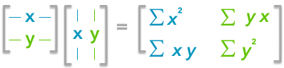
If you start with a zero-centered matrix, the dot product between this matrix and its transpose will give you the variance of each vector and covariance between them, that is to say, the covariance matrix.
This is the covariance matrix!
B. Visualize data and covariance matrices
In order to get more insights about the covariance matrix and how it can be useful, we will create a function to visualize it along with 2D data. You will be able to see the link between the covariance matrix and the data.
This function will calculate the covariance matrix as we have seen above. It will create two subplots: one for the covariance matrix and one for the data. The heatmap() function from Seaborn is used to create gradients of colour: small values will be coloured in light green and large values in dark blue. The data is represented as a scatterplot. We choose one of our palette colours, but you may prefer other colours .
def plotDataAndCov(data):     ACov = np.cov(data, rowvar=False, bias=True)     print 'Covariance matrix:n', ACov     fig, ax = plt.subplots(nrows=1, ncols=2)
     fig.set_size_inches(10, 10)
     ax0 = plt.subplot(2, 2, 1)
     # Choosing the colors
     cmap = sns.color_palette("GnBu", 10)
     sns.heatmap(ACov, cmap=cmap, vmin=0)
     ax1 = plt.subplot(2, 2, 2)
     # data can include the colors
     if data.shape[1]==3:
         c=data[:,2]
     else:
         c="#0A98BE"
     ax1.scatter(data[:,0], data[:,1], c=c, s=40)
     # Remove the top and right axes from the data plot
     ax1.spines['right'].set_visible(False)
     ax1.spines['top'].set_visible(False)
C. Simulating data
Uncorrelated data
Now that we have the plot function, we will generate some random data to visualize what the covariance matrix can tell us. We will start with some data drawn from a normal distribution with the Numpy function np.random.normal().
![]()
Drawing sample from a normal distribution with Numpy.
This function needs the mean, the standard deviation and the number of observations of the distribution as input. We will create two random variables of 300 observations with a standard deviation of 1. The first will have a mean of 1 and the second a mean of 2. If we draw two times 300 observations from a normal distribution, both vectors will be uncorrelated.
np.random.seed(1234)a1 = np.random.normal(2, 1, 300) a2 = np.random.normal(1, 1, 300) A = np.array([a1, a2]).T A.shape
(300, 2)
Note 1: We transpose the data with .T because the original shape is (2, 300) and we want the number of observations as rows (so with shape (300, 2)).
Note 2: We use np.random.seed function for reproducibility. The same random number will be used the next time we run the cell!
Let’s check how the data looks like:
A[:10,:]array([[ 2.47143516, 1.52704645], [ 0.80902431, 1.7111124 ], [ 3.43270697, 0.78245452], [ 1.6873481 , 3.63779121],
[ 1.27941127, -0.74213763],
[ 2.88716294, 0.90556519],
[ 2.85958841, 2.43118375],
[ 1.3634765 , 1.59275845],
[ 2.01569637, 1.1702969 ],
[-0.24268495, -0.75170595]])
Nice, we have our two columns vectors.
Now, we can check that the distributions are normal:
sns.distplot(A[:,0], color="#53BB04") sns.distplot(A[:,1], color="#0A98BE") plt.show() plt.close()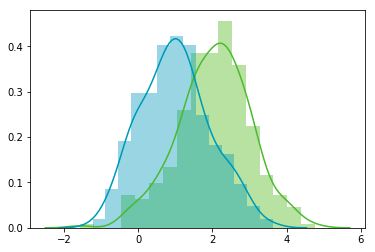
Looks good! We can see that the distributions have equivalent standard deviations but different means (1 and 2). So that’s exactly what we have asked for!
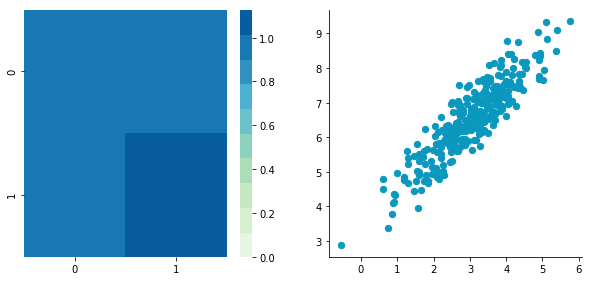
Now we can plot our dataset and its covariance matrix with our function:
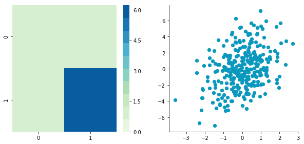
plotDataAndCov(A) plt.show() plt.close()Covariance matrix:
[[ 0.95171641 -0.0447816 ] [-0.0447816 0.87959853]]

We can see on the scatterplot that the two dimensions are uncorrelated. Note that we have one dimension with a mean of 1 and the other with the mean of 2. Also, the covariance matrix shows that the variance of each variable is very large (around 1) and the covariance of columns 1 and 2 is very small (around 0). Since we insured that the two vectors are independent this is coherent (the opposite is not necessarily true: a covariance of 0 doesn’t guaranty independency (see here).
Correlated data
Now, let’s construct dependent data by specifying one column from the other one.
np.random.seed(1234) b1 = np.random.normal(3, 1, 300) b2 = b1 + np.random.normal(7, 1, 300)/2. B = np.array([b1, b2]).T
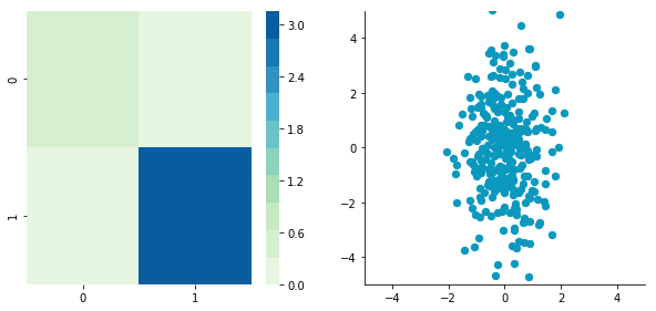
plotDataAndCov(B)
plt.show()
plt.close()Covariance matrix:
[[ 0.95171641 0.92932561] [ 0.92932561 1.12683445]]
The correlation between the two dimensions is visible on the scatter plot. We can see that a line could be drawn and used to predict y from x and vice versa. The covariance matrix is not diagonal (there are non-zero cells outside of the diagonal). That means that the covariance between dimensions is non-zero.
That’s great! We now have all the tools to see different preprocessing techniques.
2. Preprocessing
A. Mean normalization
Mean normalization is just removing the mean from each observation.
![]()
where X’ is the normalized dataset, X the original dataset and x bar the mean of X.
It will have the effect of centering the data around 0. We will create the function center() to do that:
def center(X): newX = X - np.mean(X, axis = 0) return newXLet’s give it a try with the matrix B we have created above:
BCentered = center(B) print 'Before:nn' plotDataAndCov(B) plt.show()
plt.close()
print 'After:nn'
plotDataAndCov(BCentered)
plt.show()
plt.close()Before:
Covariance matrix:
[[ 0.95171641 0.92932561] [ 0.92932561 1.12683445]]

After:
Covariance matrix:
[[ 0.95171641 0.92932561] [ 0.92932561 1.12683445]]

The first plot shows again the original data B and the second plot shows the centered data (look at the scale).
B. Standardization or normalization
The standardization is used to put all features on the same scale. The way to do it is to divide each zero-centered dimension by its standard deviation.

where X’ is the standardized dataset, X the original dataset, x bar the mean of X and sigma the standard deviation of X.
def standardize(X): newX = center(X)/np.std(X, axis = 0) return newXLet’s create another dataset with a different scale to check that it is working.
np.random.seed(1234)c1 =  np.random.normal(3, 1, 300) c2 = c1 + np.random.normal(7, 5, 300)/2. C = np.array([c1, c2]).T
plotDataAndCov(C)
plt.xlim(0, 15)
plt.ylim(0, 15)
plt.show()
plt.close()
Covariance matrix:
[[ 0.95171641 0.83976242]
[ 0.83976242 6.22529922]]

We can see that the scales of x and y are different. Note also that the correlation seems smaller because of the scale differences. Now let’s standardize it:
CStandardized = standardize(C) plotDataAndCov(CStandardized) plt.show() plt.close()Covariance matrix:
[[ 1. 0.34500274] [ 0.34500274 1. ]]

Looks good! You can see that the scales are the same and that the dataset is zero-centered according to both axes. Now, have a look at the covariance matrix: you can see that the variance of each coordinate (the top-left cell and the bottom-right cell) is equal to 1. By the way, this new covariance matrix is actually the correlation matrix! The Pearson correlation coefficient between the two variables (c1 and c2) is 0.54220151.
C. Whitening
Whitening or sphering data means that we want to transform it in a way to have a covariance matrix that is the identity matrix (1 in the diagonal and 0 for the other cells; more details on the identity matrix). It is called whitening in reference to white noise.
Whitening is a bit more complicated but we now have all the tools that we need to do it. It involves the following steps:
1- Zero-center the data
2- Decorrelate the data
3- Rescale the data
Let’s take again C and try to do these steps.
1. Zero-centering
CCentered = center(C) plotDataAndCov(CCentered) plt.show() plt.close()Covariance matrix:
[[ 0.95171641 0.83976242] [ 0.83976242 6.22529922]]
2. Decorrelate
At this point, we need to decorrelate our data. Intuitively, it means that we want to rotate the data until there is no correlation anymore. Look at the following cartoon to see what I mean:

The left plot shows correlated data. For instance, if you take a data point with a big x value, chances are that y will also be quite big. Now take all data points and do a rotation (maybe around 45 degrees counterclockwise): the new data (plotted on the right) is not correlated anymore.
The question is: how could we find the right rotation in order to get the uncorrelated data? Actually, it is exactly what the eigenvectors of the covariance matrix do: they indicate the direction where the spread of the data is at its maximum:
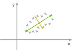
The eigenvectors of the covariance matrix give you the direction that maximizes the variance. The direction of the green line is where the variance is maximum. Just look at the smallest and largest point projected on this line: the spread is big. Compare that with the projection on the orange line: the spread is very small.
For more details about the eigendecomposition, see this post.
So we can decorrelate the data by projecting it on the eigenvectors basis. This will have the effect to apply the rotation needed and remove correlations between the dimensions. Here are the steps:
1- Calculate the covariance matrix
2- Calculate the eigenvectors of the covariance matrix
3- Apply the matrix of eigenvectors to the data (this will apply the rotation)
Let’s pack that into a function:
def decorrelate(X):     newX = center(X)     cov = X.T.dot(X)/float(X.shape[0])     # Calculate the eigenvalues and eigenvectors of the covariance matrix
     eigVals, eigVecs = np.linalg.eig(cov)
     # Apply the eigenvectors to X
     decorrelated = X.dot(eigVecs)
     return decorrelated
Let’s try to decorrelate our zero-centered matrix C to see it in action:
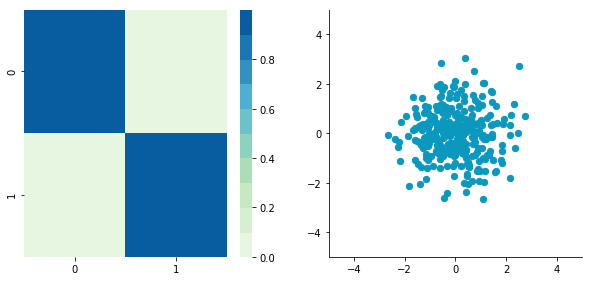
plotDataAndCov(C)plt.show()plt.close()CDecorrelated = decorrelate(CCentered)
plotDataAndCov(CDecorrelated)
plt.xlim(-5,5)
plt.ylim(-5,5)

plt.show()
plt.close()
Covariance matrix:
[[ 0.95171641 0.83976242] [ 0.83976242 6.22529922]]

Covariance matrix:
[[ 5.96126981e-01 -1.48029737e-16] [ -1.48029737e-16 3.15205774e+00]]
Nice! This is working
We can see that the correlation is not here anymore and that the covariance matrix (now a diagonal matrix) confirms that the covariance between the two dimensions are equal to 0.
3. Rescale the data
The next step is to scale the uncorrelated matrix in order to obtain a covariance matrix corresponding to the identity matrix (ones on the diagonal and zeros on the other cells). To do that we scale our decorrelated data by dividing each dimension by the square-root of its corresponding eigenvalue.
def whiten(X):     newX = center(X)     cov = X.T.dot(X)/float(X.shape[0])     # Calculate the eigenvalues and eigenvectors of the covariance matrix
     eigVals, eigVecs = np.linalg.eig(cov)
     # Apply the eigenvectors to X
     decorrelated = X.dot(eigVecs)
     # Rescale the decorrelated data
     whitened = decorrelated / np.sqrt(eigVals + 1e-5)
return whitenedNote: we add a small value (here 10^-5) to avoid the division by 0.
CWhitened = whiten(CCentered) plotDataAndCov(CWhitened) plt.xlim(-5,5) plt.ylim(-5,5)
plt.show()
plt.close()
Covariance matrix:
[[ 9.99983225e-01 -1.06581410e-16] [ -1.06581410e-16 9.99996827e-01]]
Hooray! We can see that with the covariance matrix that this is all good. We have something that really looks to the identity matrix (1 on the diagonal and 0 elsewhere).
3. Image whitening
We will see how whitening can be applied to preprocess image dataset. To do so we will use the paper of Pal & Sudeep (2016) where they give some details about the process. This preprocessing technique is called Zero component analysis (ZCA).
Check out the paper, but here is the kind of result they got:
Whitening images from the CIFAR10 dataset. Results from the paper of Pal & Sudeep (2016). The original images (left) and the images after the ZCA (right) are shown.
First thing first: we will load images from the CIFAR dataset. This dataset is available from Keras but you can also download it here.
from keras.datasets import cifar10 (X_train, y_train), (X_test, y_test) = cifar10.load_data() X_train.shape(50000, 32, 32, 3)
The training set of the CIFAR10 dataset contains 50000 images. The shape of X_train is (50000, 32, 32, 3). Each image is 32px by 32px and each pixel contains 3 dimensions (R, G, B). Each value is the brightness of the corresponding color between 0 and 255.
We will start by selecting only a subset of the images, let’s say 1000:
X = X_train[:1000] print X.shape(1000, 32, 32, 3)
That’s better! Now we will reshape the array to have flat image data with one image per row. Each image will be (1, 3072) because 32 x 32 x 3 = 3072. Thus, the array containing all images will be (1000, 3072):
X = X.reshape(X.shape[0], X.shape[1]*X.shape[2]*X.shape[3]) print X.shape(1000, 3072)
The next step is to be able to see the images. The function imshow() from Matplotlib (doc) can be used to show images. It needs images with the shape (M x N x 3) so let’s create a function to reshape the images and be able to visualize them from the shape (1, 3072).
def plotImage(X):     plt.figure(figsize=(1.5, 1.5))     plt.imshow(X.reshape(32,32,3))     plt.show()
     plt.close()
For instance, let’s plot one of the images we have loaded:
plotImage(X[12, :])
Cute!
We can now implement the whitening of the images. Pal & Sudeep (2016) describe the process:
1. The first step is to rescale the images to obtain the range [0, 1] by dividing by 255 (the maximum value of the pixels).
Remind that the formula to obtain the range [0, 1] is:

but here, the minimum value is 0, so this leads to:

X_norm = X / 255. print 'X.min()', X_norm.min() print 'X.max()', X_norm.max()X.min() 0.0
X.max() 1.0
Mean subtraction: per-pixel or per-image?
Ok cool, the range of our pixel values is between 0 and 1 now. The next step is:
2. Subtract the mean from all image.
Be careful here
One way to do it is to take each image and remove the mean of this image from every pixel (Jarrett et al., 2009). The intuition behind this process is that it centers the pixels of each image around 0.
Another way to do it is to take each of the 3072 pixels that we have (32 by 32 pixels for R, G and B) for every image and subtract the mean of that pixel across all images. This is called per-pixel mean subtraction. This time, each pixel will be centered around 0 according to all images. When you will feed your network with the images, each pixel is considered as a different feature. With the per-pixel mean subtraction, we have centered each feature (pixel) around 0. This technique is commonly used (e.g Wan et al., 2013).
We will now do the per-pixel mean subtraction from our 1000 images. Our data are organized with these dimensions (images, pixels). It was (1000, 3072) because there are 1000 images with 32 x 32 x 3 = 3072 pixels. The mean per-pixel can thus be obtained from the first axis:
X_norm.mean(axis=0).shape(3072,)
This gives us 3072 values which is the number of means: one per pixel. Let’s see the kind of values we have:
X_norm.mean(axis=0)array([ 0.5234 , 0.54323137, 0.5274 , …, 0.50369804, 0.50011765, 0.45227451])
This is near 0.5 because we already have normalized to the range [0, 1]. However, we still need to remove the mean from each pixel:
X_norm = X_norm - X_norm.mean(axis=0)Just to convince ourselves that it worked, we will compute the mean of the first pixel. Let’s hope that it is 0.
X_norm.mean(axis=0)array([ -5.30575583e-16, -5.98021632e-16, -4.23439062e-16, …, -1.81965554e-16, -2.49800181e-16, 3.98570066e-17])
This is not exactly 0 but it is small enough that we can consider that it worked!
Now we want to calculate the covariance matrix of the zero-centered data. Like we have seen above, we can calculate it with the np.cov() function from Numpy. Please note that our variables are our different images. This implies that the variables are the rows of the matrix X. Just to be clear, we will tell this information to Numpy with the parameter rowvar=TRUE even if it is True by default (see the doc):
cov = np.cov(X_norm, rowvar=True)Now the magic part: we will calculate the singular values and vectors of the covariance matrix and use them to rotate our dataset. Have a look at my post on the singular value decomposition if you need more details!
Note: It can take a bit of time with a lot of images and that’s why we are using only 1000. In the paper, they used 10000 images. Feel free to compare the results according to how many images you are using:
U,S,V = np.linalg.svd(cov)In the paper, they used the following equation:

with U the left singular vectors and S the singular values of the covariance of the initial normalized dataset of images, and X the normalized dataset. epsilon is an hyper-parameter called the whitening coefficient. diag(a) corresponds to a matrix with the vector a as a diagonal and 0 in all other cells.
We will try to implement this equation. Let’s start by checking the dimensions of the SVD:
print U.shape, S.shape(1000, 1000) (1000,)
S is a vector containing 1000 elements (the singular values). diag(S) will thus be of shape (1000, 1000) with S as the diagonal:
print np.diag(S) print 'nshape:', np.diag(S).shape[[ 8.15846654e+00 0.00000000e+00 0.00000000e+00 …, 0.00000000e+00 0.00000000e+00 0.00000000e+00] [ 0.00000000e+00 4.68234845e+00 0.00000000e+00 …, 0.00000000e+00 0.00000000e+00 0.00000000e+00]
[ 0.00000000e+00 0.00000000e+00 2.41075267e+00 …, 0.00000000e+00
0.00000000e+00 0.00000000e+00]
…,
[ 0.00000000e+00 0.00000000e+00 0.00000000e+00 …, 3.92727365e-05
0.00000000e+00 0.00000000e+00]
[ 0.00000000e+00 0.00000000e+00 0.00000000e+00 …, 0.00000000e+00
3.52614473e-05 0.00000000e+00]
[ 0.00000000e+00 0.00000000e+00 0.00000000e+00 …, 0.00000000e+00
0.00000000e+00 1.35907202e-15]]
shape: (1000, 1000)
Check this part:

This is also of shape (1000, 1000) as well as U and U^T. We have seen also that X has the shape (1000, 3072). The shape of X_ZCA is thus:
![]()
which corresponds to the shape of the initial dataset. Nice!
We have:
epsilon = 0.1 X_ZCA = U.dot(np.diag(1.0/np.sqrt(S + epsilon))).dot(U.T).dot(X_norm)plotImage(X[12, :]) plotImage(X_ZCA[12, :])

Disappointing! If you look at the paper, this is not the kind of results they show. Actually, this is because we have not rescaled the pixels and there are negative values. To do that, we can put it back in the range [0, 1] with the same technique as above:
X_ZCA_rescaled = (X_ZCA - X_ZCA.min()) / (X_ZCA.max() - X_ZCA.min()) print 'min:', X_ZCA_rescaled.min() print 'max:', X_ZCA_rescaled.max()min: 0.0max: 1.0
plotImage(X[12, :]) plotImage(X_ZCA_rescaled[12, :])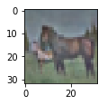
Hooray! That’s great! It looks like the images from the paper. Actually, they have used 10000 images and not 1000 like us. To see the differences in the results according to the number of images that you use and the effect of the hyper-parameter epsilon, here are the results for different values:
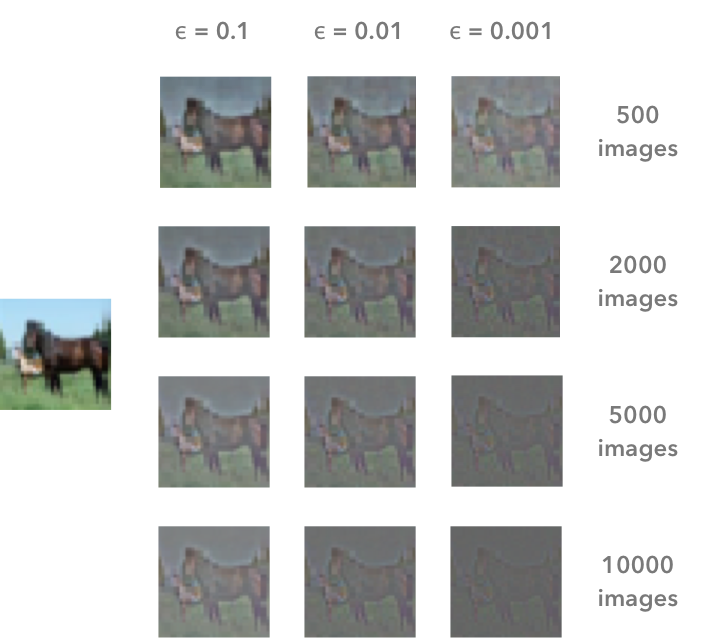
The result of the whitening is different according to the number of images that we are using and the value of the hyper-parameter epsilon. The image on the left is the original image. In the paper, Pal & Sudeep (2016) used 10000 images and epsilon = 0.1. This corresponds to the bottom left image.
That’s all!
I hope that you found something interesting in this article! You can read it on my blog (with Latex for the math for instance…), along with other articles!
You can also fork the Jupyter notebook on Github here!
MMS • RSS
Article originally posted on Data Science Central. Visit Data Science Central
Summary: Remember when we used to say data is the new oil. Not anymore. Now Training Data is the new oil. Training data is proving to be the single greatest impediment to the wide adoption and creation of deep learning models. We’ll discuss current best practice but more importantly new breakthroughs into fully automated image labeling that are proving to be superior even to hand labeling.
 More and more data scientists are skilled in the deep learning arts of CNNs and RNNs and that’s a good thing. What’s interesting though is that ordinary statistical classifiers like regression, trees, SVM, and hybrids like XGboost and ensembles are still getting good results on image and text problems too and sometimes even better.
I had a conversation with a fellow data scientist just this morning about his project to identify authors based on segments of text. LSTM was one of the algos he used but to get a good answer it was necessary to stack the LSTM with XGboost, logistic regression, and multinomial Naïve Bayes to make the project work satisfactorily.
Would this have worked as well without the LSTM component? Why go to the cost in time and compute to spin up a deep neural net? What’s holding us back?
Working with DNN Algos is Getting Easier – Somewhat
The technology of DNNs itself is getting easier. For example we have a better understanding of how many layers and how many neurons are needed to use as a starting point. A lot of this used to be trial and error but there are some good rules-of-thumb to get us started.
 There are any numbers of papers now on this but I was particularly attracted to this article by Ahmed Gad that suggests a simple graphical diagramming technique can answer the question.
The trick is to diagram the data to be classified so that it shows you how many divisions of the data would be needed to segment the data using straight lines. In this diagram, even though the data is intermixed, Gad concludes the right number of hidden layers is four. At least it gets you to a good starting point.
And yes, the cost of compute on AWS, Google, and Microsoft is now somewhat less than it used to be, and faster to boot with the advent of not just GPUs but custom TPUs. Still, you can’t realistically do a DNN on the CPUs in your office. You need to spend not insignificant amounts of time and money with a GPU cloud provider to get successful results.
Transfer Learning (TL) and Automated Deep Learning (ADL)
Transfer Learning and Automated Deep Learning need to be seen as two separate categories with the same goal, to make DL faster, cheaper, and more assessable to the middle tier of non-specialist data scientists.
First, Automated Deep Learning has to fully automate the setup of the NN architecture, nodes, layers, and hyperparameters for full de novo deep learning models. This is the holy grail for the majors (AWS, Google, Microsoft) but the only one I’ve seen to date is from a relatively new entrant OneClick.AI that handles this task for both image and text. Incidentally their platform also has fully Automated Machine Learning including blending, prep, and feature selection.
Meanwhile Transfer Learning is the low hanging fruit offered us by the majors along the journey to full ADL. Currently TL works mostly for CNNs. That used to mean just images but recently CNNs are increasingly being used for text/language problems as well.
![]() The central concept is to use a more complex but successful pre-trained DNN model to ‘transfer’ its learning to your more simplified problem. The earlier or shallower convolutional layers of the already successful CNN are learning the features. In short, in TL we retain the successful front end layers and disconnect the backend classifier replacing it with the classifier for your new problem.
The central concept is to use a more complex but successful pre-trained DNN model to ‘transfer’ its learning to your more simplified problem. The earlier or shallower convolutional layers of the already successful CNN are learning the features. In short, in TL we retain the successful front end layers and disconnect the backend classifier replacing it with the classifier for your new problem.
Then we retrain the new hybrid TL with your problem data which can be remarkably successful with far less data. Sometimes as few as 100 items per class (more is always better so perhaps 1,000 is a more reasonable estimate).
Transfer Learning services have been rolled out by Microsoft (Microsoft Custom Vision Services, https://www.customvision.ai/, and Google (in beta as of January Cloud AutoML).
These are good first steps but they come with a number of limitations on how far you can diverge from the subject matter of the successful original CNN and still have it perform well on your transfer model.
The Crux of the Matter Remains the Training Data
 Remember when we used to say that data is the new oil. Times have changed. Now Training Data is the new oil.
It’s completely clear that acquiring or hand-coding millions of instances of labeled training data is costly, time consuming, and is the single constraint that causes many interesting DNN projects to be abandoned.
Since the cloud providers are anxious for us to use their services the number of items needed to successfully train has consistently been minimized in everything we read.
The reuse of large scale models already developed by the cloud providers in transfer models is a good start, but real breakthrough applications still lie in developing your own de novo DNN models.
A 2016 study by Goodfellow, Bengio and Courville concluded you could get ‘acceptable’ performance with about 5,000 labeled examples per category BUT it would take 10 Million labeled examples per category to “match or exceed human performance”. My guess is that you and your boss are really shooting for that second one but may have way under estimated the data necessary to get there.
Some Alternative Methods of Creating DNN Training Data
There are two primary thrusts being explored today in reducing the cost of creating training data. Keep in mind that your model probably needs not only its initial training data, but also continuously updated retraining and refresh data to keep it current in the face of inevitable model drift.
Human-In-the Loop with Generated Labels
You could of course pay human beings to label your training data. There are entire service companies set up in low labor cost countries for just this purpose. Alternatively you could try Mechanical Turk.
But the ideal outcome would be to create a separate DNN model that would label your data, and to some extent this is happening. The problem is that the labeling is imperfect and using it uncorrected would result in errors in your final model.
Two different approaches are being used, one using CNNs or CNN/RNN combinations for predicting labels and the other using GANs to generate labels. Both however are realistic only if quality checked and corrected by human checkers. The goal is to maximize quality (never perfect if only sampled) while minimizing cost.
The company Figure 8 (previously known as Crowdflower) has built an entire service industry around their platform for automated label generation with human-in-the-loop correction. A number of other platforms have emerged that allow you to organize your own internal SMEs for the same purpose.
Completely Automated Label Generation
Taking out the human cost and time barrier by completely automating label generation for training data is the next big hurdle. Fortunately there are several organizations working on this, the foremost of which may be the Stanford Dawn project.
These folks are working on a whole portfolio of solutions to simplify deep learning many of which have already been rolled out. In the area of training data creation they offer DeepDive, and most recently Snorkel.
Snorkel is best described as a whole new category of activity within deep learning. The folks at Stanford Dawn have labeled it “data programming”. This is a fully automated (no human labeling) weakly supervised system. See the original study here.
In short, SMEs who may not be data scientists are trained to write ‘labeling functions’ which express the patterns and heuristics that are expected to be present in the unlabeled data.
 Source: Snorkel: Rapid Training Data Creation with Weak Supervision
Snorkel then learns a generative model from the different labeling functions so it can estimate their correlations and accuracy. The system then outputs a set of probabilistic labels that are the training data for deep learning models.
The results so far are remarkably good both in terms of efficiency and accuracy compared to hand labeling and other pseudo-automated labeling methods. This sort of major breakthrough could mean a major cost and time savings, as well as the ability for non-specialists to produce more valuable deep learning models.
Other articles by Bill Vorhies.
About the author: Bill Vorhies is Editorial Director for Data Science Central and has practiced as a data scientist since 2001. He can be reached at:
AI in Insurance: Business Process Automation Brings Digital Insurer Performance to a New Level
MMS • RSS
Article originally posted on Data Science Central. Visit Data Science Central
The insurance industry – one of the least digitalized – is not surprisingly one of the most ineffective segments of the financial services industry. Internal business processes are often duplicated, bureaucratized, and time-consuming. As the ubiquity of machine learning and artificial intelligence systems increases, they have the potential to automate operations in insurance companies thereby cutting costs and increasing productivity. However, organizations have plenty of reasons to resist the AI expansion; the fear of unemployment and the lack of trust in cognitive systems are among them.
But these are hardly justified concerns. According to Accenture, two out of three CEOs of insurance companies expect job net gain, even though AI insurance advocates claim that the time of insurance agents made of flesh and bone has gone. The truth is somewhere in the middle: Insurance companies can achieve synergy combining human and AI efforts. Interestingly, employees are optimistic about AI implementation. The Accenture report mentioned suggests that over 60 percent of insurance industry leaders surveyed by the consulting firm believe that AI adoption will boost their carriers. So, let’s talk about the main opportunities of AI adoption in the insurance industry.
What is AI Insurance: the technology behind innovation
Imagine that you plan to personalize health insurance quotes for people having various heart conditions. This requires precise, real-time, individual heart-tracking. To access this data, insurers can fully or partly cover the price of a wearable device (e.g. Apple Watch or other) that would track heart rhythm and stream collected data to a server. Then this data must be analyzed against the insurant’s electronic health record (EHR) dataset to infer predictions on whether a given person may shortly need medical attention. The higher the risk, the higher the monthly or annual quote is.
And this is a rather simplified and “one-of-many” model. Currently, AI algorithms can classify clients – by monitoring their health records – into hundreds of groups depending on various risks, which is a win-win relationship. Most customers enjoy a personalized approach as they seek fair quotes. On the other hand, insurance carriers can better manage risks and margins.
So, how does this work?
In general terms, artificial intelligence (AI) is a computer system capable of analyzing data in a nonlinear way, making predictions about it, and arriving at decisions. Advanced systems are able to continuously learn and enhance themselves.
Usually, machine learning (ML) builds AI systems using methods that employ statistical analysis of existing records to make predictions on new data. For example, if we have extensive health data on previous clients, we can predict the likelihood of this or that client looking for medical care and how soon this may happen. Unlike traditional, rule-based algorithms, machine learning doesn’t require engineers to explicitly map various input-output scenarios. This allows for forecasting and making decisions based on numerous, intricately connected factors, the thing that traditional programming can’t achieve.
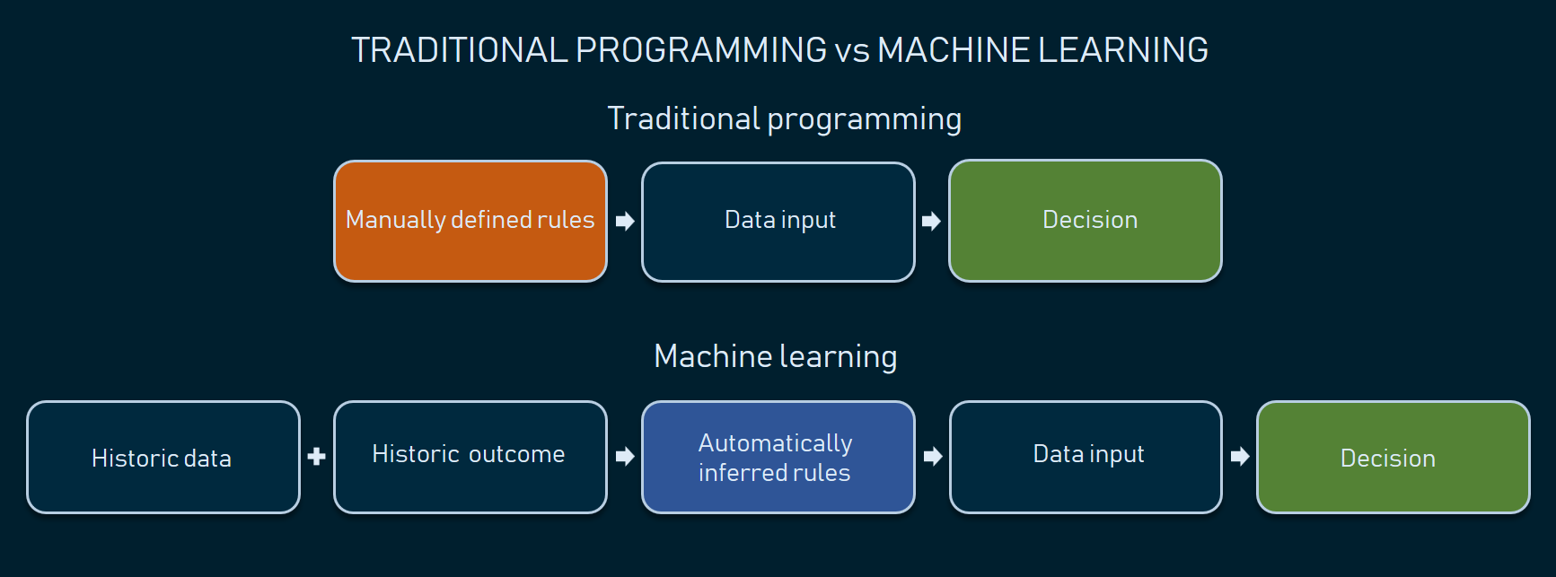
Automatically inferred rules ensure higher variety and precision of decision-making
NB: Some experts prefer to narrow down the AI term to describing a distinct and independent agent that handles inputs, analyzes them, and makes decisions. In our article, we use AI to refer to any smart system that leverages data science techniques to either make decisions or just augment human workflow.
While AI systems aren’t smart enough to fully replace humans, they already suggest several tangible improvements to a carrier’s operations. Let’s a have a look at these opportunities.
AI use cases in the insurance industry
So far, we see seven main areas in the insurance industry where AI can be helpful.
Speech/voice recognition in claims handling
Every day an average insurance agent spends up to 50 percent of their time manually filling in various forms to handle claims. Natural language processing (NLP) and speech recognition algorithms can transcribe and even interpret human speech to streamline this cumbersome routine.
There are a few NLP-driven products that specifically address claims handling. One example is Dragon Naturally Speaking solution by Nuance. The software automates data entry by transcribing agents’ speech, recognizing specific commands to fill in forms in bulk, and analyzing unstructured text. The system also provides an interface to format, correct, and revise the text using voice commands. The company claims that their AI solution has reached 99 percent recognition accuracy.
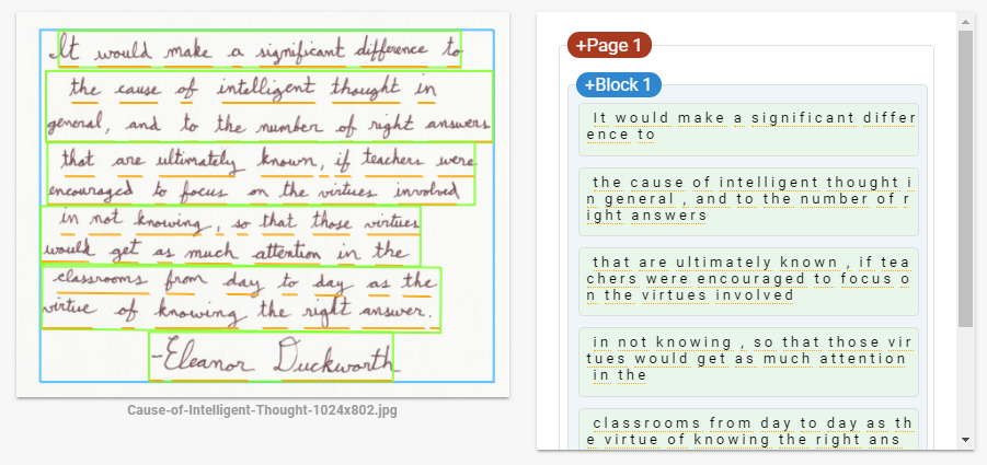
Text recognition to digitize documentation
Even though most documentation is now available in digital formats, a number of insurance practices still require physical document exchange with both typed and handwritten text, both of which eventually must be digitized in one way or another. Multiple providers of ML-driven platforms – including those supported by Microsoft and Google – have APIs for text recognition. Setting the right hardware is still a carrier’s problem, but the recognition itself doesn’t require custom machine learning engineering as now you can utilize pre-built APIs and integrate them with internal digital infrastructure.
Handwritten text recognition via Google Vision API showcase.
Recommendation engines and robo-advisors
Insurance recommendation engines can work like common eCommerce recommendation systems by applying the same techniques to insurance marketplaces that offer services by multiple carriers.
Another common case is a robo-advisory system. Both life and P&C (property and casualty) insurance can employ that system similar to how it’s used in the investment area. Such systems provide a convenient visual interface for clients to customize their insurance requirements and generate personalized insurance plans or offer P&C insurance.
One insurance robo-advisory success story is the startup Clark. The German company has raised over $43.5 million to let users buy and manage life, health, and property insurance. An AI algorithm also analyzes current insurance plans and suggests ways to optimize them.
Fraud detection
Fake or duplicated claims, unnecessary medical tests billing, and invalid social security numbers are common fraud types that both healthcare and insurance industries suffer from.
Machine learning has proved its efficiency in fraud detection as it can identify implicit and previously unknown attempts using anomaly detection combined with other complex techniques. (Check our fraud detection infographic to get the idea.)
If you don’t have a large track of fraudulent claims to use for your AI fraud detection engine, there’re options on the market to look at. Shift Technology ships an AI-based fraud detection solution suggesting that they’ve analyzed about 100 million P&C claims to train machine learning algorithm in recognizing suspicious activities.
Personalized car insurance
Personalization is a desirable leap forward – as we mentioned – both for carriers and their clients. The main barrier is acquiring enough data to make personalization precise and well… fair.
The idea of telematics (using car black boxes and sensors to track driver behavior) is becoming increasingly popular in insurance. It allows configuring custom car insurance quotes once the driver behavior data is analyzed. Telematics systems can collect data and stream it via the mobile connection right to the carrier’s servers for further analysis where the algorithm can elicit personalized quotes based on individual driving style.
UK-based insurtech company MyDrive Solutions provides end-to-end telematics products backed by ML-driven analytics. The product helps insurance companies with risk profiling, premium optimization, and even fraud detection. On top of that, the MyDrive app encourages safe driving by providing drivers with tips and feedback.
Image analysis in claim assessment
Nearly all types of insurance claims contain images, including healthcare, car insurance, and even agro cases. Image recognition has become one of the most rapidly advancing branches of machine learning after deep neural networks were introduced: Today you can use Google Lens to recognize common objects with your smartphone camera. And now off-the-shelf services like IBM Watson Visual Recognition support domain-specific tasks, given that you have enough historic data to train a machine learning model.
The use cases for image recognition in insurance abound. For instance, a carrier can speed up agrarian claims handling by collecting field images using drones and further analyzing them with AI. Another stand-out example is car insurance. A UK subsidiary of Ageas created the tool called AI Approval. The product assesses the damage in car accidents. It takes several seconds to calculate the coverage and decide whether the claim is valid. The system also sends alerts on potentially fraudulent claims.
Sentiment and personality analysis
Sentiment and personality analysis is another emerging trend in the business world as it allows for collecting and yielding insights from customer reviews on social media, in voice records, and even videos. Most often personality and sentiment insights sit in the zone of marketing interest. The insurance system can analyze reviews in media, detect complaints, and send reports to the marketing department of a company. As a result, the organization can control the media environment around the brand and proactively react to unhappy reviews and disputes.
Five questions to ask before starting an AI insurance project
Prior to embedding AI in a carrier’s operations, consider employing thorough planning for data-driven strategy, as complex AI projects usually require substantial investment and staff training. A good practice for introducing a data science strategy in a midsize or an enterprise-scale organization is to reveal the main blockers at the early stages by answering a set of essential questions.
MMS • RSS
Article originally posted on Data Science Central. Visit Data Science Central
Objective
Congestive heart failure (CHF) has been called an “epidemic” and a “staggering clinical and public health problem” (Roger, 2013). It can be defined as the impaired ability of the ventricle to fill or eject with blood. Consequences include difficulty breathing, coughing fits, leg swelling, decreased quality of life, and ultimately death. As life expectancy increases globally, we can only expect to see this syndrome more frequently. Fortunately, the advents of the electronic medical record and machine learning techniques have given us new weapons with which to fight this disease. In this post, let’s discuss three ways to combat CHF using artificial intelligence and related technologies:
- Early prediction and prevention of CHF onset
- Assistance with diagnosing CHF
- Prediction and prevention of CHF exacerbations
Early prediction and prevention of CHF onset
Once CHF is diagnosed, only 10% of patients live past 10 years (Roger, 2013). Therefore, there is much need for detecting patients who are at high risk of developing CHF before its onset and preventing those patients from developing CHF by promoting exercise, a low-salt diet, treatment with medications such as ACE inhibitors and beta-blockers, and increased engagement with physicians.
Several studies have predicted onset of CHF before clinical diagnosis. A 2010 study from the Geisinger clinic in Pennsylvania made models to predict individuals at risk of being diagnosed with CHF within 6 months or longer, using clinical data drawn from electronic health records (Wu et al., 2010). The researchers found that logistic regression and boosting algorithms achieved an AUC of 0.77 for the prediction task.
More recently, a 2016 study out of the Georgia Institute of Technology trained recurrent neural networks to predict the risk of developing CHF within 6 months (Choi et al., 2016). They used clinical event sequences collected over a 12-18 month observation window for over 30,000 patients. They achieved AUCs of 0.77 and 0.88 when using the 12-month and 18-month observation windows, respectively.
Assistance with diagnosing CHF
A definitive diagnosis of CHF is expensive to perform. Echocardiography requires skilled personnel to administer the test, and then a specialist physician (usually a cardiologist or radiologist) must read the study and assess how well the heart is pumping by visually quantifying the ejection fraction (EF), which is the fraction of blood the left ventricle ejects during its contraction. It can be unreliable to determine heart function using the images produced by sound waves, as you can imagine from the echocardiogram image below.

A cardiac MRI, while more expensive, is more accurate in measuring EF and is considered the gold standard for CHF diagnosis; however, it requires a cardiologist to spend up to 20 minutes reading an individual scan.
One approach to improve CHF detection is to sidestep the use of expensive and time-consuming imaging studies. A recent study from Keimyung University in South Korea used rough sets, decision trees, and logistic regression algorithms, and compared their performance to a physician’s diagnosis of heart disease (Son et al., 2012). The algorithms were trained on demographic characteristics and lab findings only. The models achieved over 97% sensitivity and 97% specificity in differentiating CHF from non-CHF-related shortness of breath. That’s astonishingly close to the human performance, with much less data, time, and resources used.
A second approach we should mention is the use of automated algorithms to read the echocardiography and cardiac MRI scans used to diagnose CHF. This problem was the subject of the 2015 Data Science Bowl, sponsored by the data science competition website Kaggle and Booz Allen Hamilton, the consulting company. For more on this competition, you can visit the competition website.
Prediction and prevention of CHF exacerbations
The Internet-of-Things (IoT) is a network of physical devices embedded with sensors, software, and internet connectivity, enabling these devices to exchange data. One emerging application of the IoT is to be able to remotely monitor patient health. A group of researchers at UCLA developed a weight, activity, and blood pressure patient-monitoring system for CHF called WANDA (Suh et al., 2011). Increased weight due to fluid retention, decreased activity, and uncontrolled blood pressure are critical markers of CHF decompensation; WANDA uses weight scales and blood pressure monitors to communicate these patient markers to the patient’s phone via Bluetooth. The phone then sends this data to a backend database in the cloud, along with activity and symptom information about the patient collected from a phone-based app. The data can then be used to perform logistic regression to alert a physician in case the patient is at risk of CHF decompensation. All of this is done privately and securely. This is a prime example of how the IoT and machine learning can be used to combat CHF.
Conclusion
Artificial intelligence can also be used for the following CHF-related applications (Tripoliti et al., 2017):
- Prediction and prevention of myocardial infarction, a major complication of CHF
- Prediction and prevention of hospital readmissions due to CHF
- Prediction and prevention of death resulting from CHF
In conclusion, congestive heart failure (CHF) is one of the leading causes of mortality in the developed world. To fight it effectively, we must use all the tools at our disposal. Artificial intelligence and related techniques provide additional weapons in our arsenal as we fight this catastrophic disease.
References
Choi E, Schuetz A, Stewart WF and Sun J (2017). Using recurrent neural network models for early detection of heart failure onset. JAMIA 24(2): 361-37.
File:Echocardiogram 4chambers.jpg. (2015, November 22). Wikimedia Commons, the free media repository. Retrieved 18:50, August 25, 2018 from https://commons.wikimedia.org/w/index.php?title=File:Echocardiogram_4chambers.jpg&oldid=179925202.
Roger VL (2013). Epidemiology of Heart Failure. Circulation research 113(6): 646-659.
Son C, Kim Y, Kim H, Park H, Kim M (2012). Decision-making model for early diagnosis of congestive heart failure using rough set and decision tree approaches. Journal of Biomedical Informatics 45: 999-1008.
Suh M, Chen C, Woodbridge J, Tu MK, Kim JI, Nahapetian A, Evangelista LS, Sarrafzadeh M (2011). A Remote Patient Monitoring System for Congestive Heart Failure. J Med Syst 35(5): 1165-1179.
Tripoliti EE, Papadopoulos TG, Karanasiou GS, Naka KK, Fotiadis DI (2017). Heart Failure: Diagnosis, Severity Estimation and Prediction of Adverse Events Through Machine Learning Techniques. Computational and Structural Biotechnology Journal 15: 26-47.
Wu J, Roy J, Stewart WF (2010). Prediction modeling using EHR data: challenges, strategies, and a comparison of machine learning approaches. Med Care 48: S106–S113.
MMS • RSS
Article originally posted on InfoQ. Visit InfoQ
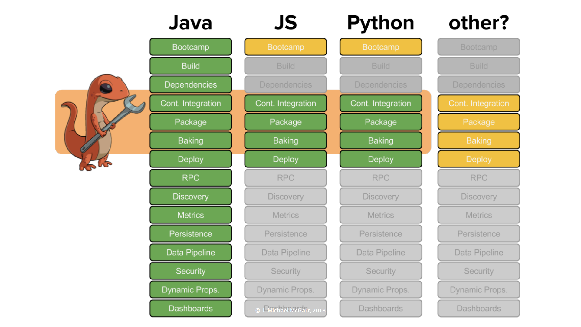
Mike McGarr, manager of developer productivity at Netflix, recently presented Better DexEx at Netflix: Polyglot and Containers at QCon New York 2018. He described how Netflix evolved from operating as a Java shop to supporting developer tools built with multiple programming languages. This has ultimately provided a better development experience for software engineers.
Netflix started operating out of a datacenter using a Java EE monolith application tied to an Oracle database. While this model worked well, the challenges of streaming and scaling required Netflix to migrate to adapt a new model that included Amazon Web Services using a Java microservices architecture tied to a Cassandra database. McGarr, having stated that this new model has made Netflix engineering famous, succinctly described the effort:
Through this transition, the engineering team made some amazing decisions and overcame some challenges in making this change.
Java at Netflix
As shown below, centralized teams at Netflix built developer tools with Java to support their customers, that is, software engineers at Netflix.
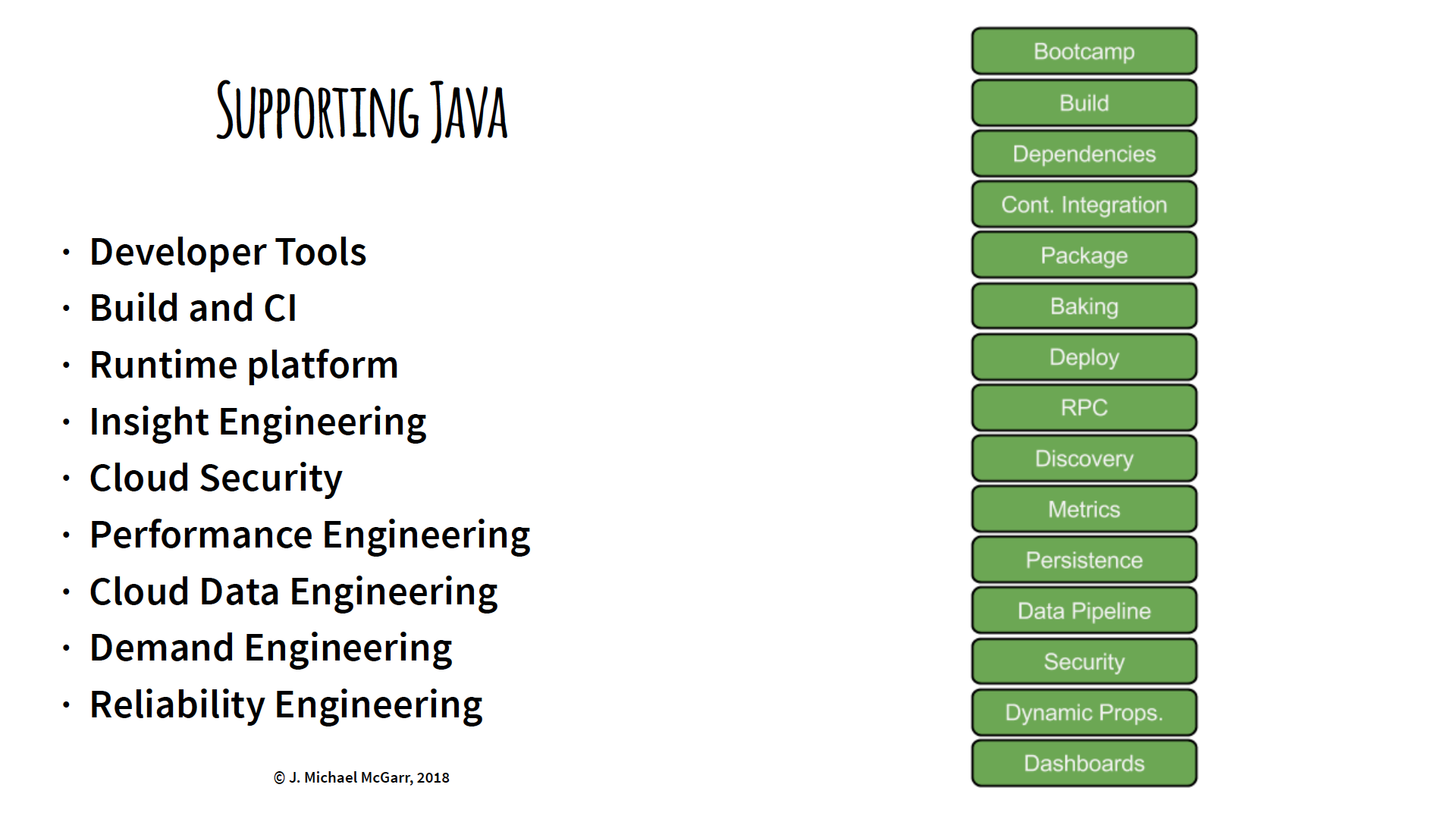
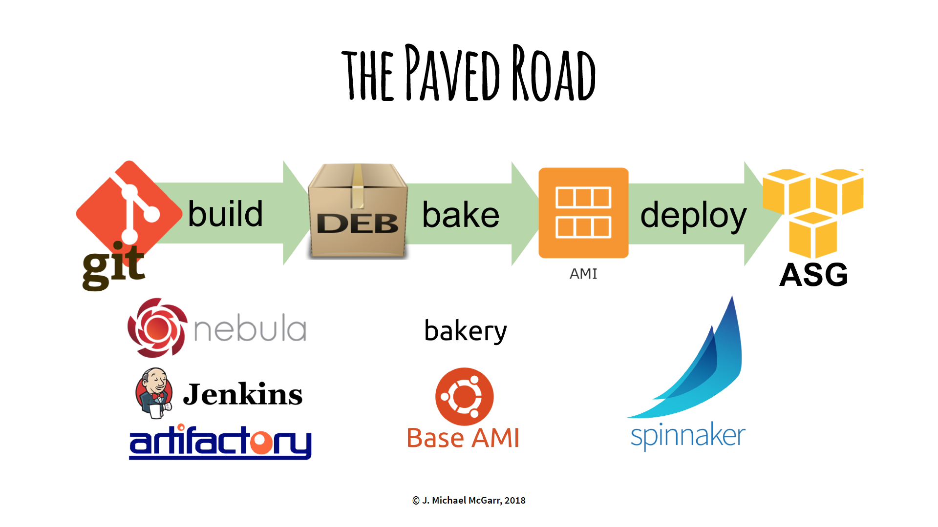
The Paved Road
The “paved road” at Netflix is their standardized path to build code, “bake” to immutable servers, and deploy to Amazon Web Services. It incorporates build tools such as Gradle, Jenkins, Spinnaker, and home-grown Nebula.
Netflix customers willing to follow this “paved road” will receive first-class support from Netflix.
Nebula
Nebula, created and open-sourced by Netflix, can be described in the What is Nebula? page:
Nebula is a collection of Gradle plugins built for engineers at Netflix. The goal of Nebula is to simplify common build, release, testing and packaging tasks needed for projects at Netflix. In building Nebula, we realized that many of these tasks were common needs in the industry, and it was worth open sourcing them.
OSPackage, a Nebula plugin, converts a Java application to a Debian package in preparation for the “baking” process. It’s an important step within the “paved road” that has worked very well for Netflix.
Non-Java at Netflix
As demonstrated in the graph below, Netflix realized a shift in popularity with non-Java programming languages such as Python and JavaScript.
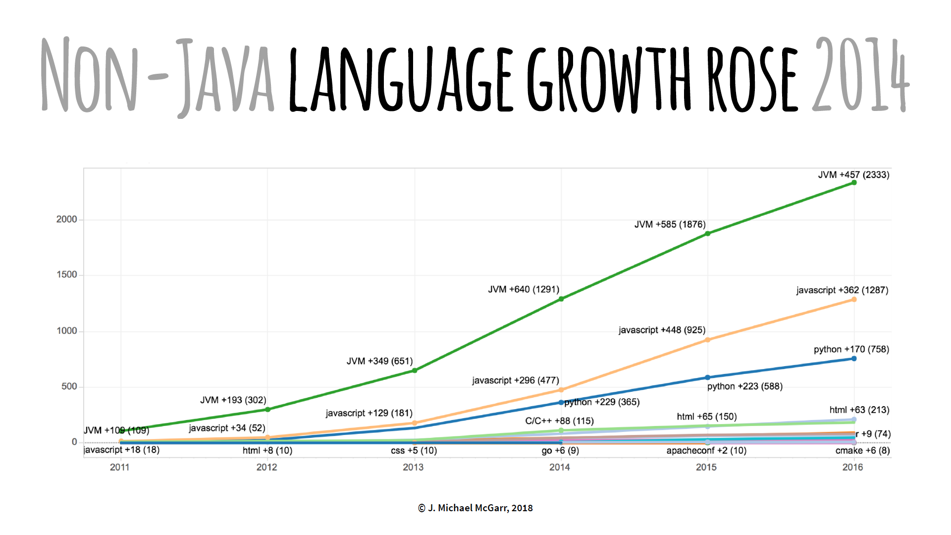
There was an increase customer requests to support non-Java build tools to deploy Netflix cloud applications. Netflix responded by offering a special Gradle build to package a NodeJS application to a Debian with OSPackage. This way, the “paved road” was still maintained. However, NodeJS developers weren’t keen on using Gradle, but Netflix continued to provide NodeJS support this way until they realized a tipping point. As McGarr stated:
That tipping point came in the form of a particular team at Netflix that made an architectural decision to move from a Java-based infrastructure, that was core to Netflix, to moving to containers and NodeJS. As soon as we heard of this project, knowing there was a subtle increase in JavaScript and Python, we realized that our answer could no longer work for the NodeJS community. So we had to make a change.
Their initial idea was to package a NodeJS application into a Debian using native JavaScript tools. Netflix wanted to build “Nebula for NodeJS” by finding the best JavaScript build tool and create plugins for it. However, Netflix discovered a vast “universe” of JavaScript build tools and patterns that aren’t present in the Java community. For example, multiple JavaScript build tools, such as Grunt, Gulp, and Browserify, could be used in the same project because of their different use cases. This is much different from using a single Java build tool such as Gradle, Maven, or Ant. Because of this, Netflix couldn’t create a simple build tool to serve the NodeJS community and had to differently approach the problem.
Developer Workflow
Netflix re-evaluated Nebula and discovered that, along with building code and dependency management, Nebula also, more importantly, provides developer workflow. Therefore, Netflix decided to create a brand new tool to address developer workflow with the following requirements:
- Language agnostic
- Native or native-like
- Reduce the cognitive load
Netflix Workflow Toolkit (Newt)
Newt, built with Google’s Go programming language, is a new command-line developer workflow tool that satisfies the three requirements listed above. Netflix chose Go because it can compile a binary that is static (that is, no dependencies) and it can cross-compile to multiple operating system architectures.
Newt was initially built for NodeJS developers and features a number of built-in command-line parameters, a few of which we examine here.
newt package is a utility that simplifies the NodeJS Debian packaging process. It points at a Docker image and executes Nebula. Despite the original goal to eliminate Nebula in NodeJS application development, Netflix felt it was important to still utilize it. As McGarr explained:
The problem with using Nebula for non-Java developers wasn’t so much the tool itself, but the experience of having to install and maintain and learn something outside the ecosystem. But OSPackage worked very well and it’s used all the time. It’s very well vetted.
So the idea behind this was “let’s throw it into a container,” put Java, Gradle, and some build files in there, and distribute that container to all the developers. Whenever they want to run
newt package, Newt will pull down that container, mount the local file system, run OSPackage inside the container and spit out a Debian. And they never have to touch Java.
McGarr emphasized that this is one of the best uses for containers because they can be used as a tool distribution and reuse mechanism.
NodeJS developers don’t have to worry about installing Docker because the concept of Newt was to automatically configure a local workstation. newt setup is a self-configuration utility that checks a predefined list of dependencies and automatically installs and updates whatever is missing or outdated. It was designed to automatically run in the background when other Newt commands are called, but may be explicitly called as necessary.
To build a NodeJS application, newt build is a utility that reads a configuration file, .newt.yml, that sits in the directory of each project and executes the code within that file. For example:
build-step: npm run-script build
This will call the command, npm run-script build, which finds the NodeJS project, reads the package.json file, and executes code defined in the scripts section that contains the command, build.
"scripts": {
     "build": "npm install && eslint src/** && npm test"
     }
Newt was designed to be language agnostic. As McGarr stated:
Newt has a very loose understanding of the world of build tools in that it’s aware they exist and it can run them.
Newt knows how to build a project without knowing how to build a project. If the developer decides to switch to webpack or something else, Newt basically just runs that script.
To address the concern of versioning conflicts, versions of NodeJS and NPM can be explicitly defined in the .newt.yml file:
build-script: npm run-script build
tool-versions:
    - node: 6.9.1
    - npm: 3.10.8
Borrowing from a Ruby pattern, newt exec stores this version information in a special cache for use in the application.
Newt also created an error reporting mechanism, newt report-error, to conveniently send error reports to the appropriate support staff.
Newt App Types
A Newt app type is a customized initialization that executes a predefined list of build tools to consistently create a new application. For example, node-ami-deploy creates: a local git project from a template; publishes it on Netflix’s git repository; creates any defined Jenkins jobs; and creates a Spinnaker delivery pipeline. It is initialized using newt init command with the --app-type flag as follows:
newt init --app-type node-ami-deploy
An app type may also be defined in a .newt.yml file.
app-type: node-ami-deploy
A number of predefined app types have been created within Netflix. The newt init command provides a complete list.
Netflix discovered that Newt is a platform, not a tool, as Newt supports a cross-section of build tools for Java, JavaScript, and Python with the potential to support other languages in the future.
Unlike Nebula, Newt is only available within Netflix. However, McGarr stated that requests from the outside developer community could make it possible to one day open source Newt.
Lessons Learned
In the end, Netflix has learned:
- Polyglot can be expensive
- Containers make for great tool distribution
- Build platforms, not just tools
- Provide native (or native-like) solutions
- Reduce cognitive load
McGarr spoke to InfoQ about centralized teams at Netflix.
InfoQ: What, in particular, is the most important aspect about Netflix application development that you would like to share with our readers?
McGarr: Our most important aspect with Netflix application development is our culture such that our customers are able to work with high trust and plenty of freedom and responsibility. Our managers provide context and do not control decisions. And we’ve found huge gains across the board with our customers.
InfoQ: What are the prospects of Newt being open-sourced?
McGarr: Only time will tell. We don’t want to open-source Newt and “walk away.” We need to evaluate the cost of internal versus external support and that would require additional resources to make that happen.
InfoQ: What’s on the horizon for Netflix application development?
McGarr: We are continually looking for ways to improve the productivity and reduce cognitive load of our software engineers as they move through working with containers, cloud applications, agile processes, etc. This is a trend that I have noticed in other companies as well.
InfoQ: What are your current responsibilities, that is, what do you do on a day-to-day basis?
McGarr: As an engineering manager, I need to ensure that we have the right people and the resources they need to be successful. I also recruit, both by reaching out to candidates, as well as building “marketing” material to talk about the work we are doing.
I spend a lot of time meeting with other people at Netflix to collect information about what’s going on, so I can provide context to my team. I focus on the “what” and the team provides the “how.” This way, Netflix engineers have enough time to focus on flow.
Resources
MMS • RSS
Article originally posted on Data Science Central. Visit Data Science Central

Last time, I wrote on wrangling data from a pdf file to assemble a data set of D1 college athletic performance in the Learfield Directors’ Cup competition. In this blog, I embellish that data, calculating individual school ranks from scores for the fall, winter, and spring seasons. I then aggregate and contrast conference performance for the total year as well as for the individual seasons. It turns out that of the 32 D1 conferences, the real competition for best boils down to just the top 5 big football or FBS “leagues” — the Pac 12, SEC, ACC, Big Ten, and Big 12.
The methodology deployed is to derive conference performance ranks for total year in addition to the fall, winter, and spring seasons by aggregating individual school ranks. Thus, for example, the Pac 12 school rankings for total year, fall, winter, and spring seasons would be combined to come up with Pac 12 total, fall, winter, and spring scores using formulae that would no doubt be debated. The conferences would then be compared on these scores, and “winners” derived for the four categories. The rankings are ultimately visualized with violin plots, descendants of the trusty box and whiskers.
Below is the R code for the final data building and analyses. The technology used is Microsoft Open R 3.4.4 running JupyterLab Beta.
Read the full blog here.